Quantcast
Channel: BOOKTRYST
Viewing all 472 articles
Browse latest View live

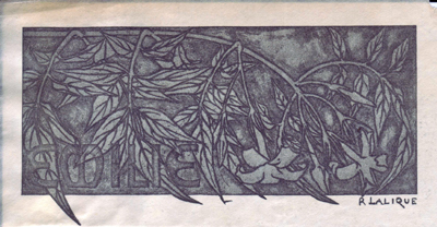
The Only Bookplate Designed By René Lalique

$
0
0
by Stephen J. Gertz


Found in a copy of the Kelmscott Press's The Defence of Guenevere and Other Poems by William Morris (1892) from the collection of Emilie B. Grigsby (1879-1964), this is the only bookplate ever designed by René Lalique (1860-1945), the celebrated French art glass and jewelry designer.
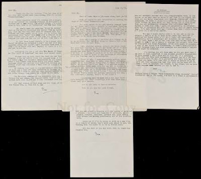
Note her given name at lower left, so well integrated into the background foliage that it almost disappears into it.

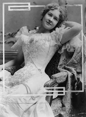
Grigsby was a wealthy American bibliophile of "colorful reputation," and the young, comely "ward" (i.e., concubine) of the notorious robber baron, Charles Yerkes (1837-1905) who built (and bilked) the Chicago transit system and Northern and Piccadilly lines in London.

Emilie Grigsby was almost forty years younger than Yerkes but held her own,; she was sophisticated charming, and intelligent. The mansion he built at 660 Park Avenue, New York City - just a few blocks from his Fifth Avenue palace where Mrs. Yerkes lived - was a gift to Emilie, the daughter of a slave-holding father from Kentucky and a brothel madam mom from Cincinnati. Her fine library was sold in New York by Anderson and Company in 1912.

Emilie B. Grigsby.

"A most interesting catalogue of books belonging to Miss Emilie Grigsby, the ward of the late Charles T. Yerkes of Chicago, has been issued by the Anderson Auction Company, which will sell them in the week beginning Jan. 29. It is a woman's library of fine books, not subscription books, but really interesting and beautiful books and fine bindings. The sale includes long series of the William Loring Andrews books; publications of the Essex House, Kelmscott, Vale and other private presses..." (Boston Evening News, January 24, 1912).

"She has a charm one feels at once and responds to, a charm, vague, indescribable, that borders on the aesthetic, the kind that some of Chopin's music exerts over the crudest of us.

"Perhaps her appearance fosters this idea of the spiritual. Golden hair, blue eyes, fragile as a piece of Dresden china, she is as many of our famous artists have painted her. Absolute unconsciousness of her beauty, lack of affectation, simplicity of manners are hers. She listens to what is told her, and speaks when she has something to say. There is no boredom, nor yet effusiveness. She strikes easily and naturally the note so many others have attempted and failed, the note of harmony and perfect poise. No restless striving for this, nor craving for that" (Lillian Barrett, Emilie Grigsby - A Reminiscence.. New York Times, July 16, 1911).
__________

Bookplate image courtesy of David Brass Rare Books, witrh our thanks.

Image of Grigsby courtesy of University of Illinois Archives, with our thanks.
__________
__________

The LSD Library Goes To Harvard

$
0
0
by Stephen J. Gertz

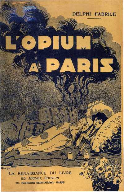
FABRICE, Delphi. L'Opium A Paris.
Paris: La Renaissance Du Livre, 1907.

The Ludlow-Santo Domingo (LSD) Library of rare books, the world's first, largest, and most distinguished collection of the literature of psychotropic drugs, has been placed at Harvard's Houghton Library on long-term loan after extended and highly sensitive negotiations with the family of the late Julio Mario Santo Domingo, Jr (1958-2009), the eldest son and scion to the fortune of his father, Columbian business magnate Julio Mario Santo Domingo (1923-2011) and omnivorous collector of books associated with the 60s Counterculture in the U.S. and Europe.

Sex, drugs, and rock n' roll was not an area of book collecting that the family, particularly his  wife, Vera, from whom he was estranged, found edifying; it was, apparently, a source of embarrassment, and since Mr. Santo Domingo's death the family had worked hard to disburse his collection with discretion through intermediaries who insisted upon the highest degree of secrecy from potential buyers - institutions, dealers, and auction houses - and negotiations with all were, reportedly, difficult.

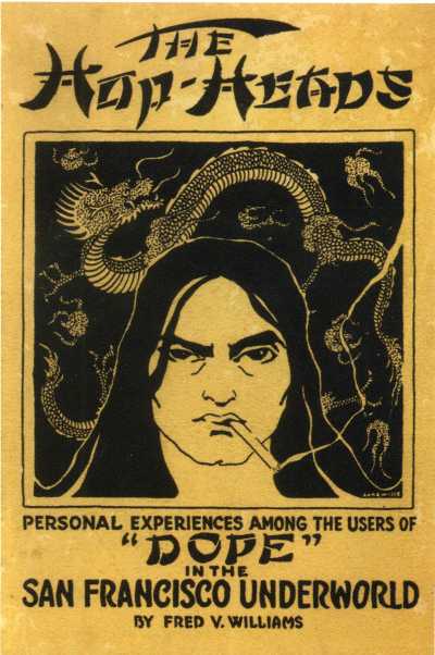
WILLIAMS, Fred V. The Hop-Heads of San Francisco.
San Francisco: Walter N. Brunt, 1920.

It was, then, something of a shock when Harvard formally and by name announced acquisition of the major part of the Julio Santo Domingo collection - over 25,000 books, manuscripts, works of art, audio recordings, and films - on September 28th of this year. When I inquired close to a year ago while chasing a rumor, Harvard refused comment.

As did The Roll N' Roll Hall of Fame and Museum & Library and Archives which coyly responded, "no comment at this time," a non-confirming confirmation that they had acquired a chunk of the collection. And as did every auction house suspected of being involved in negotiations (a slice of Santo Domingo's magnificent collection of fine erotica and Baudelaire was recently offered by Christie's-Paris without provenance; highly familiar with the collection, I recognized a few singular items). And last year a selection of books on '60s Counterculture from the collection was discreetly acquired by Maggs in London; journalist Susan Halas recently interviewed Carl Williams of Maggs about  Santo Domingo's Counterculture library for Americana Exchange.

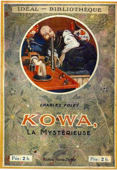
FOLEY, Charles. Kowa, La Mystérieuse.
Paris: Editions Pierre Lafitte, 1920.

The cornerstone of the LSD Library - however large just one part of Santo Domingo's huge book collection - was the Fitz Hugh Ludlow Memorial Library of the literature of psychotropic drugs, which Julio (we knew each other) acquired in early 2002 from its founders and curators, rare book dealers Michael Horowitz and William Dailey, along with Robert Barker and Michael Aldrich  Ph.D, who established the collection in the early 1970s in response to the dearth of historical resources and research materials on a controversial subject at the forefront of public consciousness and discussion. It was, and will now remain, the pre-eminent book collection on the matter.

VAUDÈRE. Jane de la. Folie D'Opium.
Paris: Albert Méricant, n.d. [c. 1910].
Unrecorded; the only known copy.

But before Julio bought the Ludlow, William Dailey (with my assistance as his cataloger/manager) was sending low- to high five figure shipments of drug-related books to Julio's offices in Geneva every other month or so. Julio bought just about anything you offered  related to his area of interest. I recall that, early on, Dailey sent Julio a very long list. He returned it with only a few items checked off. Bill and I were stunned - this was great, gotta-have stuff. It turned out that Julio had merely indicated the books he didn't want - only because he already had copies.

(I think that shipment was worth $88,000; if not, it was another air freight-load to him for that sum - I died a thousand deaths in the course of arranging its pick-up and shipment. After 9/11, moving large quantities of rare books on illegal drugs out of the country actually became easier. By then, the office guys at Swiss Air freight and those on the dock had become old friends of Dailey Rare Books and we were granted "known carrier" status after an airline official took a quick look-see through the shop. Our shipments no longer required time-consuming piece-by-piece inspection and too much paperwork; now, two quick phone calls and a fax).

Julio would visit L.A. once or twice a year and take Bill and I out to lunch. What did we talk about? Uh, books; Julio couldn't get enough of the subject. He was a hip bazzionaire and always appeared in crisp white dress shirt, pressed faded jeans, sharp blue blazer, and black tassled loafers, a casual ensemble of uncasual quality and cost to the average citizen. He was a rock n' roll jet-setter; he had personal relationships with rock n' roll's royalty and routinely vacationed with them.

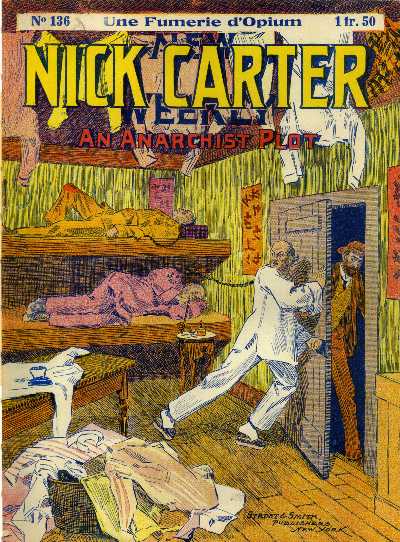
Nick Carter Weekly No. 136: Une Fumerie d'Opium. An Anarchist Plot.
New York: Street & Smith, c. 1905. French edition.

Once, while at Dailey Rare Books, I picked up the phone. It was Julio, calling from Geneva, Paris, Berlin, somewhere in Europe. We chatted for a moment then I passed the call over to William.

"Hi, Bill," Julio said, "say hello to Yoko."  Yup, that Yoko. Mick Jagger was also a friend on a long list of luminaries that were his genuine pals.

When I sold my small yet precious collection of drug literature to William Dailey in 1999 it wound up in Julio's collection. When Julio invited me to Geneva to catalog the enormous number of drug paperbacks in his collection (alas, not realized) I looked forward to seeing those old friends.

Feral House, 2008.

When I was preparing my book, Dope Menace (2008), Julio generously opened his collection to me, and had his staff in Geneva - Beatrice Rodriguez, Natasha Antonini, and Flavia Aulieri -  send requested book images for inclusion into DM, which was the first and last to cite the Ludow-Santo-Domingo Library as a reference source. Julio was supportive and proud of the project and looked forward to its publication. He was, sadly, extremely ill at the time of the book's release and while I sent him a copy I'm not sure that he saw it before he died.

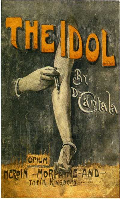
Dr. [Julius] Cantala.
The Idol: Opium, Heroin, Morphine, and Their Kingdoms.
[N.p.]: Botwen Printing, 1924.

That the Ludlow-Santo Domingo Library is now at Harvard is a relief to those who spent decades assembling its core and those associated with it. We were afraid that the collection would be broken-up and cast to the winds. There is only one other significant collection in the world of this material, in private hands, yet it's a handsome dwarf compared to the LSD. Now, scholars will have access to the finest, broadest, and deepest collection of books, art, and ephemera related to psychotropic drugs on Earth.

I think I speak for all with their hearts in the collection when I thank the family of Julio Santo Domingo, particularly his widow, Vera, for keeping the LSD Library whole and placing it at Harvard, where the collection, once the bastard step-child of the book collecting world - years ago, William Dailey was denied membership in The Grolier Club because of his involvement with it - is now recognized for its significance and takes a deserved place of  honor alongside Harvard's other distinguished special collections.

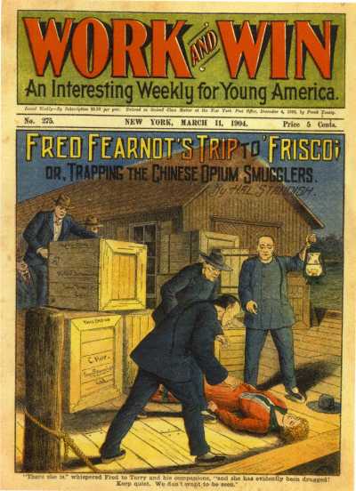
Work and Win No. 275: Fred Fearnot's Trip to Frisco, or
Trapping the Chinese Opium Smuggler.

New York: Frank Tousey, March 11, 1904.

Julio Santo Domingo, Jr.  is surely smiling, Jimi Hendrix, Janis Joplin, John Lennon, Brian Jones, Jerry Garcia, Marc Bolan, Nico, Harry Nilsson, Jim Morrison, Elvis, etc. at his side because Julio has no doubt become best friends with all of them. And they're likely talking about this, what the Harvard Gazette called, A Collection Unlike Others.

"We got the sex and drugs," said Leslie Morris, curator of Modern Books & Manuscripts at Houghton Library, of the Santo Domingo Library.

And now, a stately procession of ignoble books of the sort that Julio loved and owned, copies of many now,  presumably, on deposit at Harvard, the most respected institution of higher learning in the world. 


__________

All images from Dope Menace: The Sensational World of Drug Paperbacks 1900-1975, each, save the cover image, courtesy of the Ludlow-Santo-Domingo Library.
__________
__________

My Bonnie Lies Over the Ocean: Robbie Burns in Philly

$
0
0

by Alastair Johnston

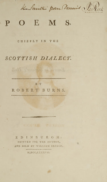
Second (first Edinburgh) edition (1787).

Like many before him, a Scotsman emigrates to the New World. He is a success, prospers, and adapts well to his new home. But as he advances in years he starts to miss his homeland. So he decides, on turning 70, to go home one last time and see his native sod. He telegrams his brothers and gets on the boat that brought him thither many years afore. On Clydebank he gets on the wee puffer to Tannochbrae and heads back into the glens once more. But at the station no one greets him. Then he sees two old guys on a bench. Och, Jamie and Geordie, he says, aa didna ken ye, wi them lang white beards! Aye, says yin, when ye went aff tae Americay, ye tak the razor wi' ye!

                                   
                                     Perhaps it may turn out a Sang;
                                     Perhaps, turn out a Sermon.
                                       (Burns, Epistle to a Young Friend, May 1786)

A new acquisition by the National Library of Scotland sheds interesting light on the way authors' works circulated before publication in the 18th century.

This summer the NLS acquired a collection of newspapers printed in Philadelphia by John Dunlap, containing individual poems by Robert Burns. Dunlap (1747-1812), you may know, was printer to the Continental Congress. He'd been brought to the colonies from county Tyrone, in Ulster (Northern Ireland) by his uncle William as a printer's apprentice. When he turned 18, Dunlap took over the printing business and began publishing a weekly newspaper, The Pennsylvania Packet, or the General Advertiser. Like many colonial publications, its contents reflected the press in Europe, particularly Britain, from whence a lot of material was derived. Thus the Pennsylvania Gazette (which was bought by Benjamin Franklin in October 1729) was padded out with extracts from the Dictionary of Eminent Scotsmen. In 1773 Dunlap married Elizabeth Ellison, niece of Franklin's wife. Three years later, a rush job for printing a broadside, brought to him by John Hancock, would put his presswork into the annals of American history. (I have often remarked how American Independence from Britain did not extend to print culture, for not only is the Declaration set in Caslon type, most of the printing in America continued to be cloned from British editions, text and typography.)

His paper was eminently successful and when Dunlap died he was one of the wealthiest men in America, owning large tracts of land. While the survival of old newspapers is not that remarkable, the contents of this group are. They are the first appearances of the poems of Robert Burns in America. Unlike the Lakers (Wordsworth, Southey, Coleridge), Burns was immediately popular on the appearance of his first book of poetry. Poems Chiefly in the Scottish Dialect (Kilmarnock, 1786) was a huge success and Burns would become the best-selling poet of the nineteenth century (followed by Byron, Milton, Pope, and then Bloomfield, whose own rustic character Giles is a complete hick next to the swinging Scotsman we find in Burns' poems and songs.) A review by Henry Mackenzie in The Lounger (no 97, Edinburgh, 9 December 1786), referring rapturously to the "Heaven-taught Ploughman," was picked up by the London Chronicle and brought the Scots bard to public notice.

The 1786 Kilmarnock edition of Burns' poems, set in Caslon type

A second edition of Burns was printed in Edinburgh (with 1600 subscribers) and copies quickly made it to the New World via the ports of Philadelphia and New York. With the peace of 1783 trade as well as immigration resumed. It was common for a bookseller to arrive by boat stocked with the latest books and start business as soon as he disembarked. As Anna Painter said, "Wherever Scotsmen had gone, the poems and fame of Burns followed, and Scotsmen had gone everywhere in the eighteenth century." The continued adoration (and memorization) of Burns' work has also meant the survival of the Lallans dialect.

In Philadelphia two Scots immigrants, Peter Stewart, a printer, and George Hyde, a bookbinder, decided to print the first American edition of Burns. There was no copyright agreement between America and its former government in Britain so piracy was rampant. They had been anticipated by some New Yorkers who were trying to get subscriptions from the St Andrew's Society in that city, but subscribers were slow in coming forward, for those who were determined enough were getting copies of the London third edition fresh off the boat. So it took over a year for the New York edition to get off the ground (today there's a statue of Burns in Central Park).

To test the market Stewart and Hyde placed poems in the Pennsylvania Packet from 24 July 1787 to 14 June 1788, then issued their edition on 7 July 1788. The NLS mentions that Burns' poems clearly had a positive impact on their American readership; the selected poems were chosen to portray him as a sentimental, God-fearing ploughman, a working man at one with nature and sympathetic to the aims of the American colonists in freeing themselves from British control. Among the poems printed in the newspaper are: "The Rigs o' barley," "The Cotter's Saturday night," "To a louse," "To ruin," and "Epistle to a young friend."

I kiss'd her owre and owre again, | Amang the rigs o' barley
(Burns' first appearance in the New World)


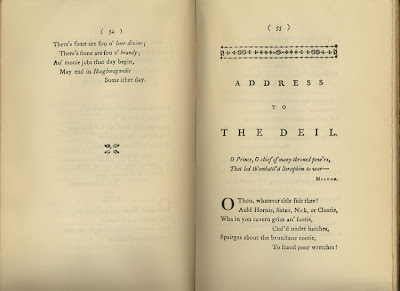
Despite its arcane rhymes of "grozet" with "rozet", and "smeddum" with "droddum," "To a Louse" is one of the most magnificent poems ever composed in any language, striding boldly from contempt and arrogance to a transcendent observation on human nature in the last stanza. It still boggles the mind today. The putative publishers didn't need to cock the big guns, like "To a Mouse," leaving them for the discovery of the delighted reader. Two later issues of the paper ran ads for the American edition as a 'neat pocket volume.' It is likely the American edition was printed by Dunlap (who was a more commercial printer than Stewart, who only printed ephemeral jobwork), then the sheets were bound by Hyde.

Frank Amari Jnr, an American rare book dealer, attorney, and member of the Ephemera Society, sold (and partly donated) the collection to the National Library of Scotland where it will be a useful tool for those studying transatlantic commerce in books.

               L--d man, were ye but whyles where I am,
               The gentles ye wad ne'er envy them!
                                  (--Burns, The Twa Dugs, a tale)


Ref: Anna M. Painter "Poems of Burns before 1800", in The Library, 4th ser. 12 (1931-32), pp. 434-456.
__________
__________

An Unrecorded And Incredibly Rare Dean & Son Movable Book Is Discovered

$
0
0
by Stephen J. Gertz

  
Dissolving Views is volume of extreme scarcity, unrecorded anywhere, and with no auction records whatsoever. It is comprised of seventeen movable leaves with tabs which when pulled reveal another image. The first six are identical to those found in Dean's New Book of Dissolving Views (1862) but are here printed on off-white paper; in New Views... the paper is pale violet.

The remaining eleven views are not, to the best of my research, found in any other edition, and may be unique to this, presumably one of the earliest, if not the earliest movable books with tabs that Dean and Son produced. 


Of Dean's New Book of Dissolving Views (1862), The Osborne Collection of Early Children's Books 1566-1910 notes, "third in a series." We can only conclude that the volume under notice precedes Dean's New Book of Dissolving Views by a few years, and is likely the first in the series. Why this edition contains so many more views than subsequent issues remains a mystery but perhaps it was a case of too much of a good thing and, expensive to produce, the subsequent editions cut back on the views.


It may also be that this was a transitional volume for Dean and Son from movables marketed to adults - it is bound in cloth with elaborate blindstamping and a gilt vignette as centerpiece, not in pictorial boards as one would expect for juvenalia and typical for Dean and Son - to movable books aimed at children who were, ultimately, the logical target audience.

And it is surely early: the cloth, blindstamping and vignette design are typical of the 1840s/early-mid1850s.

Whatever the truth, this is most certainly amongst the rarest of all Dean & Son movable books.


"The first true movable books published in any large quantity were those produced by Dean & Son, a publishing firm founded in London before 1800. By the 1860s the company claimed to be the 'originator of childrens' movable books in which characters can be made to move and act in accordance with the incidents described in each story.' From the mid-19th century Dean turned its attention to the production of movable books and between the 1860s and 1900 they produced about fifty titles" (Montanaro, A Concise History of Pop-Up and Movable Books).


"Dean and Son was the first publisher to produce movable books on a large scale. Thomas Dean, who founded the firm sometime before 1800, was one of the first publishers to take full advantage of the new printing process, lithography, which was invented in Germany in 1798. His business was devoted exclusively to making and selling novelty books, or 'toy' books, a term publishers began using in the early nineteenth century. His son George became a partner in 1847, and their toy books took over the market from the 1840s to the 1880s.


"Dean opened studios in London where teams of artists worked to design and craft all kinds of new and complex movables. Around 1856, Dean released a series of fairy tales and adventure stories under the title New Scenic Books. The scenes in the books were crafted in a "peep show" style. Each was illustrated on at least three cut-out sections. The sections were placed one behind another and attached by a ribbon running through them. This way, they could stay together and be folded flat as flaps, face down against a page. When a readers lifted a flap, a three-dimensional scene would actually pop-up!  A later, but good example of this technique is McLoughlin Brothers' The Lions' Den (ca. 1880), which is held together by a piece of board across the top instead a a ribbon.


"The books in new scenic series are probably the first that today's readers would consider pop-up books, although the term "pop-up" was yet to be used to describe such books. 'Movable' or 'toy book' was usually the choice for description. In 1860, Dean actually claimed to be the 'originator' of movable books.


"During the 1860s, Dean can be credited with inventing another first: the use of a mechanism that moved or was animated by pulling a tab. Dean advertised the new mechanisms as 'living pictures.' The Royal Punch & Judy is one of these early publications with tabs, which are located on the bottom of each page. In it, Punch and Judy are animated in their miniature theatre and act out all the violence and abuse that a Victorian audience would have expected from the couple" (University of North Texas, A Brief History of Early Movable Books). 


Miraculously, only one tab has been repaired to this copy; the others are all original and in fully functioning order suggesting that, indeed, this was a movable meant for adults otherwise it would have been a wreck secondary to book abuse of the child kind.


The Views:

1. Land. Sea.
2. War. Peace.
3. Day. Night.
4. Summer. Winter.
5. Fire. Water.
6. Earth. Air.
--
7. Fair. Dark.
8. War. Peace. (alternative images).
9. The Ocean Way. The Iron Way.
10. Outside. Inside.
11. Danger. Safety.
12. Saturday Night. Sunday Morning.
13. A Goose Hunt. Who's The Goose?
14. Fruit Search. Fruitless Result.
15. Sausage Meat. All Alive, O!
16. Pork Pie. Its Contents.
17. Curious Cabbage. Fighting Tailor. 
__________


[MOVABLE BOOK].Dissolving Views. To look at these Views effectively, keep the Book flat on a Table, - pull the shaft from the bottom, for one View, and from the top for the other. London: Dean & Son, n.d. [c. 1856-59].

First edition (?). Tall octavo (10 3/8 x 7 in; 263 x 177 mm). Seventeen movable leaves as hand-colored woodcuts.Publisher's original deep purple cloth, elaborately blindstamped, with central gilt vignette of title spelled out as tree branches.

Cf. Osborne, p. 417.
__________
__________

Gershwin Ain't Got Rhythm At Auction

$
0
0
by Stephen J. Gertz


They're selling lots of books, but not for me 
A lucky star's above but not for me 
With fame to lead the way 
I found more clouds of gray 
Than any auction play could guarantee...to flee.


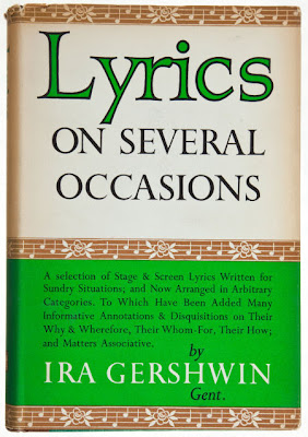
Pantheon lyricist Ira Gershwin got rhythm, he got music, he got his gal, and when an important archive of his letters was offered at PBA Galleries on November 15, 2012 who could ask for anything more?

He could. Estimated at $80,000-$120,000 the archive did not sell. Who could ask for anything less? Collectors, who apparently, were just bidin' their time and not biddin' their dime. What should have been S'Wonderful and S'Marvelous sighed a collective Let's call the whole thing off.


That the archive did not sell is not a reflection of the quality of the material or its significance. "They can't take that away from me," as Ira wrote for Fred Astaire in Shall We Dance? (1937).

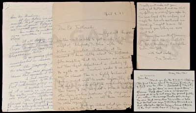
The archive comprises a rare assemblage of unpublished correspondence by Gershwin (1896-1983) and is crucial to understanding the music and entertainment industry om the U.S. during the 1920s-1950s from one of its giants, a song lyricist with a gift equaled only by his contemporaries Oscar Hammerstein II and Cole Porter.

It's an extraordinary archive of letters, offering rare insights into the mind and method of his brother and collaborator, composer George Gershwin (1898-1937), and the production of George’s masterpiece Porgy and Bess.


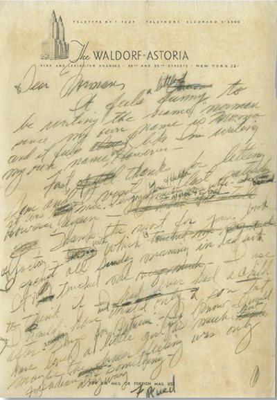
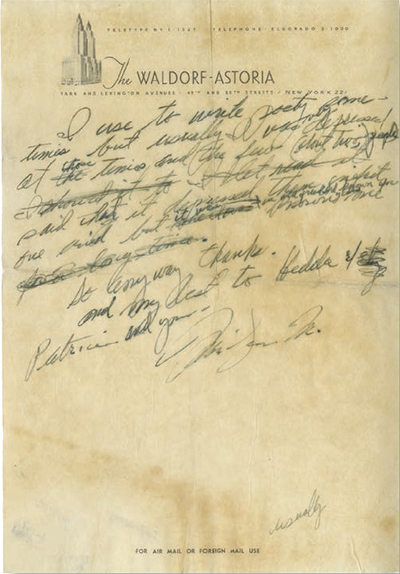
On May 26th, 1961, in perhaps the most significant letter in the collection, Ira writes about Porgy and Bess and George Gershwin’s perception of the production: “As for ‘opera’ or even ‘grand opera; - of course. ‘Folk opera’ was a compromise arrived at so as to not scare the general public – or, rather – the average theatre-goer, away. I’m sure that somewhere I’ve written or told that the Met was eager to produce the work and that Otto Kahn offered George a bonus of $5,000 if the Met could have it. (George was flattered but realizing that at best the work could get a guarantee of 4, possibly 6, performances he turned it down for Broadway)…”

The letters, a huge trove of 1-4 pages each, were written to Edward Jablonski, who later became an important  historiographer of musicians, publishing numerous works including a major biography of George Gershwin, begin in 1941 when Jablonski was still in high school and an adoring fan. In 1952, Jablonksi founded Walden Records, releasing many rare compositions by Gershwin and other musicians of the day.

The correspondence not only provides a remarkable record of Ira and George Gershwin but also gives a vivid picture of the world of music and show business in the 1940s and 1950s, the period when nearly 90% of the letters were written. Gershwin writes much on his brother and his legacy (a good deal of his time was spent in managing the estate), his own ongoing projects in Hollywood and New York, his opinions of actors, actresses and singers, criticism of composers and lyricists, reviews of movies and dramatic productions, and his thoughts on new records being released, through Jablonski’s Walden as well as Columbia and other major record labels.


Other highlights:

• June 18, 1941: “…Now as to those questions. ‘Short Story’ was a piece that might have been included in the ‘Preludes’. George wrote this at a very early age. Samuel Duskin heard it and asked if he couldn’t arrange it for the violin. George agreed to it… There is an actual 4th prelude, however – unpublished. Since it is in 32 bar song form I’m going to put a lyric to it some day…”

• September 22, 1941, on the lookout for copyright infringement: “Never heard of the Haynes-Griffin Co. and their album of excepts from ‘P. & B’ and ‘American in Paris’ etc. I imagine what they are offering are records of broadcasts like the one at the Hollywood Bowl of which I sent you a program. If it’s something else, I’d appreciate your letting me know. And thanks for the tip on records issued by the Commodore Music Shop. I’ll write them…” 

• April 6, 1942: “…Regarding ‘135th Street’ I feel that George wouldn’t have cared particularly about recording it because it was written in such a hurry and because ‘Porgy and Bess’ said in a much more mature way anything ‘135th Street’ had to say.”

• Sept. 1, 1943, about the upcoming film biography of his brother: “I went over to the Warner lot the other day and saw a couple of sequences from ‘Rhapsody in Blue’. I though they weren’t bad at all and that the unknown playing my brother captures a good deal of the spirit. It is of course too early to know how it’s all going to turn out but it is obvious that both Mr. Lasky the producer and Mr. Rapper, the director, were trying hard to make a worthy film…” 

• Oct. 30, 1943, “Sorry you missed ‘Girl Crazy’… I haven’t seen it either… I hear the story isn’t too original but that all the numbers are well done and it’s really a tribute to the vitality of George’s music that no interpolations have been made in the score and as for the lyrics I had to change only a couple of lines…”

George and Ira Gershwin

• July 5, 1945: “…I was a groom once but never had been a best man. Vincente Minnelli asked me to be his b.m. when he married Judy Garland so it was I who handed over the ring and now nobody can say I’ve never been a best man. Saw ‘Junior Miss’ and ‘The Lost Week-End’ in projection rooms. Both excellent movies – Don’t miss them when they get around…” 

• September 17th 1945, protective of his brother’s musical legacy: “I didn’t see that article in ‘Metronome’ but I did see a digest of it in ‘Newsweek’ a couple of weeks ago. I found what I read a malicious outpouring rather than an analytical criticism and therefore too special to be much concerned about. Generally, any unfavorable notice of my brother’s music doesn’t bother me too much. So someone doesn’t like ‘Rhapsody’ or ‘American in Paris’ or whatever it is. So someone is entitled to his opinion. So all right. What does bother me is when I see phrases like ‘naïve orchestration’ or ‘structural ignorance’ as though my brother were just a terribly talented fellow (which they grant) who somehow stumbled into the concert hall, was impudent enough to take advantage of it, put on a high pressure sales talk – and got away with it. With these critics there is an utter disregard of the facts that George from the age of 13 or 14 never let up in his studies of so-called classical foundations …” 

• On March 11, 1948, Ira runs afoul of the red-baiters: “As for being investigated by the Thomas Committee should you go to an institution Thomas doesn’t approve of – you ought to feel you don’t belong if you aren’t subpoenaed. As you may or may not know I was recently summoned by the Tenney Committee (our local Un-American seekers) because a meeting of the Committee for the First Amendment was held at my home. It turned out to be nothing, but it’s pretty bad that these committees have the power to drag you to them just because someone’s uncle said he thought you were wearing what seemed to him a red tie at a football game last fall…”

•  September 28, 1951, after congratulating Jablonski on his marriage: “Glad you agree that Columbia did a remarkable job with ‘Porgy and Bess.’ Those who questioned he recitatives will now, if they’re at all musical, understand and appreciate that it wasn’t composer’s indulgence but powerful and authentic musical setting in the plot lines…” 

• May 18, 1954: “Saw rough cut of ‘Star is Born’ last night. Fine acting and singing beautiful production. Has to be cut considerably though as it ran three hours and eleven minutes and a musical specialty of five to seven popular songs has yet to be added (‘Melancholy Baby’ ‘Peanut Vendor’ ‘I’ll Get By’ ‘Swanee’ and one or two others) which will take, I imagine, twelve to fifteen minutes. This is the spot that’s to close the first half of the picture and it was decided that any one new number wouldn’t be socky enough…”

1959.

Why didn't this significant archive sell? It sure ain't plenty of nothin'. It's difficult to say with certainty beyond the obvious: too rich for collectors' blood. How many collectors of American Music History, specifically that of the Gershwin Brothers incalculable contribution to popular music, are there with deep pockets? Perhaps it ought to have been offered to Ira Gershwin's torch- and standaard-bearer, singer, pianist, and historian of the Great American Songbook, Michael Feinstein, who worked for him as assistant and archivist

I suspect that the next step in the quest to find it a  home will be institutional offers. This is an ideal archive for any library with an American music Special Collection.  It's   a perfect fit for The Ransom Center's Ira Gershwin Collection.

Great song lyrics stand alone from the music that carries them. Ira Gershwin continued to flourish after his brother's premature death. In 1953, for the movie A Star Is Born, he wrote (with music by Harold Arlen) the greatest song yet written to capture the heavy yearning, emptiness, sorrow, regret, mourning, wan hope and melancholy of the heart in throbbing agony when deep love is lost forever. It's the torch-song to end all torch-songs, and though written for a woman is not  an experience exclusive to females; gut-wrench gone love does not discriminate.

The night is bitter,
The stars have lost their glitter,
The winds grow colder
And suddenly you're older,
And all because of the man that got away.

No more his eager call,
The writing's on the wall,
The dreams you dreamed have all
Gone astray.

The man that won you
Has gone off and undone you.
That great beginning
Has seen the final inning.
Don't know what happened.

It's all a crazy game!
No more that all-time thrill,
For you've been through the mill,
And never a new love will
Be the same.

Good riddance, good-bye!
Ev'ry trick of his you're on to.
But, fools will be fools,
And where's he gone to?

The road gets rougher,
It's lonelier and tougher.
With hope you burn up,
Tomorrow he may turn up.
There's just no letup the live-long night and day!

Ever since this world began
There is nothing sadder than
A one-man woman looking for
The man that got away,


You don't need Judy Garland opening her veins to hear the ache pouring out of those lines.
___________

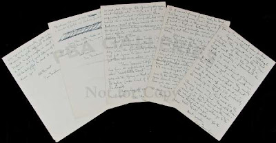
Images courtesy of PBA Galleries, with our thanks.
__________
__________

A Checklist of Goliard Press Jobwork (London 1965-7)

$
0
0

by Alastair Johnston  

Tom Raworth Working Bibliography part III

               porque todo: ropaje, piel, vasijas,
               palabras, vino, panes,
               se fué, cayó a la tierra
                                -- Pablo Neruda, Alturas de Macchu Picchu (1945)

             (for everything: clothes, skin, cups,
                words, wine, bread,
                has disappeared, fallen to earth)

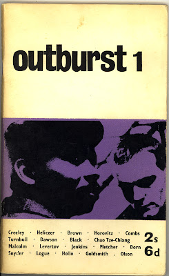
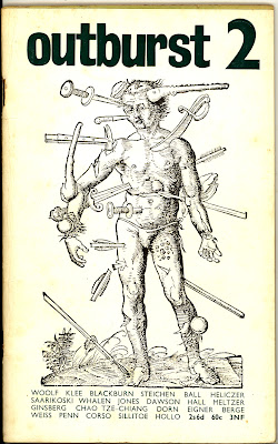
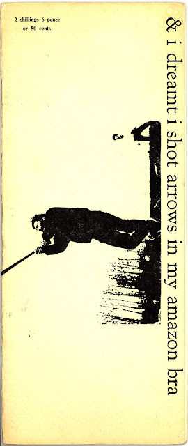
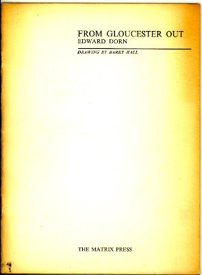
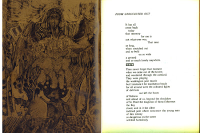
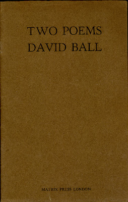
While running Matrix Press, Tom Raworth had done bits of job-printing. His biggest commission was a catalogue with full-colour cover for an exhibition of paintings by Michael Kidner at the Grabowski Gallery. Though Raworth was tired working full time and typesetting and printing at night, Barry Hall interested him in the idea of collaborating in a new press venture. In 1965, they started Goliard Press in a stable behind Finchley Road tube station, leveling the cobbled floor with planks for the equipment to stand on. It was still an evening-and-weekend operation as both were working full-time, but Hall's job as an engraver meant he could put through blocks for their own projects, while Raworth's correspondents from Outburst magazine meant there was no shortage of material to print and publish.

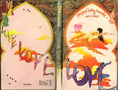
Cover for LOVE LOVE LOVE (Corgi Books, 1967) Artist unknown

The small press scene in London was friendly and fluid with the three main presses, Trigram, Fulcrum and Goliard collaborating frequently. Rathna Ramanathan* characterizes the others thus: "Trigram Press (1965 to 1980) was founded by American poet Asa Benveniste and his English wife Penelope (Pip). Trigram books were notable amongst little presses for the quality of their design and production. A number of Trigram books were printed letterpress or silk-screen by Benveniste and Pip's son Paul Vaughan. Benveniste also designed and printed for other little presses. Louis Zukofsky, Gavin Ewart, and Tom Raworth are some of the poets whose work was published by Trigram Press."

"Fulcrum Press (1965 to 1974) was run by the Rhodesian poet Stuart Montgomery and his wife Deirdre. Fulcrum Press was one of the best known little presses of the period and is recognized for publishing the works of Modernist poets, among them Ezra Pound, Basil Bunting, Allen Ginsberg and Roy Fisher."

The Fulcrum Press of Stuart & Deirdre Montgomery was not a printer however, and had most of their printing done by Villiers Press, which was serviceable though typographically uninspired (like the City Lights books they also printed). Montgomery's interest was in marketing so he wanted his books to conform to the (dull) appearance of other trade books, and he also issued special limited edition signed hardbacks on tinted Glastonbury laid paper to lure the collector market. However, Montgomery frequently had exceptional cover art from Tom Phillips, Barnett Newman, Patrick Caulfield, Ian Dury, Ron Kitaj or Richard Hamilton. He also commissioned work from the other small presses in town. Fulcrum's finest work is Basil Bunting's Loquitur (1965), designed by Richard Hamilton and printed at the Eden & Finsbury Press.

A major difference between Fulcrum and Goliard books is the labour involved. Goliard's books were all hand-set whereas Villiers used Intertype to set the books of Fulcrum, meaning longer works, like Gary Snyder's 164-page Regarding Wave (1972), could be typeset relatively quickly. The three vital small presses were joined by Ferry Press whose books were published by Andrew Crozier. He was a Cambridge student who contacted Val and Tom for information on American poetry. Raworth remembers him as "a dry, intelligent man." He started with Thread by Fielding Dawson in 1964. That year Crozier went to SUNY/ Buffalo on a Fulbright Scholarship and became a student of Olson.

Though they were selling out 2-400 copies of their books, Goliard was kept afloat by commissions from other publishers, most significantly Bernard Stone who ran the crowded Turret Bookshop at number 1, Kensington Church Walk, not far from Biba, the iconic fashion shop. Stone was an influential figure in the English small press scene, serving wine in his bookshop on Saturday afternoons to assembled poets and authors. He published 20 graphically exciting poetry posters with Christopher Logue, started Steam Press with Ralph Steadman, and published the poetry he loved under the Turret Books imprint. As Raworth told me, "Poor old Bernard did use us, and pay on time..."

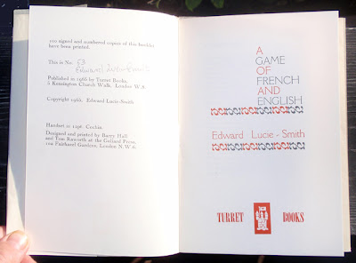
Edward Lucie-Smith, A Game of French and English, Turret Books, 1966

Hall & Raworth probably groaned at the MacBeth and Lucie-Smith manuscripts, but the commissions were important and show them being adventurous with materials. Though they never achieved the typographic acme of Asa Benveniste & Paul Vaughan at Trigram Press, their design for Edward Lucie-Smith's Game of French and English and Robin Fedden's Personal Landscape is excellent, while their handsomest productions for Stone, Zukofsky's Iyyob and Ted Hughes' Burning of the Brothel, mirror their own work at Goliard, so there was continuity with their vision and the jobs they took on.

At the point when Jonathan Cape came on board at Goliard in 1967, Raworth left, but he mentions that many manuscripts had piled up and the later Cape-Goliard publications of Paul Blackburn, Jeremy Prynne, Michael McClure, John Wieners and Charles Olson's Maximus Poems were in process. Raworth says, "We'd already been approached by George Rapp (the aluminium millionaire who later published as Rapp & Carroll) who offered to put money into the press; but we'd knocked him back, thinking that he'd want to publish boring stuff." Raworth recalled the occasion of his briefly famous remark when Rapp came by and asked how he "could help the Press and Poetry". "Give us the money and fuck off" was Raworth's reply. He had the same feeling about Jonathan Cape, that "no one gives money without wanting to influence the product, and I certainly wasn't interested in publishing manuscripts selected by committee."

The committee referred to was Tom Maschler, editor of Jonathan Cape, and one of his authors, Nathaniel Tarn. Born in Paris in 1928, Tarn trained as an anthropologist before turning to literature. His first book Old Savage, Young City was published by Jonathan Cape in 1964, for whom he also translated the widely acclaimed poem of Pablo Neruda, The Heights of Macchu Picchu. In 1967 he joined Cape as an editor and suggested they work with a small press. Among the options, Goliard was chosen and became Cape Goliard bringing more money and work to Barry Hall and a prestigious "loss-leader" to Jonathan Cape who could venture to print works by relative unknowns among their list, adding the New American voices of Olson, Robert Duncan, Zukofsky, their followers, and others. After Raworth left, Hall was joined by Chris Breyer.

While a student at King's College, Cambridge, Tarn had felt British poetry was still stuck on Rupert Brooke. At Cape he was able to bring not only anthropology (Claude Lévi-Strauss) but poetry in translation from Europe and Latin-America to the press, and this was a major service to the poetry-buying public, while at the same time Trigram & Fulcrum were continuing to promote the Transatlantic voices of Duncan, Zukofsky, Snyder, Ed Dorn, Larry Eigner, Lorine Niedecker and others to British readers.

As I said in Part II, Britain was not devoid of good poets: Roy Fisher, Basil Bunting, Philip Larkin and Hugh McDiarmid, among others, were important and influential writers. Penguin Modern Poets was launched in 1962 with the usual suspects but by 1966 they devoted a volume to the Mersey Sound of Adrian Henri, Roger McGough & Brian Patten and another to the Beat trio of Corso, Ferlinghetti & Ginsberg. 1966 was a great year for mass-market poetry in Britain with Penguin continuing its Modern European Poets series with Four Greek Poets (including Cavafy), Noboyuki Yuasa's translation of Basho's Narrow Road to the Deep North, and the landmark Peter Whigham translation of Catullus, dedicated to the memory of William Carlos Williams. The emergent voices in Britain were being heard in live readings organized in Edinburgh, Newcastle, Merseyside and London by Alan Jackson, Tom Pickard, Pete Brown, Mike Horovitz and others. These young voices were proclaimed in a popular paperback book with psychedelic cover art, Love Love Love: The New Love Poetry (edited by Pete Roche, Corgi Books, 1967), published at 5 shillings: the average age of the poets involved was 25. But the Don Allen anthology, The New American Poetry (Grove Press, 1960), gained momentum and created interest in the concurrent voices from the USA. For Cape, Goliard was a solid conduit to the new writing because of the personal connections established by Raworth and Hall over the preceding five years.

Tom Maschler, Cape's editor-in-chief mainly dealt with Barry Hall, but "All of us were initiators and mediators," said Tarn. "I remember having to argue Cape's viewpoint with Barry at times and vice versa: unlike an independent little press, we all had to compromise on occasions. Sometimes Barry & I felt a little hard done by: in cases, for instance, where Cape would decide to take someone like Duncan for the general list rather than the Cape Goliard list. But, by and large, there was a great deal of latitude. Barry, fascinated by design, often performed miracles of book production within (or without!) the official budget. Editorial process was informal: things would come in from Barry's and my contacts and discussion would begin. Commissioning was in Cape's hands.

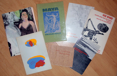
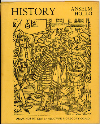
Part of Cape-Goliard's prolific output: The Adventures of Mr & Mrs Jim & Ron by Ron Padgett & Jim Dine (1970), Maya by Anselm Hollo (1970), J.H. Prynne Kitchen Poems (1968), Our Word, Guerilla Poems from Latin America translated by Ed Dorn & Gordon Brotherston (1968), Out Loud by Adrian Mitchell (1968), Wales: A Visitation by Allen Ginsberg (1968), & In the Dark Move Slowly by Tuomas Anhava, translated by Anselm Hollo (1969)

"The intention at Cape-Goliard was to publish avant-garde poets, mainly American, but with quite a few British and foreign, in the spirit of the little press with the full battery of typographic and design innovation which Barry could bring to the work. The products were to be sold as normal books, normally priced, though some de luxe versions were usually produced."

This arrangement continued until one day, fed up with Cape, Hall inked the press, ran the rollers halfway across a forme of type and walked out. (Oddly, as an eccentric badge of his role, Tarn would wear a cape in those days!) Hall did a few books under the Goliard imprint in New Mexico and in 1974 revived Goliard in London to print Ace, by Tom Raworth (but most of the edition was destroyed in a freak flood).

While this post is not about Cape Goliard's books it is important to distinguish Raworth and Hall's role in creating the market for new poetry in England and also in setting in motion the works of McClure, Olson, Ginsberg, Prynne and others that were published by Cape Goliard. Tarn has often spoken as if he was the instigator of these works, rather than the inheritor and benefactor of Raworth's groundwork. But this is nothing new in the small press world. A parallel instance is the frequent assertion of Andrew Hoyem of Arion Press in San Francisco that he came to town determined to bring into print the unknown talents of John Wieners, Michael McClure, Philip Whalen, Philip Lamantia, Lew Welch and the other poets who were published by Auerhahn. The truth is ALL of these works were printed by Dave Haselwood at Auerhahn before Hoyem came to San Francisco and became involved in the press (see, e.g., "The Good Book in Good Hands," by Carl Nolte, San Francisco Chronicle, December 27, 1998, or "Cast Out" by Ken Garcia, where again Hoyem states that he printed the first books of Burroughs and Whalen.)

Raworth says, "Certainly the Olson contact was mine (after all we'd already done West) ... and certainly the Prynne was in the works. The Blackburn too. The McClure came through Barry's SF connections I imagine. And we certainly had personal contacts with Berrigan, Ginsberg and Dine dating from well before the 'deal'. I can't really say that I'm bitter... I couldn't have stood working under those conditions, having to have 'meetings' with arseholes to 'decide'. I thought Tarn's Cape Editions series was excellent, so I had nothing personal against him. I didn't like how, in that Zamir piece,* the implication was that everything started with Cape Goliard, rather than with Goliard. But the important thing is that in London a few people and three or four presses (if one includes Ferry for example), starting from scratch, produced a lot of interesting and generally good-looking books in a very few years and made visible a very different world of poetry."


JOBWORK

Fulcrum Press

1965
Basil Bunting
Briggflatts

12 3/4 x 9 3/4", 30 pp laid paper; Hardback bound in black buckram, green laid paper dustwrapper printed in 72' Caslon with Celtic animal image printed in red.
Note: The poem, finished in May 1965, marked Bunting's triumphal return to poetry after years of obscurity as financial editor for a Newcastle newspaper. The first printing of Briggflatts was done by Hall & Raworth on Trigram's larger Glockner flat-bed cylinder press: so it was a three-way collaboration between the key small presses in London.
Colophon: This first edition is limited to 500 copies of which 100 are specially bound in cloth and 26 specially bound lettered A through Z are signed by the author. The text has been hand set in 14 pt. Caslon Old Face and printed at the Goliard Press London. We thank Barry Hall and Nick Strausfeld for the artwork, Tom Pickard and Gael Turnbull for their help and Poetry (Chicago) for their co-operation. This book has been designed by Stuart Montgomery.

The book has some awful half-uncial hand-lettering (by Strausfeld?) and clip art from Insular manuscripts printed as borders in black and red. The inspiration for these was probably Bunting's
   "punctuate a text whose initial,
     lost in Lindisfarne plaited lines
     stands for discarded love."
There are also Lombardic initials printed in red, with an upside-down C used as a D.

1965 broadside
Basil Bunting
Ode II/2

for Fulcrum Press, made as a Christmas card. Single sheet folded to make six panels.


1967
Ian Hamilton Finlay
Canal Games
Fulcrum Press
9 x 4". Set in 30 pt Placard Condensed caps, printed in multi-colours on 6 heavy cardboard leaves which have been trisected horizontally and spiral bound (in a red plastic comb binding), to form 18 cards which may be turned at random. 8 pp including titlepage and colophon: "This first edition of 1000 copies has been designed & printed by the Goliard Press, London. Fifty copies have been signed by the author & numbered."

Characteristically playful work from the Scots concrete poet and gardener.

Trigram Press

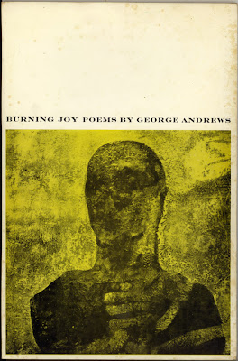
George Andrews, Burning Joy (Trigram Press, 1967)

1966
George Andrews
Burning Joy

9 3/4 x 6 3/8", 40 pp., wove paper, sewn and glued into coated card covers. 550 numbered copies, 1 to 50 signed by the author. Cover painting by Barry Hall, back cover photo by Hans Bruggeman. 15s $2.50 Set in 12' Monotype Centaur. Display in Cochin, cover title in Engravers Roman.
Note: As Benveniste was not a practicing printer when he started Trigram, and his son-in-law Paul was a silkscreen printer with only 6 months experience in letterpress, it's natural they would job out some early titles.

Ferry Press

Steve Jonas
Music Master

Illustrated by Barry Hall
Ferry Press 1966
Three panel folder with Hall's illustration, and Jonas' poem (a fold-out sheet) tipped-in. The edition was limited to 33 copies, each numbered and signed by Jonas and Hall.

Steve Jonas
Transmutations: Poems

Ferry Press 1966
Introduction by John Wieners. Drawing by Basil King.
9 3/4 x 7 1/2" 64 pp (unpaginated) wove paper, sewn and glued into plain pink wrappers, with white chromo dust jacket. Basil King cover image in red; set in 10' Perpetua, cover display in 36' Verona.

1966
Lawrence Clark Powell
Two tributes by Henry Miller
A souvenir of a visit by Lawrence Clark Powell to the College of Librarianship, Wales. 22 November 1966.
100 copies, 3 pp, folded to 10 x 6 1/2" Titlepage in green ink with Hall's rose image printed in red; inside text all printed in red ink. Colophon: "Printed in an edition of 100 by the Goliard Press, London, for The College of Librarianship, Wales.
 Handset in Cochin type, and printed on Glastonbury antique-laid paper.
 Rose drawn by Barry Hall." Right side of fold has two quotes from Henry Miller from Preface to The Air-conditioned Nightmare, 1945, and
 Preface to The Books in my Life, 1951. "No request of any sort, in fact, has he ever turned down." [Info from Kim C Mattheussens] Only institutional copy at UCLA.

Turret Books

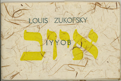
Louis Zukofsky, IYYOB, Turret Books, 1965

1965
Louis Zukofsky
IYYOB

4 x 6", 16 pp. Printed on rag paper, and sewn into wraps, in a printed rice-paper dust jacket in large Hebrew in yellow, and Westminster. Text in Cochin type. The lace paper endpaper has acidified, causing discoloration of the neighbouring sheets.
AJ: I found a copy of IYYOB, is it Hebrew as heard?
TR: Original Word: אּיּוֹב
Transliteration: Iyyob
Phonetic Spelling: (ee-yobe')
Short Definition: Job...
I guess that's it... as in "Get an iyyob!"

1965
Edward Lucie-Smith
Fir Tree Song

11 1/4 x 9 1/2", sides folded into flaps to make doors; shaped poem in green and red Caslon type; 250 copies of which 75 numbered & signed; cover title printed vertically in Westminster type

1965
Edward Lucie-Smith
Three Experiments

11 1/2 x 5 1/2" trifold on tan card stock. Cover art in black and red (repeated inside in white). Text in Caslon & Arrighi italic printed in red, cover in Westminster. 80 copies, numbered & signed.

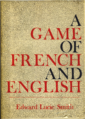
Edward Lucie-Smith, A Game of French and English, Turret Books, 1965

1965
Edward Lucie-Smith
A Game of French and English

8 x 5 5/8" 16 pp., stapled into french-folded wrappers, with a printed tissue dustwrapper, printed in red and blue in 60' Fry's Baskerville type. Text in 12' Cochin, 100 signed & numbered copies.

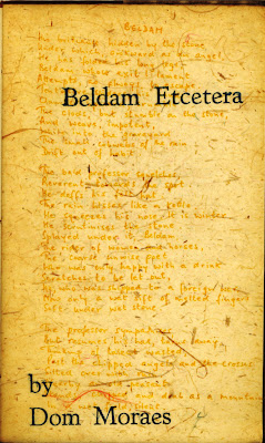
Dom Moraes, Beldam Etcetera, Turret Books, 1966

March 1966
Dom Moraes
Beldam Etcetera

8 7/8 x 5 3/8" 24 pp. of Glastonbury laid sewn into tan card wraps, with a printed duplex dust jacket. 100 signed & numbered copies, Goudy type. Title-page is printed on Japanese paper with a line-block facsimile of the manuscript in yellow and title display in turquoise.

1966
Christopher Logue
In May

broadside, yellow paper (not seen)

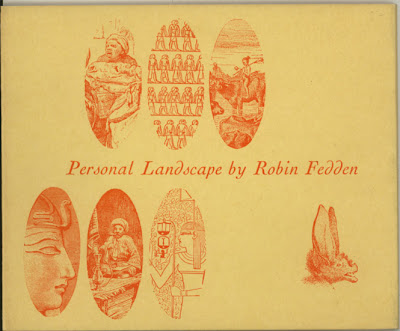
Robin Fedden, Personal Landscape, Turret Books, 1966

June 1966
Robin Fedden
Personal Landscape

5 1/2 x 6 1/2" 22 pages Glastonbury laid paper sewn into plain card wraps, with a printed yellow dust jacket. 1000 copies, of which 50 are cloth-bound (in burgundy cloth, with dust jacket). Prose memoir of Lawrence Durrell with a photograph by John Waller bound in. Goudy Old Face with Cochin italic display.
Ted Hughes, The Burning of the Brothel, Turret Books, 1966

October 1966
Ted Hughes
The Burning of the Brothel

11 1/4 x 9" 16 pp. cream-coloured Glastonbury paper, 12' Caslon type. Title in 48' Perpetua printed on a leaf of Japanese paper with lumps of bark (a sure way to destroy your type!). Illustrated with found medieval woodcuts, printed in colours. Sewn and covered with a printed blue wrapper. 300 copies of which 75 numbered and signed. (Variant: less than ten copies were issued in red wrappers before they were rejected in favour of blue.) Sagar & Tabor A9.
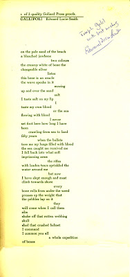
Edward Lucie-Smith, Gallipoli, Turret Books, 1966

December 1966
Edward Lucie-Smith
Gallipoli

13 x 6 1/8" broadside in green Cochin type on Glastonbury paper, in wrapper. 300 copies, of which 100 numbered & signed. Folded in thirds, with printed label on front of wrapper. My copy (shown) designated "1 of 3 quality Goliard Press proofs" and inscribed to (American collector) Joseph Gold from the author. (One of four or more Christmas cards issued by Turret Books.)


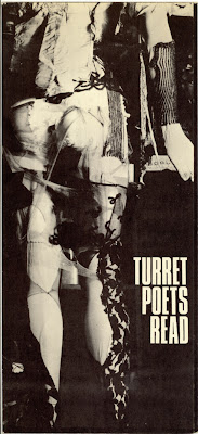
February 1967
Turret Poets Read
11 x 14 3/4" folded in thirds. Offset on cardstock; programme for reading at the ICA (Institute of Contemporary Arts), 17 Dover Street. With contributions from Kevin Crossley-Holland, Christopher Logue, Jeff Nuttall, George MacBeth, Edward Lucie-Smith, and stills from "Juicy Movie," a film by Barry Hall & Tom Raworth. 400 copies issued as invitation/programmes for the event, with 100 more numbered and signed.

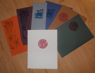
George MacBeth, The Screens, Turret Books, 1967

February 1967
George MacBeth
The Screens

10 x 7 3/4" 200 copies of which 100 numbered and signed. 6 sheets of Canson cover, each a different colour, printed with a poem, then folded to make "doors" in the front with an image printed on the left side. Housed in a sheet of heavy white etching paper, printed, embossed & scored. (Poems inspired by Chinese calligraphy)

Edward Lucie-Smith, Heureux Qui, comme Ulysse, Turret Books, 1966

December 1967
Edward Lucie-Smith
'Heureux Qui, Comme Ulysse...'

8 1/4 x 6" 500 copies, 100 numbered & signed. Three-colour broadside on Glastonbury cream laid paper, tipped into yellow cardstock folder with what appears to be a Flaxman drawing of Greek sculpture on the cover. Caslon type with Cochin italic. Display in 24' Recherché caps in red and green.

***

Note: Anselm Hollo's The Man in the Treetop Hat, published by Turret, was printed by Hall & Breyer in June 1968. Michael McClure's broadside, "Childhood memories are like the smallness of Keats' words..." also appeared in 1968. Other significant Turret publications were Jonathan Williams' The Lucidities, with drawings by John Furnival (Turret, 1967), Henry Miller & Alfred Perles' What are You Going to Do about Alf? (Turret, 1971), Lucie-Smith's A Garland from the Greek (Christmas, 1971), and Beasthood by Bryn Griffiths, with photographs by Pip Benveniste (Turret, 1972), which were all printed at Trigram Press.

Refs: Rathna Ramanathan, "English little presses, book design and production. A Study of five London publishers, 1945-1979," Doctoral dissertation, University of Reading, Dept of Typography & Graphic Communication, October 2006.

Shamoon Zamir: "Bringing the World to Little England: Cape Editions, Cape Goliard and Poetry in the Sixties. An Interview with Nathaniel Tarn. With an afterword by Tom Raworth," in E. S. Shaffer, ed., in "Literary Devolution." Comparative Criticism, vol 19, Cambridge, UK: Cambridge University Press, 1997, pp. 263-286,

[Joe McCann] "Bernard Stone's Books," Maggs Bros Ltd Catalogue 1456, with a foreword by Barry Miles, London, 2012
__________

Tom Raworth Working Bibliography Part II. A Checklist of the Goliard Press (1965-7).

Tom Raworth Working Bibliography Part I: A Checklist Of Matrix Press (London 1961-4). 
__________
__________

A Message To Torres-Garcia: See You At Christie's

$
0
0
by Stephen J. Gertz

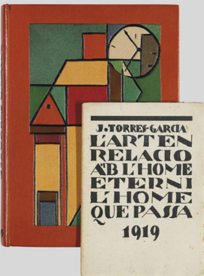
TORRES-GARCIA, Joachim.
L'Art en relació amb l'home etemi l'home que passa.
[Barcelona]: Amics de Sitges and sold by Salvat-Papasseit, 1919.
Twelvemo. Original wrappers (probably after Torres-Garcia).
Case by Cambras w/design after Torres-Garcia.
Inscribed to Joan Salvat-Papasseit.

On November 29, 2012, Christie's-South Kensington is offering a fiesta of books associated with South American Modernism at their Fine Printed Books and Manuscripts sale. 

Amongst books by Neruda, Gabriel Garcia Marquez, and Borges ia a selection of first editions by Joachim Torres-Garcia (1874-1949), the Uruguayan artist, theorist, and writer who introduced abstract art to South American culture after moving to New York City in 1920.

TORRES-GARCIA, Joachim. Raison et nature.
Paris [Montevideo]: Imán, 1932 [but later].
Small folio. 44 ff reproducing Torres-Garcia's MS
and drawings. Case by Cambras.

Born in Uruguay's capitol, Montevideo, Torres-Garcia studied drawing as a seventeen year-old, and when the family moved to Barcelona in 1892 he enrolled in Escuela de Bellas Artes de Barcelona. His earliest work was influenced by French Impressionism and his paintings were exhibited. He soon began to paint frescoes, murals, and design stained glass. He possessed an idealist conception of art and followed the ideology of Catalan nationalism bringing its themes into his work.

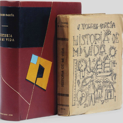
TORRES-GARCIA, Joachim. Historia de mi vida.
Montevideo: Asociación de Arte Constructivo [the author],1939.
Octavo. Illustrations throughout. Original wrappers.
Case by Cambras.

But his first book, Notes sobre Art ("Notes on Art"), published in May 1913, marked the de facto break with the Catalanistas. Slowly and inexorably he moved toward Modernism and abstraction while developing his progressive art theories, and in 1920 moved to Paris and then New York City where he mingled with the expat Parisian and American artists who were turning the art world upside down. He never returned to Barcelona.

TORRES-GARCIA. Joachim.
Nueva escuela de arte del Uruguay.
Montevideo: Asociación de Arte Constructico, 1946.
Quarto.  Reproductin of the author's MS and
photomechanical illustrations throughout.
Original printed card covers w/dust jacket, each
illustrated after Torres-Garcia. Inscribed by the author.

Broke and with a family to support, he returned to Europe, settled in Italy, and turned to toymaking, founding the Aladdin Toy Company. Encouraged to take up his brush once more, he exhibited to favorable reviews, returned to Paris in 1926 and began his association with the Constructivist movement to which he brought the order and logic of geometry and proportion to composition.

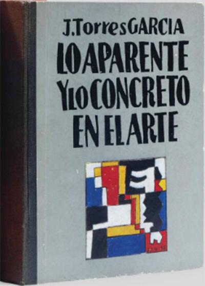
TORRES-GARCIA, Joachim.
Lo aparente y lo concreto en al arte.
Paris: Studio Torres-Garcia, 1948.
Octavo. 32 plates. Original cloth backed illustrated boards.

He left Paris once more in 1932 and migrated to Madrid where he established the Grupo Constructivo. Two years later, he packed his family and moved- this time for good - to his native Montevideo, where he was received as a member of the European artistic elite, and founded the Sociedad de las Artes del Uruguay.

By the late 1930s, Torres-Garcia had begun to integrate Pre-Columbian and indigenous Native American symbolism into his work.

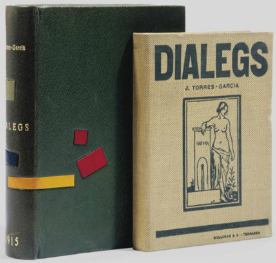
TORRES-GARCIA, Joachim. Diálegs.
Terrassa: Mulleras & Co. [for the author?], 1915.
Octavo. Original cloth. Morocco case by Cambras.

His aesthetic-philosophical artistic theory of Universalismo Constructivo ("Constructive Universalism") was published in 1944 based upon the principles of proportion, unity and structure organized on a mystic theory of order.

TORRES-GARCIA, Joaquin. Notes Sobre Art.
N.p. [Terrassa?]: Printed by Rafel Masó [for the author?], 1913.
Octavo. Title with illustrations after "M.P." Four headpieces after Torres-Garcia.
Original cloth, by Eduard Domench of Barcelona.

Torres-Garcia's influence upon Latin American artists was incalculable. It was he who called upon them to embrace their local roots and bring their heritage to bear in their work through a modern artistic language of which he was a key developer. When discussing Latin American art in the twentieth century all conversation leads back to Torres-Garcia.

With over thirty-five writing credits to his name, Torres-Garcia was as fluent and influential as an author as he was an artist.
__________

All images courtesy  of Christie's, with our thanks.
__________
__________

For Purple Monsters Majesty Above A Nutty Plain

$
0
0
by Stephen J. Gertz

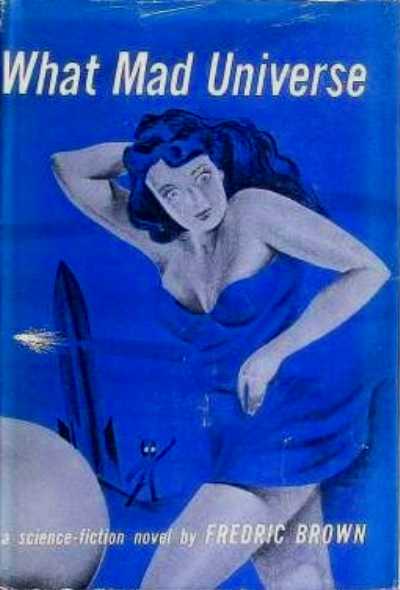
New York: E.P. Dutton, 1949.First separate edition.

 "What mad universe was this that Keith Winton found himself in?
Where purple monsters from the moon roamed the streets with
no one paying any attention to them?"

While strolling in the park one day, in the merry, merry month of May, I was taken by surprise by a pair of purple eyes, purple limbs, purple torso, bad hair day.

Hi, I'm Keith Winton, editor of a pulp science fiction magazine based in a major market - and I ain't  talkin' Trader Joe's. One day (in May), with my trusty co-worker and glamorous girlfriend, Betty, at my side, I visited  my publisher's elegant Borscht Belt estate in the Catskills, just down the road from Grrossinger's, up the street from The Concord, around the corner from The Pines, and next door to The Nevele, which is eleven spelled backwards but don't ask me why. We were in a mad universe of upstate New York Jewish resorts and spritzing, tummling comedians. Rim-shot! Laugh? I thought I'd die.

New York: Bantam Books #835, 1950. Cover by Herman Bischoff.
First edition in paperback.

Unfortunately, on that same day an experimental rocket was launched to the Moon. Simultaneously, Betty was launched back to New York. I was alone, then, in my publisher's' garden, lost in thought, when, suddenly, the Moon rocket (whose launch was a friggin' failure) crashed and exploded on the estate (aka Inanity Acres), careening me into a strange but deceptively similar parallel universe. 

Wild-eyed, as you might imagine (if not, imagine it now), I was astonished to discover that credits had replaced dollars; amazed when I encountered scantily-clad pin-up girls who, it turned out, were distaff astronauts with va-va-voom and oh-la-la lunar dreams; and was stupefied when I encountered a Moon race of seven-foot tall purple beings who insouciantly walked down Broadway in New York City as if they were cast members from a parallel universe production of Rogers and Hammerstein's 1949 sock-o South Pacific and belonged there, enjoying one enchanted evening on The Great White Way. Even a cockeyed optimist would look askance at this parade of purple protoplasm engaged in happy talk. How would Earth wash these purple people right out of its hair?

New York: Bantom Books #1253, 1954. Cover by Charles Binger. Reprint.

What mad 1949 universe was I in where Gen. Dwight D. Eisenhower makes a cameo appearance? Last I heard he was president of Columbia University and the staff and faculty resented his galavanting around the nation to promote a personal agenda that would one day lead to his nomination and election as President of the United States. Now he's in command of the Venus Sector in defense against the Arcturians with whom we are at war? I like Ike but what mad universe indeed!

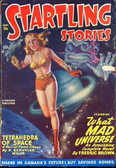
Startling Stories - September 1948 - Vol. 18, No. 1
First appearance in print.

And a comic one, yet. Y'know, when a character like yours truly winds up in a science-fiction novel you figure cosmic funereal not interplanetary farce; dying is easy, comedy is hard. But that's exactly what What Mad Universe is, a social and literary satire of modern American life at mid-century and science-fiction genre conventions.

Call me Pirandello minus five but I feel like one character in search of an author, specifically Fredric Brown (1906-1972), who wrote me into  What Mad Universe. I suppose I should consider myself lucky: Brown was a master of the short-short story, often writing fully-developed tales of only one to three pages in length; my story - my life! - could have been dramatically condensed. In 1955, he published Martians Go Home (They Came, They Saw, They Left!), another screwball sci-fi comedy.

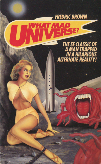
London: Grafton, 1987. Artist unknown.

Brown was also a fine mystery writer, his first full-length novel, The Fabulous Clipjoint (1947), winning an Edgar Award. For years prior he wrote hundreds of stories for the pulp magazines of his era.

What Mad Universe has become a classic, one of the most popular speculative fiction novels ever written. It has been reprinted many times.

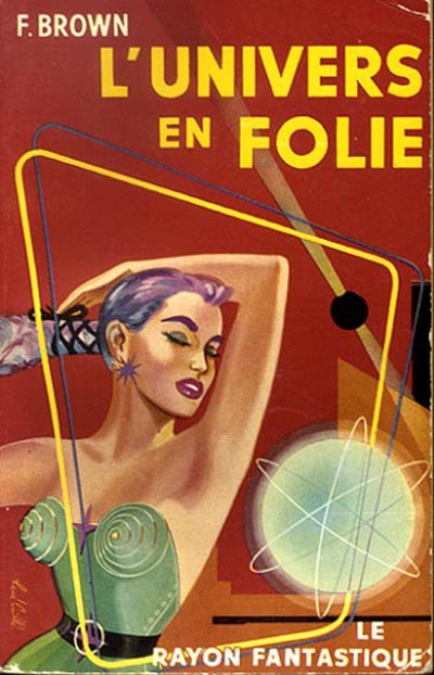
Paris: Le Rayon Fantastique #21 (Hachette/Gallimard), 1953.
First ppk. edition in French. Cover by Rene Caillé.

It was very popular in France, winning immediate critical acclaim upon its release. Many French critics consider it to be one of the major sci-fi novels of all time. But they are equally ga-ga about Jerry Lewis movies, UFOs in the U.S.A. but laff-fests in France. Vive L'Univers en Folie.

What Mad Universe?

Goodbye, I'm Keith Winton, not to be confused with my cousin, Alfred E. Newman, above.

Below, allow me to serenade you with a little bagatelle I recorded in 1959 under an assumed name when the purple people eaters returned to digest and excrete me.


__________

BROWN, Fredric.What Mad Universe. New York: E.P. Dutton, 1949. First separate edition. Octavo. 255, [1] pp. Cloth. Dust jacket.
__________
__________

The Best British Binding of the 1930s

$
0
0
by Stephen J. Gertz


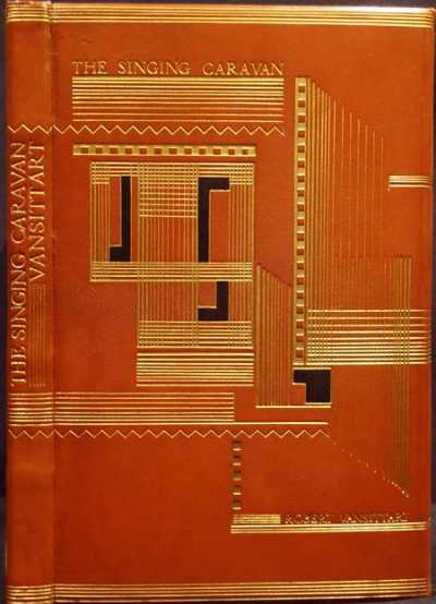
On November 29, 2012, Bloomsbury Auctions is offering a copy of Robert Vansittart's The Singing Caravan, published by The Gregynog Press in 1932. It is one of twenty-five copies specially bound by the Gregynog Bindery, one that has been called, "a brilliant binding, one of the most spectacular produced at the Gregynog Press Bindery and perhaps the best British binding of the 1930s" (Maggs,  Bookbinding in the British Isles Part II, no. 307). It is estimated to sell for £3,000-£4,000 ($4,800 - $6,400).

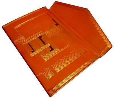
Bound by George Fisher at the Gregynog Press Bindery from an Art Deco-influenced design by William MacCance (signed on the lower turn-in "William MacCance. Gregynog Press Bindery. George Fisher") it is in burnt-orange oasis morocco elaborately tooled with gilt vertical and horizontal fillets of varying thickness, with solid gilt squares and four "L"  shaped onlays of black morocco on each cover. The design on the front incorporates the title and author, and on the lower cover the Press. The upper cover has a fore-edge flap in the manner of an Islamic binding (aka wallet binding) and is tooled to match the covers. It has a smooth spine with gilt lines running over from the covers and lettered up the spine. The top edge is gilt, the others uncut.

MacCance made a charcoal sketch of the design which  Fisher translated into a working drawing as guide.

Lower cover with flap opened.

"George Fisher was born in 1879. His father and grandfather were blacksmiths. He was first employed by a wealthy amateur binder to help with the forwarding and received a sund grounding in this branch of the craft. After two years his employer went to South Africa and Fisher was offered an apprenticeship to Riviere;s. He chose to become a finisher. He tooled thousands of books and also attended Douglas Cockerell's classes. After finishing his time in 1902 he was employed at the small bindery run by Miss Alice Pattinson and her partner Miss Hoffman. In 1907 he married and also set up his own workshop, but this project failed and the next years were spent teaching, with a little binding and working on his small farm in Hampshire.

"It was not until 1924 that, at the sugestion of Douglas Cockerell, he took charge of the Gregynog Press Bindery. John Mason and Sidney Cockerell had also worked there briefly, but it was not until Fisher took over that a limited number (varying between 15 and 43) of each publication were to be specially bound. Except for the sewing these were entirely the work of Fisher. He designed some of them himself but the best designs date from the early 1930s and were the work of William MacCance or Blair Hughes-Stanton. The Press o in 1940 but Fisher stayed on for another four years working on the special bindings. All this time at Gregynog Fisher had travelled the weekends to his farm which was run when he was absent by his wife. When he left the Bindery he retired to the farm and lived there until his death in 1970 but he did no more binding" (Op cit, Maggs).

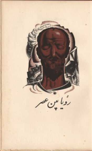
Frontispieceby William MacCance.

Poet, novelist, playwright, screenwriter, song lyricist, and historian Robert Vansittart, 1st Baron Vansittart (1881-1957),  was a senior British diplomat before and during the Second World War. He was Principal Private Secretary to the Prime Minister from 1928 to 1930 and Permanent Under-Secretary at the Foreign Office from 1930 to 1938 and later served as Chief Diplomatic Adviser to the British Government. His poem, The Singing Caravan: A Sufi Tale, was originally published in London by William Heinemann in 1919.

"The Gregynog Press was unique in that everything was created under one roof - design, typography, illustration, printing and binding. Its fine printing owed much to the incomparable skill of Herbert John Hodgson, pressman from 1927 to 1936, and his successor, Idris Jones. It was fortunate also in the employment of one of the great twentieth-century bookbinders, George Fisher, who joined the staff in 1925. Fisher was responsible for inaugurating special bindings in full leather for part of each edition. Though many of these were designed by the Press artists, Fisher undertook the major part of their making himself. They were superbly executed and noted particularly for the quality of their tooling. Among private presses, only Gregynog paid attention to the quality of its bindings which were to enhance the value of the books among collectors" (Dorothy Harrop, History of Gwasg Gregynog and the Gregynog Press).
__________


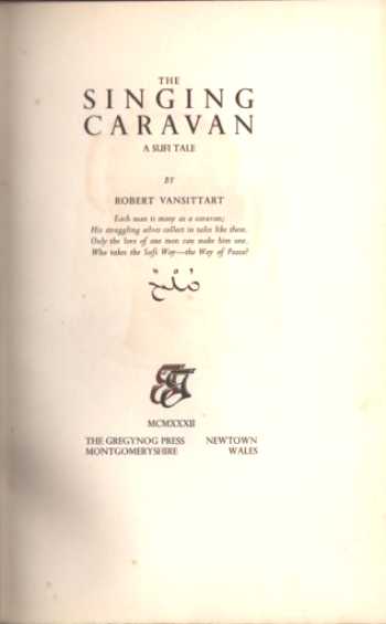
[Gregynog Press]. VANSITTART, [Robert].The Singing Caravan. A Sufi Tale. Quarto (282 x 180 mm). Newtown: The Gregynog Press, 1932.  One of 25 specially bound copies out of a total edition of 250. Quarto (282 x 180 mm). viii, [1] f., 143 pp., plus colophon leaf. Wood-engraved frontispiece, tailpiece, and initials, in brown and black, by William McCance.

Harrop 22.
__________
__________

Ian Hamilton Finlay: Ego in Arcadia

$
0
0
by Alastair Johnston


Ian Hamilton Finlay:Selections, edited with an introduction by Alec Finlay (UC Press, 2012, 312 pp., paperback, $24.95).

Among the most fatal accolades one can achieve is to be called "greatest living" anything. After the death of Francis Bacon (in 1992), Ian Hamilton Finlay (1925–2006) was hailed as Britain's greatest living artist. (After him Lucien Freud got the nod, died 2011, then David Hockney. Why don't they give it to Damien Hirst?)

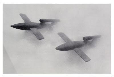
Like many of his predecessors Finlay's road to the title was one of early poverty, dismissal of his work, and a life of struggle leading to late recognition. Born in the Bahamas, Finlay spent a lot of his early life on boats, one of which smuggled rum into Prohibition ports in the USA. But after the family's orchards in Florida failed due to frost he was shipped off to school in Scotland. As a teen on Clydeside Finlay heard German bombers voiding down explosives and incendiary bombs on the dockland and surrounding areas. Cowering under the table he saw the flash of bombs and waited for the explosions. It seems he never recovered from this traumatic experience. Charts were published by the War Office showing the silhouettes of airplanes so you would know friend from foe. In 1941 Rudolf Hess crash-landed his Messerschmitt, bailing out over Scotland, hoping to broker a peace deal, but was locked up as a war criminal. Finlay enlisted in the British Army in 1942 as a non-combatant. Traveling through Holland he was astounded to see rows of German tanks lined up in front of intact neo-Classical buildings. Another deep impression was made.

After the war he became a shepherd on the remote Orkney islands. His early adult life, seemingly pastoral, was actually turbulent: his girlfriends were as much nurse as muse, and he was finally diagnosed as agoraphobic and treated with LSD-25. His illness put severe constraints on him and he was only happy at home. But he had a vast correspondence among the literary avant garde, including Robert Creeley, Lorine Niedecker and Jerry Rothenberg in America, as well as publishers Jonathan Williams (of Jargon Press) and Gael Turnbull of Migrant. He allied himself with Edwin Morgan and younger Scots poets and their magazine Poor. Old. Tired. Horse. was derided in the media as Poor. Young. Trite. Verse.

    When I have talked for an hour I feel lousy –
    Not so when I have danced for an hour:
    The dancers inherit the party
    While the talkers wear themselves out and
    sit in corners alone, and glower.

This new book compacts much of his writing into one volume. His early poems are mostly negligible, but the odd memorable line occurs ("The dancers inherit the party"-- also the title of his first book of poems). Glasgow Beasts is a charming series of childlike verses written in broad Gleskae dialect. (Finlay's early battles with the dole come off like an episode of Rab C Nesbit.)


The Dancers inherit the Party, (true first edition), Ventura, Ca.: Migrant Press, 1960. Mimeographed with cover woodcut by Zeljko Kujundzic.

In 1963, Finlay began to write concrete poems which are best seen in the original context: whether as an artwork or a small press book with clever typography. There is an attempt to illustrate one or two in the present book (in 2D and monochrome) which is not very successful, but the introduction, by Finlay's son Alec, is a resumé of the poet's career and quotes extensively from his correspondence to illuminate his ideas about poetics, morality, and his various struggles.
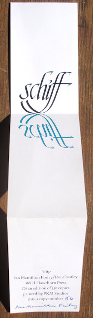
Schiff, Ian Hamilton Finlay, Calligraphy by Ron Costley, printed by PKM Studios (Wild Hawthorn Press)

Finlay first discovered concrete poetry through Eugen Gomringer, then published the Brasilian De Campos brothers in his magazine, and even compiled an anthology of concrete poetry for Rothenberg (which has remained unpublished), including Kandinsky and Klee to show that there was a long tradition of using language abstractly. Finlay was excited by concrete poetry which existed objectively: he was "through with poems which are about, and instead wanted poems which just are" (from a letter to Gael Turnbull). He also began to envision his concrete poems sandblasted on glass, set in a landscape.

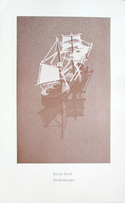
"birch-bark /birch-barque" Ian Hamilton Finlay, photography by Diane Tammes (Wild Hawthorn Press postcard)

By 1967 he had contracted the local gravestone cutter to make an inscribed stone for him. In 1968 he collaborated with Hansjörg Mayer who would publish a series of influential books, most notably the work of Dieter Roth, the icelandic artist. Others (Ferdinand Kriwet in Germany, Robert Lax in the USA) were working on similar paths and in Britain there was Dom Sylvester Houédard who created kinetic outdoor sculptures out of words (Finlay dismissed him as "anti-culture" and "nonsense"). I have to add that my own discovery of Houédard's wonderful work in the 60s made me rethink the possibilities of poetry as art. (A Benedictine monk, Houédard was also the literary editor of the Jerusalem Bible).

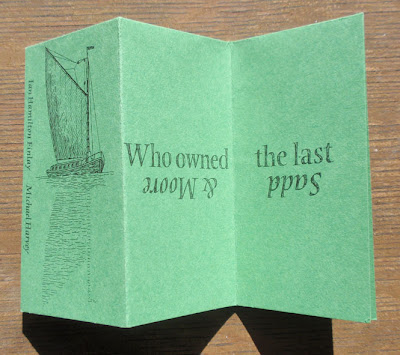
Ian Hamilton Finlay & Michael Harvey, "Who owned the last Norfolk wherry?" (Wild Hawthorn Press, n.d.)

After his second marriage, Finlay's in-laws gave him a small plot of land with a cottage on their estate and that is where he became the great artist, gradually turning the wind-chapped border landscape into Little Sparta, his own one-man nation standing against the might of empire. Other than the allusion to Ancient Greek wars, it should be borne in mind that nearby Edinburgh was called "the New Athens" in the time of Sir Walter Scott. His wife Sue planted the flowers; Ian dreamed up the site-specific texts. Thus his concrete poems were soon literally that, carved in stone or wood. Finlay carried his childhood delight in toy boats and war games into adulthood and it became a central aspect of his art. He built ponds to sail his toy boats and, though far from the ocean, put a sign next to an ash tree "Mare nostrum," as the sound of the wind in the leaves reminded him of the sea. Gradually he took his place among classic British gardeners like Shenstone, and the successive designers of Stowe and Caversham.

Ian Hamilton Finlay/Albrecht Dürer, "The Great Piece of Turf," Photograph by Michael McQueen (Wild Hawthorn Press postcard)

Not content to cultivate his garden, Finlay embarked on the first of his many art-world wars. This was with his publisher Stuart Montgomery of Fulcrum Press. When Fulcrum printed The Dancers Inherit the Party in 1969 they incorrectly described it as the first edition. A five-year long legal battle ensued, which was costly in financial terms to all parties but also caused many fractured friendships & the bankruptcy of the small press. I've seen many an author get hysterical over typographical errors, missed deadlines and other minor matters, but this is absurd! Fortunately Finlay found a longstanding, tolerant and loyal collaborator in Michael Harvey who began calligraphing and carving inscriptions for him in the 1970s. Finlay had over 80 collaborators -- though not in the French sense -- as a list on Wikipedia shows.

This tells us one thing: he was impossible to work with! He had the idea, then the calligrapher, typographer, stone carver, or silk-screener executed it. He liked working with commercial artist more than fine artists, the latter were too snooty and full of their own ideas, whereas commercial artists were good at following instructions.

In the '80s Finlay's interest in German architect Albert Speer deepened and he began to incorporate the double lightning bolt insignia of the SS into his works. Less than a generation after the War he came up with such whimsical ideas as "The Third Reich Revisited." Incredibly, one of his concrete poems is reimagined "enacted by the Reich Labour Corps, on the Terracing at the Zeppelin Field" (the famous Nazi rallying ground in Nuremberg). Shades of "Springtime for Hitler"!

"Cherry Stones" V1s of the Kirschkern project. Models by Ian Hamilton Finlay, photographed by Dave Paterson (Wild Hawthorn Weapons Series postcard)

A friend of mine who is also a keen "art-gardener" went to visit Stonypath and Finlay told her the story of the tax collector. There was a ruined byre on the property and after much thought Finlay decided it would make a great temple to Mercury. There is a Greek myth about Zeus and Hermes (Mercury) coming to the house of a poor, old couple (Baucis and Philemon), being well fed and housed, and on their departure, turning the straw roof of their house into gold & the wooden pillars into marble. So Finlay painted one roof tile gold to indicate the beginning of the transformation and left the rest of the ruin to indicate the poor dwelling. After listening to Finlay's explanation, the tax assessor said, well, I will come back when you've finished it.

Scots people are known for their classical learning, however some of IHF's apothegms are so terse and oblique as to leave the reasonably educated reader guessing. What was Hazlitt's comment on skipping stones? Many of IHF's poems end up as wisecracks or clever one liners, viz:
                   Euclid
                   Il Duce
shows his paronomasia hard at work, but much of Finlay's "Table Talk" (Yes, like some eighteenth century writers he collected his own table talk) is sprawling and unedited and often seems like the slightest of notes:

      Vengeance is an act of good faith.

      Schemes for making a great deal of money usually cost a lot.

But then among the cute or labored one-liners are inspired ideas, some of which became works of art, others merely a jot. "Images from the Arcadian Dream Garden" includes many ideas that may or may not have been realized concretely, such as

Carved on a low, broken column in a clearing the numerals 010 30 265 (the International Dialling Code for Delphoi).

A similar column, but with the dialling code for Rome (OIO XXXIX VI).

A boulder inscribed in one corner with the word moss.

etc.

Austere neo-Classicism is a hallmark of Finlay's garden art. As Jonathan Jones pointed out in an article in the Guardian, a stone at Stonypath is carved with the provocative statement, "The world has been empty since the Romans," attributed to the French revolutionary Louis-Antoine-Léon Saint-Just. Saint-Just is an important touchstone for Finlay as the French revolutionaries looked back to the Roman Republic as an ideal state.

At the end of his career, Finlay's fickle feuding reached the international stage. In 1987 disaster, rather than terror, struck when the French government, perhaps in recognition of the "Auld Alliance" between the Jacobites and the French court, commissioned him to create an artwork for the bicentennial of the Declaration of the Rights of Man. His interest in revolutionary politics made him an ideal candidate, but the French know "collaborateurs" when they see one! Finlay's lifelong obsession with war (particularly German military might of the Second World War, expressed in U-boats and Panzer divisions) and the struggle with Fascism hoist him on his own petals. It came out that he was not only fascinated by Nazi imagery but had corresponded with Albert Speer! The French people were incensed; the British press defended him. But like a true Jacobin, thinking murder was the way to carry forward the revolution, Finlay went on the attack. Yes the Nazis were abominable but they built great edifices, was his response. Another of his garden temples is dedicated to Apollo, "his music, his missiles, and his muses." Since Apollo was the God of War we shouldn't be surprised. But when his taxman refused to give him exemption on the ground it was not a religious building he had another campaign to fight.

At Documenta 8 in Kassel, Germany, Finlay installed four full-size guillotines, called "A View to the Temple," with quotes from Poussin, Diderot, Robespierre & himself on them. Big art always garners big attention. Finlay was finally an artworld commodity and traded in his wellies for Dolce & Gabbana. His temples are mock-historic edifices, but who are we to say that they are not sacred sites? As Michael Charlesworth wrote in his essay "Contemplative and Spiritual Use of the Temple at Little Sparta" (1994), "Sacred and scared are just a typing error apart and so are worship and warship."
__________
__________

Bibliodeath: The Writing's On The Wall And All Over The Place

$
0
0
by Stephen J. Gertz

Cover detail from Dürer's Apocalypse depicting
St. John devouring the Book (1498)
.

Andrei Codrescu's new book, Bibliodeath, published this week by Antibookclub, is an extended essay with footnotes longer (it seems) than the text they amplify, dealing with what its rear wrapper blurb describes as the "techno-evolution...often decried as the death knell of the written word."

Bibliodeath, it turns out, has little to do with the digital revolution and the demise of the printed codex as its title suggests. It is, rather, one writer's  memoir of writing, "a suspenseful meditation planted in a bed of alluring stories-cum-footnotes," as the rear cover blurb continues. But there is nothing suspenseful about this entree on salad. With the digital revolution there is more writing - for better or worse - than ever before. We already know that the written word is safe. Codrescu, a prolific  writer, has written an essay to counter a false proposition. It seems as if he wanted to write a memoir of writing and needed a contextual framework. But the framework is a weak and feels contrived.

The written word is in no danger as long as Codrescu is slinging a pen or banging a keyboard. As long as Codrescu writes the written word is in no danger of extinction as Codrescu demonstrates in this all over the place essay in search of a writer, Codrescu, his roots, development, and evolution as a writer as the world passes from the print to the digital age. Bibliodeath is an autobiographical olio of a writer's life from Romania, to Rome, New York, New Orleans; a writer of the world, his own.

Left with simply a memoir, then, what Andrei Codrescu has done is less than the archiving of himself as he suggests ("My Archives With Life in Footnotes") than indulgence in his absolute love of writing and writing about himself as an ongoing search for identity, which, we learn, he began as a youngster with notebook-journals, whether blank or pre-prose printed with his own writing interspersed throughout.


It's a workout for the reader, who must often endure long passages, either in the footnotes or text, to get to many worthwhile anecdotes of value to the reader - as well as to the guy who wrote them.

It is a writer's gift to be facile and loquacious, as Codrescu clearly is. It is a curse, however, when that gift is allowed to be an end unto itself. Writing for digital media (for that is what this printed book actually is) requires, it seems to me, a higher degree of discipline than writing for print. Shortening attention spans may seem like an onerous development but, in practical terms, they require a writer to be more precise and concise, squeezing every bit of meaning into each word as one can. That process can only make a writer better, and economy of prose does not necessarily mean short length of text. It does, however, require s poet's sensibility to measure each word and imbue them with resonance so that the text does not dry up or, worse, liquify into a flood of loose verbiage.

Codrescu identifies himself as a poet, first and foremost, so it is surprising that he has not brought the discipline of poetry into this work. For a poet, the freedom of prose is liberating but that freedom  can be a prison if you're locked in your own head and not listening to the reader (the editorial id), who simply asks to be captured and retained by an author, the latter being the key because what good is grabbing a reader's attention if they soon grow weary of the text? If a writer doesn't  hear a reader in his head every now and then while writing he/she is lost at sea without benefit of lighthouse. Often, those showing videos of their recent vacation to friends at home  (for that is what a reader is, a guest in the writer's house) are deaf, dumb, and blind to closed eyes and snores simply because they're wrapped-up in their memories.


Much of the problem is due to how the book is structured and formatted. Open to just about any page and you will be confronted with a tableau right out of the Talmud, the Jewish book of law, within which the main text block is framed by notes and commentary longer than the text they elucidate. For a law book the format makes sense. For a narrative story it's deadly, the footnotes breaking it up in into bits with long tangents; it's like listening to my mother on the phone.  I know that the  monologue  is fascinating to her but after five minutes it loses its fascination to me and I tune-out, holding the phone at a distance from my ear, interjecting a "hmmm," "oh," or "really" every now and then to let her know I'm still listening even though I stopped fifteen minutes ago. Moby Dick works not despite its many long digressive passages but because they are skillfully integrated into the narrative and hold our attention and interest. Bibliodeath is only 146 pages in length but it feels much longer.

There is some irony here. Bibliodeath appears to be  a digital document translated into analog, the hyperlinks here as footnotes. Laid out in print, it's a disaster for the reader, who is forced to leap into extended extra-text side-trips and by the time each trek has ended you've forgotten the scenery on the main road and have to re-orient yourself. 

As an essay upon the state of books in the 21st century Bibliodeath is a grand failure. But as a writer's memoir of writing it's a keeper, perhaps best kept in the bathroom where you can  flip-through it and cherry-pick. There are a lot of ripe cherries. Codrescu, at one point, for instance, discusses the "paid-reader," an imaginary occupation that might come to be if current trends in writing reach their logical conclusion, and, rather than being paid to write, the writer pays to be read. (Or pays to have good reviews written about their work).

Unfortunately, I can't afford to pay you to read this; Booktryst pays me nothing and I've earned a lot of it. I trust, however, that I've done my best and you won't go on strike simply because wages are non-existent. I like to think that the benefits aren't bad.

Same with Bibliodeath. Beyond the memoir and its frenzy of footnotes, enjoyable however annoyingly (though attractively) placed, it has benefits in the gold nuggets you have to dig for (Soviet-bloc writers' clubs!) and as a cautionary example of a digital document seemingly adapted to print, perfectly suited to a medium that encourages self-indulgence, and of writers without editors to tell them what they don't want to hear but must. A writer who ignores his reader within will lose the reader without, and without readers a writer is nobody. That is bibliodeath.
__________

CODRESCU, Andrei.Bibliodeath. My Archives With Life In Footnotes. [Austin]: Antibookclub, 2012. Trade paperback. Octavo. 168 pp. Illustrated wrappers. $25.00.
__________
__________

Heartbreaking Marilyn Monroe Letter Estimated At $30,000-$50,000

$
0
0
by Stephen J. Gertz

On December 18, 2012, auction house Profiles in History is offering an extremely poignant, rich and revealing, aching and intriguing two-page letter signed by Marilyn Monroe. Undated but written c.1954-55 and composed in her own hand on Waldorf-Astoria stationary, it provides an intimate peek into the troubled soul of Hollywood's most enduring and legendary sex symbol. This extraordinary letter is estimated to sell  for $30,000-$50,000.

In 1954, Marilyn Monroe fled Hollywood for New York City to study at The Actors Studio, sub-leasing an apartment at the Waldorf-Astoria for the duration. There she was reintroduced to playwright Arthur Miller, whom she'd originally met in 1950, and they began to date. Her neighbor in New York, Brooklyn-born playwright, poet, and novelist Norman Rosten, to whom the letter is addressed, was a friend of Miller's; Rosten and his wife, Hedda, became close to Marilyn after Miller introduced them.


By the mid-1950s Monroe's use of alcohol and prescription drugs began to get out of control in concert with her struggle with chronic depression.

With its many cross-outs, corrections, and sloppy and confused handwriting it is not unreasonable to strongly suspect that Marilyn was intoxicated when she wrote the letter.

It reads in full:

Dear Norman,

It feels a little funny to be writing the name Norman since my own name is Norma and it feels like I’m writing my own name almost, However—

First, thanks for letting Sam[photographer and MM confidant Sam Shaw] and me visit you and Hedda last Saturday. It was nice. I enjoyed meeting your wife – she seemed so warm to me. Thanks the most for your book of poetry—with which I spent all Sunday morning in bed with. It touched me – I use to think if I had ever had a child I would have wanted only a son, but after reading - Songs for Patricia[Simon and Schuster, 1951] – I know I would have loved a little girl just as much but maybe the former feeling was only Freudian for something…anyway Frued [sic]

I use to write poetry sometimes but usually I was very depressed at those times and the few (about two) people said that it depressed them, in fact one cried but it was an old friend I’d known for years. So anyway thanks. And my best to Hedda & Patricia and you— 

Marilyn M.


Monroe's mention in the letter of her desire to bear a child was a tragically unfulfilled dream. After her marriage to Miller in 1956 she suffered a miscarriage and an ectopic pregnancy followed shortly thereafter while she was living in a farmhouse in Amagansett, New York. It was at this time, in 1957, that her abuse of drugs and alcohol accelerated: Rosten received a call one night that year from Monroe’s maid in the middle of the night. When Rosten rushed over, Monroe had overdosed and her stomach was being pumped.

This letter was professionally washed resulting in a slight bleeding of the ink, the inadvertent effect of which dramatically heightens the content. It's as if she used a fountain pen filled with black tears.
__________

Images courtesy of Profiles in History, with our thanks.
__________

Of related interest: Marilyn Monroe: Avid Reader & Book Collector.
__________
__________

Where Childrens Books Were Sold

$
0
0
by Stephen J. Gertz

Premises of John Harris, formerly of John Newbery, 1770 forward.


Tabart & Co, 1800 forward.


From a book published by A.K. Newman in 1829.


Stall at a fair, c. 1878.
__________

All images and captions, including headline, from English Children's Books 1600 to 1900 by Percy Muir (1954).
__________
__________

Extraordinary John Lennon Letter To Eric Clapton: Join My New Band!

$
0
0
by Stephen J. Gertz


A spectacular, significant and revealing eight-page handwritten and signed  letter, undated but c. mid-late 1969, from John Lennon to Eric Clapton inviting him to team up in a new band, is being offered by auctioneer Profiles in History in its Property of a Distinguished American Private Collector sale on December 18, 2012. It is estimated to sell for $20,000 - $30,000.

Over a thousand words, it was written by Lennon on behalf of Yoko and him after the Beatles  split-up and Lennon and Ono were seeking an opportunity to create music of a more profound and artistic nature - and "revolutionary." Clapton had left Cream when it curdled, intent on pursuing a solo career. Lennon and Clapton had originally met in the mid-1960s when Eric was with The Yardbirds and they had remained friends.

Their careers were in a state of flux and John sensed a unique opportunity. "I’ve/we’ve long admired your music—and always kept an eye open to see what you’ve been up to lately. I really feel I/we can bring out the best in you."


The letter reads in full:

Dear Eric and

I’ve been meaning to write or call you for a few weeks now. I think maybe writing will give you and yours more time to think.

You must know by now that Yoko and I rate your music and yourself very highly, always have. You also know the kind of music we’ve been making and hope to make. Anyway, the point is, after missing the Bangla-Desh concert, we began to feel more and more like going on the road, but not the way I used to with the Beatles—night after night of torture. We mean to enjoy ourselves, take it easy, and maybe even see some of the places we go to! We have many ‘revolutionary’ ideas for presenting shows that completely involve the audience—not just as ‘Superstars’ up there—blessing the people—but that’s another letter really.

I’ll get more to the point. We’ve asked Klaus [Voormann], Jim Keltner, Nicky Hopkins — Phil Spector even! to form a ‘nucleus’ group (Plastic Ono Band)—and between us all would decide what—if any—augmentation to the group we’d like—e.g. saxs, vocal group, they all agreed so far—and of course we had YOU!!! in mind as soon as we decided.

In the past when Nicky  was working around (Stones, etc.) bringing your girl/woman/wife was frowned on—with us it’s the opposite, Nicky’s missus—will also come with us—on stage if she wants (Yoko has ideas for her!)—or backstage. Our uppermost concern is to have a happy group in body and mind. Nobody will be asked to do anything that they don’t want to, no-one will be held to any contract of any sort—(unless they wanted to, of course!).

Back to music. I’ve/we’ve long admired your music—and always kept an eye open to see what you’ve been up to lately. I really feel I/we can bring out the best in you—(same kind of security, financial or otherwise will help) but the main thing is the music. I consider Klaus, Jim, Nicky, Phil, Yoko, and you could make the kind of sound that could bring back the Balls in rock ‘n’ roll.

Both of us have been thru the same kind of shit/pain that I know you’ve had—and I know we could help each other in that area—but mainly Eric—I know I can bring out something great—in fact greater in you that had been so far evident in your music, I hope to bring out the same kind of greatness in all of us—which I know will happen if/when we get together. I’m not trying to pressure you in any way and would quite understand if you decide against joining us, we would still love and respect you. We’re not asking you for your ‘name,’ I’m sure you know this—it’s your mind we want!

Yoko and I are not interested in earning bread from public appearances, but neither do we expect the rest of the band (who mostly have families) to work for free—they/you must all be happy money wise as well—otherwise what’s the use for them to join us. We don’t ask you/them to ratify everything we believe politically—but we’re certainly interested in “revolutionizing” the world thru music, we’d love to 'do' Russia, China, Hungary, Poland, etc. 


A friend of ours just got back from Moscow, and the kids over there are really hip—they have all the latest sounds on tape from giant radios they have. 'Don’t come without your guitar' was the message they sent there are millions of people in the East—who needed to be exposed to our kind of freedom/music. We can change the world—and have a ball at the same time.

We don’t want to work under such pressure we feel dead on stage or have to pep ourselves up to live, maybe we could do 2 shows a week even, tentatively (nothing definite) goes like this:

I know we have to rehearse sometimes or other, I’m sick of going on and jamming every live session. I’ve also always wanted to go across the Pacific from the U.S. thru all those beautiful islands—across to Australia, New Zealand, Japan,--wherever, you know—Tahiti—Tonga—etc, so I came up with this.

How about a kind of 'Easy Rider' at sea. I mean we get EMI or some film co., to finance a big ship with 30 people aboard (including crew)—we take 8 track recording equipment with us (mine probably) movie equipment—and we rehearse on the way over—record if we want, play anywhere we fancy— say we film from L.A. to Tahiti, we stop there if we want—maybe have the film developed there—stay a week or as long as we want—collect the film (of course) we’ll probably film wherever we stop (if we want) and edit it on board etc. (Having just finished a movie we made around our albums ‘Imagine’ & ‘Fly’—it’s a beautiful surreal film, very surreal, all music, only about two words spoken in the whole thing! We know we are ready to make a major movie). Anyway it’s just a thought, we’d always stay as near to land as possible, and of course, we’d take doctors etc, in case of any kind of bother. We’d always be able to get to a place where someone could fly off if they’ve had enough. The whole trip could take 3-4-5-6 months, depending how we all felt—all families, children whatever are welcome etc. Please don’t think you have to go alone with the boat trip, to be in the band. I just wanted to let you know everything we’ve been talking about. (I thought we’d really be ready to hit the road after such a healthy restful rehearsal.)

Anyway, there it is, if you want to talk more please call us, or even come over here to N. York. We’re at the St. Regis, here til Nov. 30 at least (753-4500- ext/room 1701) all expenses paid of course! Or write. At least think about it, please don’t be frightened, I understand paranoia, only too well, I think it could only do good for you, to work with people who love and respect you, and that’s from all of us.

Lots of love to you both from, John & Yoko.


Lennon's reference in his greeting to "Eric and" and later to  "you both" and "you and yours" refers to Paula Boyd, 17-year-old sister of Pattie Boyd, George Harrison's wife, with whom Clapton (a friend of Harrison) was involved in a thus far unrequited love affair painful for all concerned. Patty was the someone behind Harrison's Something; Paula subbed for Patty until she learned that the lady behind Clapton's  love-sick plea, Layla, was her sister. That's not the half of it; the entire saga is one of rock's greatest soap operas.

"'Becoming American' won't stop the pain..."

A few years ago I had a marvelous first edition association copy of Arthur Janov's The Primal Scream inscribed in March 1970 - within nine months of the letter under notice - by Lennon to Clapton pass through my hands with similar references, "Eric +" and "you and yours." Paula Boyd was, apparently, She Who Must Remain Nameless. Here, John reached out to his close friend once again to offer support during a time of personal turmoil for Eric. Nine months after the inscription's date Paula got the message and left Clapton..

Clapton played with The Plastic Ono Band in December 1969 during its Live Peace in Toronto performance but did not become a full-time member.

This historic letter from rock n' roll's most progressive voice and towering icon to the greatest guitarist of his generation is a draft. The content of the final version is unknown.
_________

Images courtesy of Profiles in History, with our thanks.
__________
__________

Rare Edition of Lawrence Of Arabia $112,000 - $144,000 At Auction

$
0
0
by Stephen J. Gertz


A scarce "incomplete" Presentation copy of the Subscriber's ("Cranwell") edition of T.E. Lawrence's Seven Pillars of Wisdom, one of only thirty-two of a total edition of 211 copies and inscribed at the time of publication to writer E.M. Forster, is being offered by Sotheby's in their English Literature, History, Children's Books & Illustrations sale on December 12, 2012.

It is estimated to sell for  $112,000 - 144,000 (£70,000 - £90,000). That's $16,000 - $20,571 per pillar.

The book, in which Lawrence wrote of the Arab revolt, 1916-1918, against the Ottoman Empire during World War I and his role in organizing and leading it, set in stone the  legendary adventures of Lawrence of Arabia that emerged from the war's news coverage and stoked the mythos that had grown around one of the most fascinating, complex, and enigmatic characters of his or any other time.

"In 1913 Lawrence wrote a book entitled Seven Pillars of Wisdom. It was designed to cover seven Middle Eastern cities,,,The manuscript was burned in 1914....Lawrence began writing his version of the desert war in 1919...A major portion, if not all, of this first edition was lost at Reading Station in late 1919. A second version was written in London 1919-1920 in a period of three months. Lawrence burned this in 1922...The third manuscript was written in London, Jeddah and Amman, 1921, and in London 1922. This third manuscript, some 330,000 words long, was donated to the Bodleian Library" (O'Brien).

Lawrence had a eight copies printed of that third version in 1922, the first English ("Oxford") edition. He reworked the text 1923-1926, during which time he loaned copies of the 1922 version to various people for critical comment,  E.M. Forster amongst them.

"E.M. Forster was one of the most influential readers of Seven Pillars of Wisdom during the time that Lawrence was cutting down the 1922 ‘Oxford’ text to the abridged version that he issued to subscribers in 1926. Forster offered far more than general praise and admiration. He provided expert criticism of specific writing faults. The two became friends and remained in contact until Lawrence’s death in 1935" (Jeremy Wilson for Castle Hill Press, E.M. Forster and T.E. Lawrence, upon the publication of the Lawrence-Forster letters).

Despite the enormous amount of time, effort, craft and artistry that Lawrence invested in writing this classic his inscription to Forster modestly reads: "Not good enough, but as good, apparently, as I can do."

This, the elaborate "Cranwell" or privately printed Subscriber's (second English) edition - a text of 280,000 words - was published in 1926. Of the total of 211 copies, 170 were complete and 32 were incomplete with three plates lacking, a version "presented to the men who had served with him in Arabia and who were not able to pay the high price asked for the complete issue" (German Reed). the complete issue priced at £31 10s, a princely sum in 1926. The final nine copies were "spoils," i.e. plates only. Each copy was bound differently with various binders employed: for Bumpus (by Riviere); Best; Sangorski and Sutcliffe (as here); Harrison; Charles McLeish; Roger de Coverly & Sons; and Henry T. Wood.

Presentation copy inscribed by the author to E.M. Forster,
“E.M.F.  from T.E.S. ['T.E. Shaw' Lawrence's post-War pseudonym]:
Not good enough, but as good, apparently, as I can do. | I.XII.26"
on preliminary blank together with later inscription from E.M. Forster
to Bob Buckingham, “R.J. Buckingham  from  E.M. Forster 20-1-68”.

No incomplete copies (aside from the nine plates-only "spoil" copies the rarest of the "Cranwell" edition) have come to auction within the last thirty-six years. One of the 170 complete copies sold earlier this year at Bonham's for $65,000 (incl. premium). Only a small handful of copies of the first ("Oxford") English edition of 1922 are in private hands. Should one miraculously find its way to market it will surely fetch upwards of $500,000.

In 1927, Lawrence published Revolt in the Desert, an abridgment of Seven Pillars of Wisdom, in a limited and trade edition that brought his story to a wider audience.
__________

[LAWRENCE, T.E.]Seven Pillars of Wisdom. A Triumph. [Privately Printed, 1926]. Quarto (251 by 188mm.). The subscribers' or "Cranwell" edition, one of 32 “incomplete” copies (from an edition of 211 copies) (annotated “Incomplete copy | I.XII.26 TES” on page XIX), presentation copy inscribed by the author to E.M. Forster (“E.M.F. | from | T.E.S. | Not good enough, but as good, apparently, as I can do. | I.XII.26.”) on preliminary blank together with later inscription from E.M. Forster to Bob Buckingham (“R.J. Buckingham | from | E.M. Forster | 20-1-68”) on preliminary blank, printed in red and black, frontispiece portrait of King Feysal after Augustus John and 62 (of 65) plates (mostly in colour) and other text illustrations after Roberts, Kennington, Nash, Nicholson and others, 4 folding coloured maps, decorative initials by Edward Wadsworth.

Original full tan morocco signed by Sangorski and Sutcliffe, tooled in gilt on covers, spine gilt in compartments, endpapers by Kennington, collector’s tan morocco backed folding box with thirty typed leaves and one handwritten leaf by Forster, occasional light spotting, one of the most complete of the “incomplete copies” but lacking plates ‘Waterfalls’ and ‘Mountains’ (within the plates following the text) and ‘Prophet’s Tomb’ (not listed, but noted by O’Brien).

O'Brien A040.
__________


Images courtesy of Sotheby's, with our thanks.
__________
__________

Common Prayers, Uncommon Binding

$
0
0
by Stephen J. Gertz


This stunning, c. 1853, binding by Hayday of London of an 1840 edition of The Book of Common Prayer is in full brown smooth-grained Turkey morocco over beveled boards, with a single fillet framing an eye-catching panel of onlaid red, green (the quadrants, their color not, alas, fully visible due to lighting), and black morocco with gilt tooling and central cross of gilt-tooled inlaid orange morocco to both sides.


The spine compartments possess deep crimson and orange labels and are decorated in gilt with inlaid red and orange calf crosses. Fine details include extravagantly gilt-tooled dentelles, gilt-tooled edges, and all edges gilt and gauffered.


A cross is not an unusual decorative binding design for finely bound copies of The Book of Common Prayer, yet the design, while based upon earlier  ecclesiastical bindings, is a particularly handsome and contemporary mosaic. It suggests that it was bound for a man of means.


One of the most distinctive and unusual aspects of this binding is the tortoise shell effect to the Turkey morocco most visible along the top edge of the upper board. It's unclear whether the pattern is an attractive blemish in the skin itself or the result of a chemical wash. I've seen countless bindings in calf with various stain-effects (mottled, tree, rainbow, etc.) but I've never seen  morocco  leather quite like this with such a fine grain and unusual varigration.


James Hayday, (1796–1872), "bookbinder, was born in London. Of his parents, nothing is known. He was apprenticed to Charles Marchant, vellum binder, 12 Old Gloucester Street, Queen Square, London, and then for some time worked as a journeyman commencing business in a very humble way. In 1825 he became one of the auditors of the Journeymen Bookbinders' Trade Society. In 1833 he rented premises at 31 Little Queen Street, Lincoln's Inn Fields, where he continued until his retirement in 1861…

Gauffered fore-edge.

"Constant opening of traditionally bound books disfigured the grain of the leather, and to obviate this Hayday introduced the cross or pin-headed grain known as Turkey morocco. In his own binding he sewed the books fully along every sheet, a technique that caused extra thickness that Hayday remedied by sewing with silk, rather than thread. Also, in order to equalize the thickness he rounded the fore edges more than was customary. To make the back tight he dispensed with the ordinary backing of paper, and fastened the leather cover down to the back.

"Works bound by Hayday became famous and increased in monetary value. Edward Gardner of the Oxford Warehouse, 7 Paternoster Row, London, secured Hayday's services for the Oxford University Press. William Pickering, bookseller, of 57 Chancery Lane, also introduced him to many wealthy patrons…A number of his bindings are in the National Art Library, Victoria and Albert Museum, London" (Oxford Online Dictionary of National Biography).

Between 1837-and 1838 the Hayday bindery employed between thirty and forty people including ten finishers. James Hayday's retirement in 1861 had nothing to do with a desire for a life of ease after a life of toil. He went bankrupt. He then partnered with William Mansell until he finally retired in 1869.

Close-up of gauffering, with gilt-tooled edge.

The first manual of worship in English for any religion. The Book of Common Prayer is the key and most important volume of the Church of England, uniting all Churchgoers within a common liturgy in English, and was so prior to the publication of the Church's King James translation of the Bible in 1611. It has been in print without interruption since its introduction in 1549. It was revised in 1552 and mildly amended a hundred years later, in 1662, 350 years ago.

Dentelle.

It is, for the most part, the work and language of Thomas Cranmer (1489-1556), Archbishop of Canterbury 1533-1556 and a leader of the Reformation in England, who based it upon the centuries old Latin liturgy of the English Catholic Church and gracefully simplified the language so that it would be understood by all no matter their degree of literacy. It is, what the Oxford historian and author of A History of Christianity, Diarmaid MacCulloch, has called, “one of a handful of texts to have decided the future of a world language.”

Here bound in a  masterful manner suitable for worship.
__________


[HAYDAY, bindery]. [CHURCH OF ENGLAND].The Book of Common Prayer, And Administration of the Sacraments. And Other Rites and Ceremonies of the Church, According to the Use of the United Church of England and Ireland; Together with the Psalter or Psalms of David, Pointed as They are to be Sung or Said in Churches; and the Form and Manner of Making, Ordaining, and Consecrating of Bishops, Priests, and Deacons. Oxford: Printed at the University Press by Samuel Collingwood and Co., 1840.

Small octavo (5 1/2 x 3 1/4 in; 140 x 80 mm). Unpaginated.
__________

Images courtesy of David Brass Rare Books, with our thanks.
__________
__________

A Checklist of Matrix Press (London 1961-4)

$
0
0
by Alastair Johnston

Tom Raworth Printing Bibliography Part I
 

Two hundred years ago when people were reading Shenstone, Bloomfield, Cowper and Collins (I am sure you know their works by heart), Wordsworth and Coleridge published Lyrical Ballads to great public indifference.

Tom Raworth is known (in literary circles) as the pre-eminent English poet writing today. If you've never heard of him, that is the fate of artists who are ahead of their time. Raworth and his wife Valarie live on the south coast of England. He writes and publishes his work from small presses and sometimes slightly larger presses put out compilations of his writing (Collected Poems, Carcanet Press, 2003). He has also written a prose work, Serial Biography (Fulcrum Press, 1969), and recorded an LP of his reading, Little Trace Remains of Emmett Miller (Stream Records, 1970). Carcanet has also issued CDs of two of his works: Ace (1974) and Writing (1982).

The purpose of this post is to document his early work as a printer and publisher, a little-known aspect of his career, but central to his own interests as an editor and author.

Raworth is of Irish descent (his middle name is Moore and Thomas Moore is one of Ireland's most beloved lyric poets), but he grew up in London and is every bit a Londoner. As a printer too he can claim a pedigree. There was a Ruth Raworth who printed Milton's poems. The widow of John Raworth, she printed and published in Paul's Wharf, in the Parish of St Bennet, London from 1643 until 1655, then remarried Thomas Newcomb. John Raworth and his father Robert Raworth were also printers and members of the Stationers' Company in the early seventeenth century. 


Tom Raworth started Matrix Press in 1961. His first book was a tiny edition of poems by Pete Brown. He then issued three numbers of a magazine called Outburst. One, in collaboration with the Finnish poet Anselm Hollo and the American Gregory Corso was Outburst: The Minicab War, a humorous salvo in the class war. (The British satirical magazine Private Eye was launched in 1961.) Outburst became part of a network of avant-garde writers and aired the trans-Atlantic voices of Creeley, Dorn, Levertov, Fee Dawson, and Olson for the first time in Britain.

In an interview with Andy Spragg, Raworth explained his reason for starting his own press:


TR: I was following threads of people I liked in the Allen anthology [The New American Poetry, edited by Don Allen, Grove Press, 1960] ... Dorn, O'Hara, Creeley, Ginsberg and so on ... hard to do then in London (though Better Books and Zwemmers in Charing Cross Road were occasional sources) and I got used to having to write to the US for books. It crossed my mind that if I liked this stuff there might be a few others who would too. Around then, late 1959 early 1960, my father-in-law gave us a delayed wedding present of £100. I can't remember how I'd got interested in letterpress printing: it might be genetic ... years later I discovered my father had wanted to be a printer, and that an ancestor, Ruth Raworth, had printed one of Milton's early books in the 17th C. Anyway, I got a small Adana press first and then a larger treadle press. Offset printing was slowly taking over and letterpress equipment and type was not too expensive then. By late 1960/early 1961 I was in correspondence with Dorn, Creeley and others in the US and had met Anselm Hollo, Michael Horovitz, Pete Brown and others here. I printed the first small booklet (a couple of tiny poems by Pete Brown) on the Adana. I was working then in the Euston Road, at Burroughs Wellcome, the manufacturing pharmacists, and a photographer friend there, Steve Fletcher, had a brother who was an engraver and shared a workshop just off Oxford Street with a letterpress printer. They let me move the treadle press there so they could use it for small jobs and in return I could have access whenever I wanted. I'd met, and become good friends with, David Ball and Piero Heliczer (also a letterpress printer with his Dead Language in Paris). So I did small books of Dorn, Ball and Heliczer. And two and a half issues of the magazine Outburst. I had to set two pages at a time (only enough type for that) on the floor at night after work, carry it into town the next day, print the pages on the press with whatever colour ink was in use, go home, sort the type back into the case and start again.

BOOKS
1961

The first book of the press was Pete Brown Sample Pack. According to Raworth about 6 copies were printed. The poems were collected in Let Em Roll Kafka, Brown's book from Fulcrum Press (London, 1969). Best-known today as the lyricist for the rock band Cream, Pete Brown was Britain's first performance poet who earned his living giving readings. He was the first reader at the Morden Tower in Newcastle, one of the most important poetry venues in England in the 60s. "When John Lennon was still in art college Pete was turning on Liverpool with his synthesis of Beat poetry, Bop jazz, and British humour."-- Stuart Montgomery


1961
Outburst 1 
"published in the basement of 167 Amhurst Road * London E 8" 2s 6d
8 x 5", 52 pp, plus wrappers, stapled. Handset by Raworth in Gill Sans, Perpetua, Times Bold, Ultra Bodoni. Printed by Richard Moore and Sons. Cover photo (& 2 more inside) by Steve Fletcher.
Contributors include Anselm Hollo, Tram Combs, Robert Creeley, Fielding Dawson, Denise Levertov, Ed Dorn, Christopher Logue, Gary Snyder, Charles Olson, Michael Horovitz, Piero Heliczer, Ian Hamilton Finlay, Pete Brown, Gregory Corso, "Six Poems of Tu Fu" by Chao Tze-Chiang, et al. The advertisements for other little magazines, like Migrant, Yugen and New Departures, show how closely networked the avant-garde was in the 1960s. Gael Turnbull (1928-2004) was a key figure in the literary small press movement. A Scottish doctor he started Migrant Press in 1957 and continued operating it (with a mimeograph machine) after he moved to Ventura, California. He published many of the same poets as Raworth, including Dorn, Hollo and Ian Hamilton Finlay, whose The Dancers Inherit the Party is reviewed in this issue of Outburst. My copy has a blown-in newsprint ad for The Outsider published by Loujon Press in New Orleans.


Gregory Corso, Anselm Hollo, Tom Raworth
THE MINICAB WAR: the gotla world -- interview with minicab driver and cabbie
16 pp., unpaginated. 8.25 x 5".
Wrappers (white or blue wrappers). Staple bound, each page in a different color of ink.
Photo: Steve Fletcher. "This issue was done with the hope that it might give a benevolent lift to the satirists of the Establishment, who want very much to destroy a possibly REAL revolution by making entertainment of it, and England's future darker -- The Minicab War is the Synthesis of Class War."
Cover title: OUTBURST: THE MINICAB WAR | ELIOT BETJEMAN MACMILLAN | BARKER RUSSELL BORMANN | MINICAB DRIVER & CABBIE GOTLA
Signed: de la rue sykes o'moore

Notes: In June 1961 Michael Gotla of Welbeck launched a fleet of 400 minicabs on the streets of London, that carried advertising and undercut the well-established black cabs. Soon things turned nasty with hundreds of bogus phone calls to the minicab companies ordering cabs, black taxis hemming in the smaller vehicles, even vandalism as the situation escalated. In an editorial in August, under the headline “What the Public Wants,” The Times wrote: “It is fairly obvious that for many people in London finding a taxi has become too chancy and paying for it too stiff.” Minicab War contains spurious interviews with T. S. Eliot, John Betjeman, (Prime Minister) Harold MacMillan, George Barker, Bertrand Russell, Martin Bormann, & various cabbies. The perpetrators were Tom Raworth (O'Moore), Gregory Corso (De la Rue) & Anselm Hollo (Sykes). Martin Bormann was Hitler's personal secretary. It was believed he had escaped Germany after the War and fled to South America so he remained alive in British popular culture, resurfacing on the beach in Brazil with Great Train Robber Ronnie Biggs in the Sex Pistols' movie The Great Rock 'n' Roll Swindle (dir: Julian Temple, 1980).

   It's hard to date this undated pamphlet from 60 years ago. A rare book dealer described it as the first work of the press. Raworth thought it was a sort of Outburst 2 and a half, but the current of events suggests the end of 1961 rather than 1963. Also Corso was in London then, as Raworth recalls: "As I remember it, Allen and Gregory were in London on their way from Tangier. I remember that because they asked me if I could get a Minox film developed privately for them, which I did via Steve Fletcher and the Wellcome Foundation photo lab... The film was those naked images of them all in Tangier which Allen thought would cause a scandal if Boots Photos did the job. I have somewhere a clear memory and a photo of Gregory outside our basement flat in Amhurst Road, Hackney....  And we were well out of there by 1965. So it is quite possible the 1961 date is accurate though it certainly was after Outburst 1.  Maybe winter 1961 as Peter Cook's The Establishment club opened in October that year and is referenced in the text.

 "I remember in one of those 10,000 word biographies for Gale Research I did mine by addresses lived at, so there are some parameters there. For Minicab War I remember Anselm Gregory and myself sitting around in Anselm and Josie's flat in Cornwall Gardens, which was also where we made some reel to reel tapes of poems and distorted music. Those are decomposing somewhere in our stored stuff."


1963
Outburst 2 
8 x 5", unpaginated, 48 pp, plus wrappers, stapled. Some pages printed in colored ink.

Contributors include Douglas Woolf "Notes for an Autobituary," Paul Blackburn "Ritual IV," Leroi Jones (2 Poems), Fielding Dawson, Allen Ginsberg "To an Old Poet in Peru," Gregory Corso "Moroccan Writings," Larry Eigner (2 poems), Ruth Weiss (2 poems), Ed Dorn, David Meltzer "Heroes," Alan Sillitoe, Carol Bergé, Piero Heliczer, poems of Klee & Pentti Saarikoski translated by Anselm Hollo, "Irregular Ode" by Philip Whalen, "Four Poems of Tu Fu" by Chao Tze-Chiang et al. Artwork by Barry Hall, and photos by Irving Penn & Edward Steichen. Also contains 4 pp of book reviews and pointed commentary by Anselm Hollo.


1963
Piero Heliczer
& I DREAMT I SHOT ARROWS IN MY AMAZON BRA

Brighton: Dead Language & London: Matrix Press

11 x 4.5", 20 pp. Second edition, stapled illustrated wrappers, cover photo by Ph Mechanicus, Amsterdam. The image is reused from the last page of Outburst 2. 2 shillings 6 pence or 50 cents.

Notes: & I DREAMT I SHOT ARROWS IN MY AMAZON BRA is "a poem in eleven takes". "An earlier edition was dittoed by Anselm Hollo... My earlier inspiration little frogs and clay dams in the sound of leaves theres no need to worry about fulfilling a sign as signs necessarily fulfull themselves just as every thing has a pot dimension ie that emittor sends pot signals to pot man it is not necessary to the manifestation whether the emittor is under the influence".-- Author

  "Piero was living with us; he and I printed in on my treadle press which was off Oxford Street in Richard Moore's print-shop..." --TR

Spread from Piero Heliczer's & I Dreamt I Shot Arrows in my Amazon Bra

   Ambitious design using the gutter as a focal point. Each page has a black bar printed in the gutter which then continues across the fold. Large condensed Gill Sans headers make striking compositions. The text is in Perpetua with Times Bold. One leaf is printed on lavender paper.


1963
Anselm Hollo
History
24 pp., 6 1/4 x 5 1/4"; stapled in card cover, in yellow printed wraps, with images on yellow paper bound in. Set in Linotype Times, printed on Brookleigh Bond wove paper; price 3 shillings. Colophon:
This book has been set in Times Roman type. The two drawings are by Ken Lansdowne. Nelson is by Gregory Corso. A photograph of the cover illustration was supplied by Steve Fletcher.
All blocks were made by Barry Hall. 350 copies were printed.
Designed and printed by Tom Raworth

Note: AJ: History by Anselm seems like the transitional book from matrix to goliard, since barry made the blocks. i guess you met him at this point and decided to collaborate from then on? it looks like a really light impression, or else some of it is offset, and it says typeset and printed by you, so what press were you using?

TR:  It was done on my treadle press, the Adana, smaller than the later Goliard press one, which was stored at the print shop of Richard Moore, three floors up off Oxford Street where the deal was that he could use it for small jobs (his main press was a large Heidelberg). That came about because one of the other two craftsmen in the shop, the engraver (there was also a diestamper and process engraver) was the brother of my friend Steve Fletcher a photographer, who took the photo on the front of the second issue of Outburst.

   I must, if it says plates by Barry Hall, have known Barry and he did them at his work to save me money. If it doesn't specifically say that, then they were made commercially via Richard Moore. There were very few copies of History stapled and Anselm never includes it (I think) in bibliographies. Somewhere I have a box of pages and covers.


March 1964
Edward Dorn
From Gloucester Out
drawing by Barry Hall
12 pp., 8 3/4 x 6 1/2"

Colophon:
This book is set in Times Roman. There are 350 copies
Designed and printed by Tom Raworth, Flat 3, Stanley House, Finchley Rd, London NW11 20.3.64

Spread from Ed Dorn's From Gloucester Out, with illustration by Barry Hall

Green wove paper, stapled in white wrappers, with Hall's image in black and gold on coated stock, printed over a brown tint. Asymmetric design with large margins and running heads set off to the left of the text block.

Notes: Dorn visited England to teach at the University of Essex. He and Raworth became lifelong friends and collaborated later at Zephyrus Image, when both were living in San Francisco in the mid to late 70s.


August 1964
David Ball
Two Poems
9 x 5 3/4", 8 pp.
Drawing by Gene Mahon
Blue paper, stapled into brown wrappers
This book is set in Baskerville and Times Roman (cover title in Verona). Matrix Press, 3 Stanley Hse., Finchley Rd., N.W. 11.
__________

Scarce Emily Dickinson Letter Comes To Auction

$
0
0
by Stephen J. Gertz


A rare three-page autograph letter by Emily Dickinson, written in pencil and signed  “Emily," is being offered by Profiles In History in its Property of a Distinguished American Private Collector sale December 18, 2012. 

It is estimated to sell for $20,000 - $30,000.

Written in Amherst during Autumn 1884 to Mrs. Samuel E. Mack, the reclusive American poetess expresses her pleasure in Mrs. Mack's recent visit and quotes from Last Lines, a poem by Emily Brontë.


Dickinson writes in full:

It was very dear to see Mrs. Mack. A friend is a solemnity and after the great intrusion of Death, each one that remains has a special pricelessness besides the mortal worth --- I hope you may live while we live, and then with loving selfishness consent that you should go ---

Said the Marvellous Emily Bronte

Though Earth and Man were gone And suns and Universe ceased to be And thou wert left alone,
Every Existence would Exist in thee--

Tenderly, Emily

Letters by Dickinson are extremely rare. This missive - oddly addressing her correspondent  in the first sentence in the third person  -  was published in the Letters of Emily Dickinson  edited by T.H. Johnson, no. 940, (Cambridge: Harvard University Press, 1958), noting that Dickinson quoted the same poem of Emily Bronte in a letter to another friend, Maria Whitney.

The letter was last seen at Christie’s New York, 15 December 1995, lot 16, when, along with related material, it sold for $16,000.
__________

Images courtesy of Profiles In History, woth our thanks.
__________
__________

The Princess and the Paparazzo: A Compelling and Important New Anthology On Ethical Photography

$
0
0
by Alastair Johnston


Daniel Girardin and Christian Pirker CONTROVERSIES; A Legal and Ethical History of Photography, Actes Sud/Musée de l'Elysée (Lausanne 2012, 312 pp., hardback, ISBN: 978-2-7427-9700-4 : 45 Euro)

Photography has always been controversial. First it was not considered an art, then its uses were questioned, and as it became a dominant part of our culture, battles were fought over aspects of its ethics and legality in a variety of contexts. (Most recently, on 4 December 2012 the New York Post published a front-page photo of a man on the tracks about to be hit by a subway train that raises ethical questions.) This book, the catalogue of a show at the Musée de l'Elysée in Lausanne, reproduces and discusses many of the photographs exhibited. Consequently it provides the opportunity for a more thorough understanding of the show than might have been experienced and absorbed in a museum walk-through. Girardin is the exhibition's curator and his co-author Pirker is a Swiss lawyer who specializes in business and art law, and also collects photographs.

The book then is a discussion of how our taste and legal freedoms applied to photography have evolved since 1839. Images of naked children and dead people are two of the major battlegrounds in this history. Some photos were published for decades and then suddenly became illegal to view, while others were secret for a long time until they finally came to light. The adolescents of David Hamilton were celebrated in popular paperbacks like Dreams of a Young Girl (Collins, 1971) but today there would be outrage if they appeared in a magazine. Two photographers snuck into the bedroom of Bismarck in 1898, hours after his death, propped up his head on the pillows and took a photo which they then tried to sell to the papers. The family heard about it and acted swiftly: the negatives were confiscated and the photographers jailed (They had been offered the equivalent of $300,000 in today's money). But a copy survived and the image finally appeared in 1952 in a Frankfurter newspaper.

Remember this macabre joke? When Princess Diana died in August 1997, someone asked, Did you hear Diana was on the radio?

   Really?

   Yes, and all over the dashboard.

We know this because the crazed paparazzi in pursuit rushed into the tunnel to photograph the dying occupants of her limousine. When the photographers were charged with homicide, involuntary injury and failure to assist a person in danger, the very newspapers who were willing to shell out millions of dollars for their invasive photos of celebrities turned against them. But then a decade after they were acquitted, a photo of Diana dying appeared in the Italian press. This public lust never ends. Just this year there was the famous case of the paparazzo up a tree who snapped the topless Duchess of Cambridge for a French magazine. I didn't see the picture but assume her breasts look like others I have seen, and ironically the royal couple were next recorded in the South Pacific where they were greeted by topless natives at the airport!


Since its inception, manipulation of photography has been used to sway us. It's now common to doctor images in Photoshop, to remove unwanted parts, to extend pictures, to graft on parts of other images. Two of the most famous images of the roll-film era were staged: Robert Capa's "Death of a Republican Soldier," 1936, and Robert Doisneau's "Kissing Couple at City Hall," 1950, which respectively convey the horror of war and the power of love. I felt cheated when I discovered that Bill Brandt had staged the images in his "A Night in London" series (1938). He so wanted to be as good as Brassaï or Cartier-Bresson that he couldn't wait for the "decisive moment," so set it up. Doisneau, too, hired actors to pose for his picture, though the Capa mystery has never been fully explained.

Quite often there's no controversy until someone stirs things up. In 2007 the Blue Noses collective staged an exhibit in Paris, including a photo of two Russian police officers kissing, called "The Era of Mercy, 2005." The Russian Minister of Culture moved to ban the image as a "disgrace to Russia." The Gallery sued for defamation and the image went viral.


A bizarre recent turn of events in photo censorship involves smoking. Under French law certain photos of Jean-Paul Sartre and Serge Gainsbourg can only be published after retouching to remove their cigarettes. Sartre sans Gauloises, c'est incroyable!!Serge mis en nue? Sacre bleu d'Iliac! This is Stalinism! -- and yes the book does include a shot of Stalin accompanied by Molotov, Yezhov and others plus the same photo with the unfortunate Yezhov removed. (Yezhov was put in charge of the purges of the late 30s but when he was replaced by Beria he himself was tortured and executed. Moral: Never build a better Guillotine.)

Other doctored photos include the "Raising of the Red Flag on the Reichstag, 2 May 1945." After the famous (re-enacted) photo by Joe Rosenthal of American GIs raising the stars and stripes on Iwo Jima (since replicated by firemen at the site of the World Trade Center attack), the Russians thought it would be a good publicity move to stage a photo of their flag going up over Berlin. Yevgeny Khaldei, a press photographer, was flown to Berlin with a large homemade flag to get the shot. He photographed it in several locations, most notably over the Reichstag. But back in Moscow a small problem arose: the officer holding the flag clearly had watches on both wrists, an undeniable sign of looting. The photo was retouched before Tass published it.

There are plenty of shocking images in this book, from Nazi concentration camps to an American one (Abu Ghraib). The horrors of Bergen-Belsen were photographed by the British Army in April 1945, before the end of the war, but they believed that if the photos were published it might lead the Germans to try to cover up their atrocities or speed up mass-murder to cover their crimes. Also, the book asks, can you really depict the unspeakable in a photo and how does that alter our perception of it? As a macabre sidelight there is a shot of Lee Miller in Hitler's bathtub. (I wonder if this was hung next to Gary Gross' image of Brooke Shields in the bath?)

Walter Benjamin wrote that "a photograph is technically reproducible indefinitely," so why should an excellent posthumous print from a photographer's original negative be considered a fake? Obviously there is the fetish value of the vintage print at stake here: a Diane Arbus photo printed by her sells for hundreds of thousands (her "Viva at Home" sold at Sotheby's for $194,500 in December 2011) while for a (relative) pittance you can get a reprint (Arbus's iconic "Child with a toy hand grenade in Central Park, N.Y.C.," a Neil Selkirk print, sold at Phillips de Pury, New York on October 2, 2012 for $74,500.). The same goes for many other artists like August Sander or Edward Weston. You can get a good deal on a Lee Friedlander print of an E.J. Bellocq glass plate whereas a Berenice Abbot print of an Atget plate will cost you twice as much.

In the case of Man Ray a collector spent a fortune ($2.3 million) on vintage prints that had impeccable provenance but turned out to be later prints. Not only did the collector get his money back but the prints were destroyed. However this calls into question the authenticity of dozens of similar excellent Man Ray prints now in museums. And there was a case in the US where Walter Rosenblum (who had control of the Hine archive) was printing Lewis Hine photos on old paper and adding the Hine studio stamp to the back to make them appear vintage. The slump in the value of Hine's exemplary work makes an interesting footnote to this story.

One segment I found informative concerned the work of Lehnert and Landrock. Before the First World War the Bohemian Lehnert practiced photography in Tunisia, documenting Arab life. He and Landrock lived in Cairo in the late twenties, and pursued a vision of Orientalism with Pictorialist postcards which they manufactured and sold through their firm, Orient Kunst Verlag in Leipzig. As you may know Islam forbids representation of religious figures. So how curious it is to see a 1998 Iranian poster claiming to be a portrait of the young Mohammed the Prophet of Islam. The image, it says, "is from the brush of a Christian monk, the original being currently conserved in a museum in Rum." I don't know who drank the rum, or the Scriptural Kool-Aid here, but it is based on a Rudolf Lehnert photo. One supposes the Iranians inserted the Christian monk to get around the proscription.


The saddest image in here (for me) is Frank Fournier's portrait of Omayra Sanchez, taken in Armero, Columbia, in 1985. A volcano erupted: there was a mudslide that killed 24,000 people. Young Omayra was trapped in a collapsed building. There was no crane to lift the heavy metal beams that had trapped her and crushed her legs. Frank Fournier took the photo of her as the world's media filmed her impossible plight and watched her die. His portrait won the World Press Photo prize in 1986. The catalogue notes, "For some, the mediatisation [sic] of Omayra's death was obscene. It illustrates the mercantile spiral in which information is trapped today, the escalation to which it is obliged, between sensationalism and voyeurism." Fournier made the ethical decision to take the picture in the hopes he could raise awareness about the lack of preparedness and denounce the shortcomings of some governments in dealing with disasters which have often been predicted. But the book argues "the commercial aestheticization of suffering and misery" (a charge leveled against Sebastião Salgado) is merely a rephrasing of the artist's attempt to create an aesthetic in their work, to reach the public, which can be seen going back to Dorothea Lange, who was booted out of the FSA for staging her photos of the misery of migrant farmworkers. It posits that true documentary photography has to reject any sense of aesthetics or style in order to be neutral.

The images involved in many famous legal cases are included here: Andres Serrano's "Piss Christ"; Art Rogers' "Puppies" (appropriated by Jeff Koons); the screaming naked Vietnamese girl, photographed by Nick Ut in 1972, her skin scorched by Napalm, can never be forgotten. A news photo of the execution of Kurdish rebels in 1979 won the Pulitzer Prize for journalism, anonymously. The photographer who had been assigned to cover the execution was afraid to come forward. Once the image was spread around the world the Ayatollahs tried to pin it on someone and arrested and shot a soldier who had been present. Two other photographers who lived outside Iran claimed authorship before the true author, Jahangir Razmi, came forward in 2007 to claim his 1980 Pulitzer Prize.


Copyright laws are discussed with (among others) two famous images: Alberto Korda's 1960 portrait of Che Guevara that today is as much an icon as the Shroud of Turin (Secundo Pia's 1898 photo of the latter is also present); and Richard Avedon's "Dovima with Elephants," 1955, which was the subject of a lawsuit in 1991. An individual sold the photo at Sotheby's for almost 20,000 pounds, saying he had received it from a former editor at Harper's Bazaar. Avedon claimed that though he had given the print to Harper's it was understood that they would have the rights to print the image once, and the copyright and the print would remain his property, even if they did not return it. Harper's lawyer claimed that the submission of the photo implied a transfer of ownership and the court agreed with them. (According to Stephen Perloff, editor of The Photograph Collector, Avedon's "Dovima with Elephants" brought $56,250 -- slightly under low estimate -- at Phillips de Pury, New York on October 2, 2012. But "Dovima with Elephants, Evening dress by Dior, Cirque d'Hiver, Paris, August 1955" went to an absentee U.S. dealer for $266,500, at Christie's the same week. Size matters: the second print was jumbo size, we presume.)


What's missing from this collection? There are at least three photos that never made it to the exhibit: First, "Candy Cigarette" by Sally Mann. This is a sweet image of the photographer's 7-year-old daughter holding a sugar cigarette and standing like a sophisticated adult (or maybe it's just her natural poise given that her mother was always taking her picture). The image appears in Immediate Family but caused such a stir and, with the howls of child abuse from the religious right over Mann's nude photos of her children, left such painful memories that Mann no longer wishes to exhibit or discuss this and similar works.

Then there is "The Wedding of the Diors" by Richard Avedon. For a Christian Dior ad campaign Avedon staged a mock celebrity wedding that included a Jackie Onassis lookalike in the shot. Onassis won an injunction against the company for invasion of her privacy by using a lookalike, so the photo cannot be shown, even though it is not Onassis in the picture. As Piker says, "The winner's point of view in court is not necessarily the right one, but his arguments were more convincing."

Also we learn about the case of Thomas Condon of Cincinnati. He had access to a morgue and staged photos of corpses with a snail, an apple and a key. But unlike Joel-Peter Witkin (who also used body parts in his photography), Condon was found guilty of disturbing the dead and sentenced to 18 months in prison and his photographs can never be shown. (A web search confirms this.)

These missing images therefore define the frontiers of what this book is about. The control of imagery has become a power issue in our society. Two big companies, Corbis and Getty, sell reproduction rights to the millions of photos they control. Often a photo that is in the public domain fetches higher prices for reproduction than a recent image because the extant prints are owned by museums or these photo agencies. And "whoever controls images controls minds," said Bill Gates, owner of Corbis.

Other images missing from the show include the work of David Hamilton who refused to participate. But this book called Controversies has created its own controversy. The Swiss edition of the book also showed Gary Gross's notorious bath-tub photo of Brooke Shields as a child from his booklet Little Women. (The image was made even more controversial after another appropriation artist, Richard Prince, mounted it in its own room at the Tate Gallery in London. Scotland Yard got involved and the picture was prohibited from further public view.)

Also missing from the English-language edition is a nude photo of Maud Hewes by Graham Ovenden, which was legally published in New York in 1992, and included in the exhibition. Their exclusion from the American market edition of the catalogue reinforces the fact that though they have been published, these images can still cause a stir for any number of reasons. The Right Wing Nutjobs in the USA love to get outraged over Guess Jeans ads, and we have to ask, Why are they so upset? If obscenity is in the eye of the beholder, they might be better off gouging out their eyes rather than impose their vision on everyone else.

The book is typeset in a pallid condensed sans serif typeface which is unappealing and hard to read, and there is no index. I give the design a B minus, but this is a compelling and important anthology.

(Note: Current print values mentioned are taken from Alex Novak's e-photo newsletter, published by i Photo Central.)
__________
__________

Paul McCartney's Handwritten Lyrics To "Lovely Rita" Offered At $175,000

$
0
0
by Stephen J. Gertz


Paul McCartney's handwritten, working manuscript for the song Lovely Rita, from the Beatles' preeminent and triumphant album, Sgt. Pepper's Lonely Heart's Club Band (1967), has come into the marketplace. The first rough draft, ten lines in ink on a sheet of lined paper from a steno pad, it is being offered by Biblioctopus of Beverly Hills for $175,000.

Within, McCartney rewrites the line,  "writing all the numbers in her little black book," to read,  "filling in a ticket with her little blue pen." In the final version as recorded the line reads, "filling in a ticket in her little white book." At the top is a note, "chorus."

Accompanying the manuscript is an unncorrected first state proof of the Sgt. Pepper album cover, varying from the released version with McCartney kneeling, the band instruments placed differently, and with two people amongst the cast of onlookers who refused to sign releases and were dropped from the final, published album cover.

Authentic Beatles manuscript material from Sgt. Pepper hold the records for rock n' roll memorabilia at auction. In 1994, a manuscript draft of Getting Better sold at Butterfield's for $249,200. In 2010, the manuscript lyrics to A Day in the Life sold at Sotheby's for $1,202,500.

At $175,000 Lovely Rita seems a lovely bargain.

This piece was last seen at Butterfield's on December 12, 1993.
__________

Of Related Interest:

Extraordinary John Lennon Letter To Eric Clapton: Join My New Band!.

Yoko Ono Collects Rare Books: The Booktryst Interview.
__________
__________
Viewing all 472 articles
Browse latest View live


Latest Images