Quantcast
Viewing all 472 articles
Browse latest View live

Louis Icart: Leda And The Swann Auction

by Stephen J. Gertz


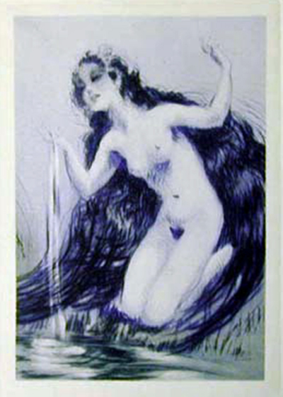
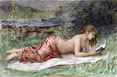
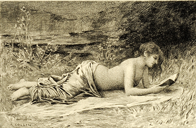
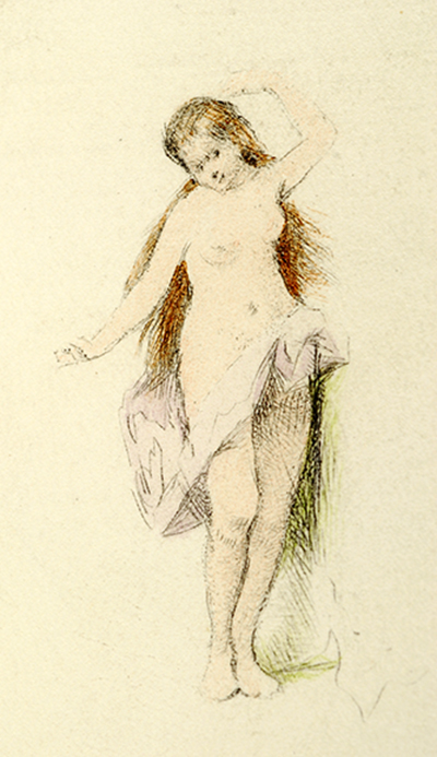
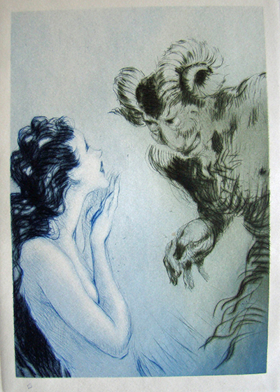
Swann Auction Galleries is offering a copy of the Louis Icart-illustrated edition of Leda, Pierre Loüys adaptation of the classic tale from Greek mythology, Leda and the Swan, in their 19th & 20th Century Prints and Drawings sale this Thursday, March 7, 2013. One of 125 copies on vélin crème out of a total edition of 147 with sixteen drypoint etchings by Icart, it is estimated to sell for $2,500 - $3,500.


Leda and the Swan is the Greek myth in which the god Zeus, in the form of a swan, seduces, or rapes, Leda, daughter of the Aetolian king, Thestius. In later Greek mythology, Leda bore Zeus's children, Helen and Polydeuces, while at the same time bearing Castor and Clytemnestra, children of her husband Tyndareus, the King of Sparta.

William Butler Yeats adapted the myth in a powerful 1924 sonnet.

A sudden blow: the great wings beating still
Above the staggering girl, her thighs caressed
By the dark webs, her nape caught in his bill,
He holds her helpless breast upon his breast.

How can those terrified vague fingers push
The feathered glory from her loosening thighs?
And how can body, laid in that white rush,
But feel the strange heart beating where it lies?

A shudder in the loins engenders there
The broken wall, the burning roof and tower
And Agamemnon dead.
          Being so caught up,
So mastered by the brute blood of the air,
Did she put on his knowledge with his power
Before the indifferent beak could let her drop?


In many versions of the story Zeus takes the form of a swan and rapes or seducs Leda on the same night she slept with her husband, King Tyndareus. In other versions, she lays two eggs from which the children hatch. In further versions, Helen is a daughter of Nemesis, the goddess who personified the disaster that awaited those suffering from the pride of Hubris.

The Middle Ages knew the myth of Leda through the literature of Ovid and Fulgentius. The artists of the Italian Renaissance were attracted to its classical theme and implicit eroticism, which Loüys made gracefully, gently explicit, the hallmark of his erotic works.


The first edition of Loüys' prose adaptation was published in an octavo by Librairie de l'art indépendant, Paris, 1893. A second, in quarto, was issued Paris: Édition du Mercure de France, 1898 with designs in color by Paul-Albert Laurens (1870-1934). Another edition was published in Paris, 1920, by Librairie Borel with illustrations by  Antoine Calbet (1860-1944). In 1920, a privately printed English translation by American poet and classical scholar Mitchell S. Buck was published in New York in a collection titled, Byblis, Leda, and a New Adventure, limited to 925 copies.

Louis Justin Laurent Icart (1888-1950) was born in Toulouse, France.  In 1907, at age nineteen, he moved to Paris and began to study painting, drawing, and etching. Icart is best known for his delightful etchings that captured the free spirit of life in Paris during the opening decades of the twentieth century and became a leading exponent of Art Deco design. By the late 1920s he was working for major fashion and design studios and had become artistically and financially successful. Though his style reflected the élan of Deco, it owed much to his studies of earlier artists such as Jean Antoine Watteau, Jean Honoré Fragonard and François Boucher. He also drew inspiration from the Impressionists as well as the Symbolist artists Odilon Redon and Gustave Moreau.


The limitation to Icart's Leda by Loüys is as follows:

• One copy on japon containing all of the original drawings and sketches, signed, one original copperplate, No.1

• Four copies on japon with a set of the first state and a set of the second state with remarques plus one copper plate, nos. II - V.

• Eleven copies on japon containing a set of the 2nd state with remarques plus one copper plate, nos.
VI - XVI.

• Three copies on velin blance with a set of the 2nd state with remarques, nos. 17 - 19.

• Three copies on velin teinte with a set of the 2nd state with remarques, nos. 20 - 23.

• 125 copies on velin crème, nos. 23 - 147.


This is a scarce edition in any example of its limitation. There appears to be only one copy in institutional holdings worldwide, at the Bibliothéque Nationale de France. According to ABPC, only one copy has previously come to auction within the last thirty-six years, the singular example, copy No.1 on japon containing all of the original drawings and sketches, signed, with one original copperplate. It sold at Sotheby's, May 22, 1997, lot 20 for $5,216.
__________


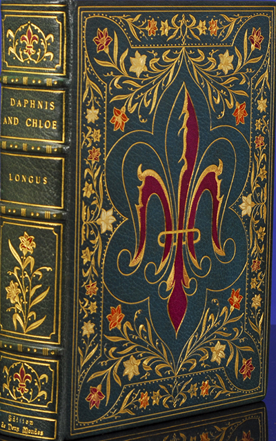
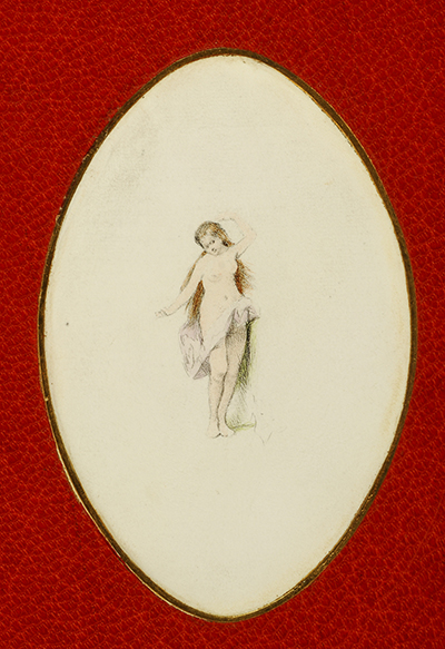
[ICART, Louis, illustrator. LOÜYS, Pierre.Lêda ou la Louange des bienheureuses ténèbres, de Pierre Louÿs. Conte imagé de seize gravures à la pointe-sèche par Louis Icart. Paris: L. Icart (impr. de P. Renouard), [February] 1940. First edition thus, one of 125 numbered copies on vélin crème, from a total edition of 147. this being copy no. 102 . Quarto (11 1/2 x 8 in.; 290 x 205 mm, sheets). 24 pp. Sixteen drypoints printed in blue, five full-page. Full margins, loose as issued.

Original printed paper wrappers and marbled paste board portfolio and slip case.
___________

Images courtesy of Swann Auction Galleries, with our thanks.
___________
___________Image may be NSFW.
Clik here to view.

Meet Paul Parrot, Rare Bird Casanova & Star Of Rare Book

by Albert

Today's guest blogger is, once more,Albert the Writing Parrot, a thirty-four year old Yellow-Naped Amazon, Booktryt's mascot, my ward since fledged, and, pathetically, my most successful long-term relationship. He knows more about these books than I do. If his writing voice sounds similar to mine do not be surprised. He is, after all, a parrot  - SJG.

Image may be NSFW.
Clik here to view.
Title-page.

Me again, pressed into service with the promise of a filbert thrown my way. I'm a conditioned fool.

Image may be NSFW.
Clik here to view.
Tittums Deserting Fido.
As the go-to bird on parrot books I'm often asked, What's the best volume on Mr. Paul Parrot, the notoriously horny hook-bill, fine-feathered lothario, and wandering roué with wings?

Step into my cage, sit at my zygodactyl feet, lend me an ear (I need a nosh), and I shall tell you, strictly entre-nous, a scandalous tale exceeded only, perhaps, by that of Aly Khan, the "fabulously wealthy, hard riding, fast driving, restless man of the world with a liking for parties and beautiful women" (NY Times, Feb. 7, 1958) for whom hi-fidelity was strictly for sound recordings; faithfulness to wives and lovers cramped his style.

There was Hon. Joan Guinness, Pamela Churchill Harriman, Rita Hayworth, Gene Tierney, countless other high-profile lovers, as well as the UCLA Pep Squad, the Pan American Airlines stewardess brigade, and a cast of gorgeous thousands from various Hollywood epics, take your pick. He needed a spreadsheet to keep track of the sheet spreads on his schedule.

Image may be NSFW.
Clik here to view.
Tittums Walking Out With The Parrot.

What's the book? In 1858, The Faithless Parrot by Charles H. Bennett was published by George Routledge and Co. of London as part of their New Toy Books series. The great, innovative color printer Edmund Evans engraved and printed the book's seven woodcuts based upon Bennett's designs.

It's the (one and only) cautionary tale of Paul Parrot, who, having seduced Tittums, a cat, from the arms of her lover, Fido, a dog (it's a modern relationship), and then two-timing her with the widow Mrs. Daw, a comely jackdaw,  gets his comeuppance when Tittums catches him in the act and he gets plucked within an inch of his life. 

Image may be NSFW.
Clik here to view.
The Parrot Courting The Jackdaw.

"Nothing is more noble, nothing more venerable than fidelity. Faithfulness and truth are the most sacred excellences and endowments of the parrot mind" (Marcus Tullius Psittacine Cicero). It's a lesson Paul Parrot missed at Eton.

He's a votary of Oscar Wilde: "Faithfulness is to the emotional life what consistency is to the life of the intellect - simply a confession of failures” (The Picture of Dorian Gray).


To which I can only reply, Double, double, toil and trouble: Bill Shakes knew what he was talking about - I date more than one bird at a time and I'm a nervous wreck;  I'm faithful secondary to woeful and that's fine with me. I once woke up with two scarlet macaws and an African Gray next to me in a sleazy nest. They must have slipped me a Rophie - I have no idea how I got there and, worse, have no memory of what was probably an ecstatic night but all l took away from it was feather-burn and a hangover. So much for bird of paradise wanna-be's.

It never ceases to amaze me how some kitties will fall for any suave hookbill with a silver-tongue, to wit:

Image may be NSFW.
Clik here to view.
The Parrot Exposed.

"One morning, when Tittums came in from a visit she had been paying her mamma, she was followed by a gentleman from the tropics, who, with all the impudence of his race, made himself quite at home, pressed Tittums’ paw to his heart, called her 'the loveliest of Cats,' asked her to oblige him with a song, which he had been told she could sing very sweetly, and never took the least notice of poor Fido, who was sitting in the corner. To tell the truth, poor Fido was very cross, and began to growl quite savagely; the more so when, to his dismay, he beheld the pleasure with which Tittums heard all this nonsense. He could not think what right the bold stranger had to come there unasked; for all that he had bright red and green feathers, a rakish, broad-brimmed hat, and a gold-headed walking-cane, he was not good-looking, that was very certain.

"But Tittums was very much struck by his appearance and bearing; his feathers were so pretty, he spoke so many languages, shrieked so terribly and in such a loud voice, had travelled so much, and was so struck by the beauty of Tittums, that, poor little Cat as she was, she ceased to care a button for faithful Fido, and kept all her sly glances for Mr. Paul Parrot.

“'Lovely Tittums,' said Mr. Paul, 'you must forget such upstart puppies as Fido. Listen to me—I am a traveller—I speak five languages,—I have a palace made of golden bars, within which is a perch fit for a king,—I have a pension of bread and milk and Barcelona nuts: all of which I will share with you. Tomorrow we will go for a trip into the field next to the house. Good-bye for the present, my dear Pussy Cat;' and he went away kissing his hand."

Pussycats, this is the bird your mother warned you about. Never trust a mister who kisses his own hand.

Image may be NSFW.
Clik here to view.
The Parrot Getting a Good Picking.

Because this is a typical mid-nineteenth century children's book it's a didactic moral tale that must conclude with Mr. Paul Parrot paying the wages of sin.

"As soon as Mrs. Daw was left alone with Paul, she began to upbraid him with his falseness. 'You vulgar, stuck-up, ugly, awkward deceiver! You have neither honesty enough to live by, nor wings enough to fly with.' Whereupon she jumped at him and gave him such a plucking as spoilt his good looks.

"Never after this was the Parrot able to hold up his head. Every one scorned him; even his golden palace turned out to be a brass cage; and for his misdeeds a chain was fastened round his leg. He was confined to a wooden perch, which, out of pure spite, he was always pecking."

No compulsive horn-dog parrot pecker one-liners. Sorry to disappoint. What am I, Henny Youngbird?

There was a parrot-babe knocking on my hotel room door all night! Finally, I let her out.
 
I know a parrot who's frank and earnest with pussycats. In Fresno, he's Frank and in Chicago he's Ernest.

Take my mate - please!

Rimshot.

I give The Faithless Parrot 5-Seeds, my highest rating. It's a true rarity; according to OCLC there are less than a dozen copies in institutional holdings worldwide. The Cotson Children's Library at Princeton only has it as reprinted within Routledge's 1865 compilation, The Comical Story Book With Comical Illustrations: Printed In Colours. It was separately reprinted by Routledge in 1870.

I'll have that filbert now.
__________

BENNETT, Charles H. The Faithless Parrot. Designed and Narrated by… London: G. Routledge and Co., n.d. [1858]. First edition. Quarto. 15, [1] pp. Seven full-page woodcuts engraved and printed in color by Edmund Evans.

__________

Images courtesy of The Gutenberg Project, with our thanks.
__________ 
Image may be NSFW.
Clik here to view.

Don't Wipe Your Nose With This Map

by Stephen J. Gertz


Evelyn Mulwray: It's a handkerchief!
[slap]
Jake Gertz: I said I want the truth!
Evelyn Mulwray: It's a map…
[slap]
Evelyn Mulwray: It's a handkerchief…
[slap]
Evelyn Mulwray: A handkerchief, a map.
[More slaps]
Jake Gertz: I said I want the truth!
Evelyn Mulwray: It's a handkerchief AND a map!

The Travelling Handkerchief  has come to town, Fairburn's Map of the Country Twelve Miles Round London by E. Bourne, printed on calico, 590 x 540 mm, in 1831, a scarce, early handkerchief map.

The map is circular, and reaches Teddington in the south west, clockside to Norwood, Harrow on the Hill, Chipping Barnet, Dagenham, Purley and Kingsston, wherever they are. I'm in Los Angeles, clockside to Westwood, harrowing on Barrington, Pico and Sepulveda; what do I know? This cartographical Kleenex™ is decorated by vignette views of Chelsea and Greenwich Hospitals in the bottom corners, and a banner heralding the title is held aloft in an eagle's beak.

Image may be NSFW.
Clik here to view.
Washington D.C. based on
Samuel Hill's engraving of Andrew Ellicott's plan.
Printed in Boston, c. 1792.

Handkerchief maps date back to the late 18th century. Examples featuring the plan for Washington D.C. werre sold as "'an authentic plan of the Metropolis of the United States,' advertised as an accurate guide for the prospective purchaser of lots but also as 'a very handsome ornament for the parlor or counting room" (Luria, Capital Speculations: Writing and Building Washington, p. 14). These handkerchief maps are believed to have been printed in Boston in 1792 in connection with "the sale of lots in the new 'Federal Town'" (Works Progress Administration, Washington: City and Capital, p. xiv).

Image may be NSFW.
Clik here to view.
Map of the Baltic theatre of the Crimean War
Paris, Dopter, c.1855.
Engraved map, printed on silk. 650 x 610mm.

Map of the Baltic Sea during
the Crimean War, when the British and French
sent their fleets to blockade St Petersburg.
It is decorated with vignettes of St Petersberg,
Kronstadt, naval scenes and French and British coat-of-arms.

During the 19th century, the British Army's Quartermaster-General Department in India issued handkerchief maps of Delhi and Attock for use by their troops, and they were published as souvenirs during the Crimean War.

Image may be NSFW.
Clik here to view.
The Absent-Minded Beggar.
London, the Daily Mail Publishing Co. Ltd, c.1899.
Linen handkerchief printed in blue, 460 x 470mm.
Printed handkerchief published by the Daily Mail
to rise funds for the "Soldiers' Families Fund"
after the outbreak of the Second Boer War (1899-1902).

Guildhall Library in London has an example of The Travelling Handkerchief in its collection and of another handkerchief map scarcity, An Illustrated Map of London, published in 1850.

Image may be NSFW.
Clik here to view.
Anonymous.
London and its Environs for 1832.
Engraving on cotton. 915 x 890mm.

Handkerchief maps were issued to U.S. Air Force servicemen during WWII as escape maps if shot down over enemy territory. On acetate rayon, linen, or silk, they were lightweight, waterproof, hard to tear and tough to disintegrate; they were able to take a beating yet still fulfill their purpose. The British also issued handkerchief maps to their air force crews and ground troops in all theaters of operation.

The Helen Louise Allen Textile Collection at University of Wisconsin has sixteen mid-20th century handkerchief maps of U.S. states, Canada, the 1939 World's Fair, etc. in its collection.

Surviving Eighteenth and nineteenth century handkerchief maps in collectible condition are quite rare.

Jake Gertz: My nose is bleeding, gimme your handkerchief.
Walsh: Forget it, Jake, I'm lookin' for Chinatown. It's on here somewhere.
__________

BOURNE, E.The Travelling Handkerchief. Fairburn's Map of the Country Twelve Miles Round London. London: John Fairburn, 1831. Engraved map printed on calico. 590 x 540mm.

Howgego 216 (3).
__________

The Travelling Handkerchief and other British handkerchief map images courtesy of Altea Gallery, with our thanks.

Image of Washington D.C. handkerchief map courtesy of George Washington University GW Magazine, with our thanks.
__________
__________Image may be NSFW.
Clik here to view.

If Classic Rock Albums Were Books

by Stephen J. Gertz

Image may be NSFW.
Clik here to view.
"Fast-paced 1958 thriller: a jilted train driver hijacks
his New York subway train to exact revenge upon his love
rival, only to threaten the life of his ex-lover.
The last 30 pages are missing. Don’t know if she survives."

Last year, Christophe Gowans, a British graphic designer who has worked as art director at Blitz, Hybrid, Esquire, Modern Painters, The Sunday Telegraph Magazine, and Stella, created The Record Books, a series of faux volumes based upon great, best-selling record albums. Booktryst is pleased to present a sampler. The blurbs are his own.

Image may be NSFW.
Clik here to view.
"Thorough and clear children’s reference book concerning
all things equine. Sadly, many of the illustrations
within have been disfigured with juvenile amendments
and additions, in biro.
"

Image may be NSFW.
Clik here to view.
"Gruesome schlock from the prolific Jackson. In this
relentless stalkerfest, private eye Dwight Blackman
takes on the ‘Shamone’ Killer for the 3rd time.
Will the psycho slip through the dick’s fingers yet again?
Yes.
"

Image may be NSFW.
Clik here to view.
"When a form of acid rain, caused by a comet plowing
into Uranus, appears to stunt the growth of every
living thing on Earth, mankind’s very existence is
on a knife edge. When a group of pygmies realize
that the peach is the only plant unaffected, they
found a new society, with the peach stone as its currency."

Image may be NSFW.
Clik here to view.
"Charismatic Harvard whizkid Hendrix’s self-help bible.
A spin-off from his phenomenally successful TV reality show,
’The Experience.’"

Image may be NSFW.
Clik here to view.
"A rags to glory autobiography by Bruce Reginald Grayson
Springsteen. The story of his rise from squalor to victory
in the 1932 Los Angeles Olympics is…
well, it’s a pretty dull book."

Image may be NSFW.
Clik here to view.
"War comic. Part of a very long series, an epic really,
recounting the journey of three boys from early
conscription to their various fates. Heroic, tragic,
moving. This one is covered in puerile sexual additions
in blue biro, though.
"
__________

All images courtesy of Christopher Gowans, with our thanks.

Images are available as prints and postcards here.
__________
__________Image may be NSFW.
Clik here to view.

The Benny Hill (Or Soupy Sales) of 19th C. British Caricaturists

by Stephen J. Gertz

Image may be NSFW.
Clik here to view.
A Cutlass. (Cut-Lass).

In 1828, a tasty if somewhat groan-inducing gallimaufry of visual wordplay, corniness, and puns in aquatint caricature, Joe Lisle's Play Upon Words, was published by Thomas McLean, the renowned publisher of satirical prints. Very little is known about it. At its time of issue it may have been very popular; word-play, particularly punning, has a long tradition within English folk culture. Though often considered low humor it was a pleasure, innocent or guilty,  across social class. Fun with language is global; even Inuits enjoy its wit.

Image may be NSFW.
Clik here to view.
Taking a Galloway. (Girl away).
Image may be NSFW.
Clik here to view.
A Grenadier. (Granny-dear).

Little is known about Joseph Lisle (fl. 1828-1835), who, based upon a small collection of individual caricatures found in the British Museum, was a satirical designer and lithographer who specialized in visual wordplay and social satire. In addition to Thomas McLean, his work was published by George Hunt, Berthoud & Son, S. Gans, S.W. Fores, Frederick William Collard, Z.T. Purday, S. Maunders, Paine & Hopkins, and Gabriel Shire Tregear. He received notice in Figaro In London (1834, Vols 3-4, p. 139), the forerunner of Punch, for "a clever caricature" regarding the national debt.


In 1828, the same year that he published his Play Upon Words, Joe Lisle created an aquatint for a series, British Classics. The Spectator, published by Berthoud & Son and captioned Very Fond of Prints & a Drawing Master. Within, "A man in quasi-fashionable dress with spurred top-boots and knee-breeches gapes oafishly at a print-shop window, while a little boy, respectably dressed, takes a purse from his breeches-pocket, having already twitched a handkerchief from the coat-tail pocket which hangs inside out" (M. Dorothy George, Catalogue of Political and Personal Satires in the British Museum).


Unlike the aquatints in Play Upon Words, he signed it at lower left ("J. Lisle"). Very Fond of Prints and a Drawing Master shamelessly promotes Joe Lisle's Play Upon Words by featuring it in a double-spread in the center display window at far left.


 The "Drawing Master" of the caption is likely  self-referential. Circa 1830, he drew, etched and  stipple-engraved, and published A Designing Character, with what may be the only image of Lisle we have, a poverty-stricken starving artist.

M. Dorothy George, in the British Museum's Catalogue of British Political And Personal Satires (no. 16413), describes it as "seemingly a self-portrait, a youngish artist in a garret lit by a skylight. He sits in a massive arm-chair under a low slanting roof (right), leaning his head on his right hand, palette and brushes in the left hand. He is neatly dressed and looks with fixed but amiable melancholy through spectacles at the spectator. Easel and canvas are on the left. At his feet is an open portfolio; a tea-pot and bottle are on a rickety stool and on the floor is a frying-pan filled with small coals (sign of great poverty cf. BM Satires No. 14993). A bust on a bracket under the roof is the sole decoration."

Image may be NSFW.
Clik here to view.
A Pioneer. (A pie-on-here).

Here, then, is a collection by a journeyman satirical caricaturist who, if not a peer of his contemporaries Cruikshank, Seymour, Heath, Alken, and Woodward, left a notable mark, however small, in the field.

As to why so little is known and so little produced by Lisle, one can only speculate that he, clearly no stranger to melancholy, was, as so many journeyman artists and writers of his time, perhaps a little too familiar with the play upon livers by ardent spirits.

Image may be NSFW.
Clik here to view.
Misadvised. (Miss-advised).

Whatever the reason for his obscurity he fell through the cracks and Joe Lisle's  Play Upon Words escaped the notice of caricature and color-plate book bibliographers; it is an orphan not found in Abbey, Prideaux, or Tooley. Perhaps it wasn't popular, few copies were printed and fewer survived. Perhaps Lisle's humor was too obvious, the Benny Hill of British caricature, less clever than broad, relying on easy gags rather than sharp social observation, low-brow music hall comedy rather than sly wit. When you have to explain the puns in wink-wink nudge-nudge, Get it?  parenthetical asides you're in trouble.

Americans who were weaned on a certain classic children's show of the '50s through early 1960s will recognize Lisle as a forerunner to comedian Milton Supman (1926-2009), who, performing on U.S. television as Soupy Sales, captured the goofy, simple pleasures of sophomoric humor.

Image may be NSFW.
Clik here to view.
Muggy Weather

I know why there's a beer keg standing by
Muggy weather
Just can't get my poorself together
Without a pint or three.
(Apologies to Harold Arlen and Ted Koehler).

Joe Lisle's Play Upon Words is now an extremely rare volume: ABPC notes only one copy at auction since 1970 and OCLC/KVK record only four copies in institutional holdings worldwide.
__________


[LISLE, Joseph].Joe Lisle's Play Upon Words. London: Thomas McLean, 1828. Small oblong quarto (6 1/2 x 10 in; 166 x 253 mm). Forty hand-colored aquatint plates, watermarked 1825, with interleaves.

The Plates:
1.    An Action off Spit-Head
2.    Muggy Weather
3.    A Cutlass. (Cut-Lass)
4.    A Chaste Character. (Chased)
5.    An Ad-mired Character
6.    Lath
7.    Plaister
8.    A Coal Meter. (A Coal meet-Her)
9.    A Rain Bow. (Beau)
10.  An Officious Character. (O-Fish's)
11.  A Jewel. (A Jew-Ill.)
12.  A Sub-Lime Character
13.  A Stage Manager
14.  A Stable Character
15.  My Hog & I. (Mahogany)
16.  Elegant Extracts
17.  A very amusing Company. (Ham-using)
18.  Sootable (Suitable) Characters
19.  A Charger
20.  A Sophist-Ical Argument
21.  Taking a Galloway. (Girl Away)
22.  A Diving Belle
23.  The Dread-Nought taking A Smack
24.  Moore's (Blackamoors.) Loves of the Angels
25.  A Grenadier. (Granny-dear)
26.  A Pioneer. (A Pie-on-here)
27.  Misadvised. (Miss-advised)
28.  A Dutch Place. (Plaice)
29.  May we meet more numerous & never less respectable
30.  Metaphysics. (Met-he-Physics?)
31.  Coming off with a claw (éclat)
32.  A Common Sewer. (Sower)
33.  Empailed. (Him pailed)
34.  Mutual Civility
35.  An Armless (Harmless) Character
36.  Canon Law. (Cannon)
37.  (History) His-story
38.  The Infant in Arms
39.  A Man Milling her. (Milliner)
40.  Mistaken. (Miss-taken)
__________

Images from Joe Lisle's Play Upon Words courtesy of David Brass Rare Books, with our thanks.

Images of Very Fond of Prints and a Drawing Master and A Designing Master courtesy of the British Museum, with our thanks.
__________
__________
Image may be NSFW.
Clik here to view.

Elegant Style And Fashion In 19th C. Spain

by Stephen J. Gertz


Published weekly from 1842 through the turn of the 20th century, La Moda Elegante Ilustrada, Periodico de las Familias (Illustrated Elegant Style, A Family Magazine) was nineteenth century Spain's leading fashion magazine.


The plates within La Moda Elegante Ilustrada depict the latest fashions from Paris including seaside attire, day dresses, fashions for a day in the country, ball gowns, as well as children's clothing.


It was Spain's Vogue and Harper's Bazaar, the go-to magazine for Spain's upper class women.


This, the annual for 1882, features thirty-two hand-colored steel-engraved plates printed by A. Godchaux, and Guilquin, of Paris with designs after Adele-Anais Toudouze; F. Bonnard; A. Chaillot; Jules David; and P. Lacouriere.


Notable is that in more than a few of the plates women are reading or holding a book, reflecting, as current fashion magazines do, current trends and customs in culture, in Spain and, by extension, those of Europe's upper class, all following the French example. Books were a fashion accessory and reading a fashionable activity for ladies who wished to be au courant. Reading, in short, was cool.


Annuals of La Moda Elegante Ilustrada are extremely scarce, with only one institutional copy of the 1882 volume worldwide, at University of Granada, according to OCLC/KVK. Princeton and three libraries in Spain appear to have multiple volumes from the series but it is unclear whether 1882 is amongst them.  Only two volumes in the series have come to auction since ABPC began indexing results in 1923, for 1893 and 1902. No copies of this, the 1882 volume, have been seen at auction within the last ninety years.
___________


[FASHION].La Moda Elegante Ilustrada. Periodico de las Familias. Cromos Pertenecientes al Año de 1882. Madrid: [Officinas de La Moda Elegante Illustrada], 1882. First edition. Folio (13 7/8 x 10 1/8 in; 354 x 257 mm). [4] pp. Thirty-two hand-colored steel-engraved plates, printed by A. Godchaux, and Guilquin, of Paris. Designs after Adele-Anais Toudouze; F. Bonnard; A. Chaillot; Jules David; and P. Lacouriere. Plates untitled but numbered 1680-1700  (eleven in numerical series with letters, i.e. 1681D), and 2247E (final).

Colas 2069. Lipperheide 4642. Hiler, p. 619. Holland, p. 88.
__________

Images courtesy of David Brass Rare Books, with out thanks.
__________
__________Image may be NSFW.
Clik here to view.

Never Seen Hemingway Photos As Teen Come To Auction

by Stephen J. Gertz

Image may be NSFW.
Clik here to view.
Ernie's trout
Ernest at age fourteen.

"All modern American literature comes from
one book by Mark Twain called 'Huckleberry Finn'"

                                                - Ernest Hemingway


A Hemingway family album containing unpublished photographs of Ernest as a teenager is featured at PBA Gelleries'  Fine Literature - Children's & Illustrated Books & Artwork auction this Thursday March 14, 2013. It is estimated to sell for $10,000 - $15,000.

Image may be NSFW.
Clik here to view.
Ernest, in dark shirt at left, on the cusp of high school, with family.

The album was the creation of Hemingway's younger sister, Ursula, who wrote on the flyleaf, "Ursula Hemingway, Book IV from July 1st 1913 to July 1st 1916, Eleven years 2 months to Fourteen years and 2 months old.” Within we see Ernest - here "Ernie" - at age fourteen through seventeen.

Image may be NSFW.
Clik here to view.
Ernest standing at left.

The photographs document the Hemingway family during the early 1910s, with images of children partying, family dinners, group images before the city house, and the Walloon Lake summer house in Northern Michigan that the family loved and that was so much a part of the Hemingway family's life.

Image may be NSFW.
Clik here to view.
A splash fest, and Ernest, 2d from left. Sept. 1915.
Image may be NSFW.
Clik here to view.
Ernest at 16, sitting far left.

There are photographs of the Hemingway grandparents, the father, Dr. Clarence Hemingway, including a 1914 photograph of him with his famed “Tin Lizzie” from which he made his legendary house calls, and a wonderful image of a family Thanksgiving dinner with the Grandparents.

Image may be NSFW.
Clik here to view.
Ernest, standing behind his grandmother.

There are approximately twenty-one images showing young Ernest, many in group family shots, a  picture of him ala Huck Finn as a young fisherman holding his catch of trout, and playing on the waterfront in and around boats and canoes.

Image may be NSFW.
Clik here to view.
Ernest, at right.

A small portrait photo captures young Ernest at seventeen as a high school junior, the year he took his first journalism class and worked on the school newspaper, The Trapeze. After graduation he got a job as a cub reporter for the Kansas City Star. Two years after that photograph was taken he was a Red Cross ambulance driver in Italy during WWI.

Image may be NSFW.
Clik here to view.
Ernest 2d from right.

Scattered throughout the album are numerous programs of recital, school and church events in which the Hemingway children participated, approximately twenty-five letters in envelopes or as postcards mailed to young Ursula, and approximately thirty pieces of original art by Ursula who would become an accomplished artist in her later years. 

Image may be NSFW.
Clik here to view.
Ernest, standing at rear.

A twelve-page holograph diary of a trip Ursula took with her mother Grace, to Nantucket in 1914, along with photographs and an original miniature watercolor presented to Ursula by the Nantucket artist Marianna Van Pelt are also included. One photograph is captioned “the 6 children taken together for the first time," complete with a smiling Ernest, and everyone in their Sunday best. 

Image may be NSFW.
Clik here to view.
Ernest, at right.
Image may be NSFW.
Clik here to view.
Ernest standing, at rear.
Image may be NSFW.
Clik here to view.
Ernest, at left, net fishing.

Ursula Hemingway, (1902-1966), graduated from Carleton College in Minnesota where she met her future husband Jasper Jepson. After marriage in 1925 the Jepsons settled in Honolulu where Mr. Jepson was a Vice President of the Bishop Trust. Ursula became a recognized painter and the Jepsons had one daughter. It was through this daughter's family that this Hemingway family album descended until the present.

Image may be NSFW.
Clik here to view.
At left, with siblings. July 13, 1915.

The album is approximately 7½x10¾”, consists of 100 pages of family memorabilia including approximately 121 original family sepia-silverprint photographs ranging in size from 2x4” to 7x8”, most are 3x5½" or period postcard size. Nearly every photograph in the album is identified in Ursula Hemingway’s hand, often to the length of a short paragraph.


It's a singular and remarkable archive that documents the early life of Ernest Hemingway and his family during their Oak Park, Illinois and Walloon Lake years.
____________

All images by permission of PBA Galleries, with our thanks.

Some images have been cropped for publication by Booktryst.
____________
____________Image may be NSFW.
Clik here to view.

Original F. Scott Fitzgerald Manuscript Poems Discovered

by Stephen J. Gertz


A cache of never before seen original and revealing F. Scott Fitzgerald autograph material has surfaced and is being introduced into the marketplace by Nate D. Sanders Auctions today, March 26, 2013 through Tuesday, April 2, 2013 via online auction. It is estimated to sell for $75,000-$100,000.


 In descent from the estate of First Lady of the American Theater, actress Helen Hayes (1900-1993), to whom, with her husband, writer Charles MacArthur, (1928-1956) Fitzgerald had grown close during the 1930s, the trove is highlighted by a six-stanza poem written to Hayes' daughter, Mary MacArthur, in 1937, when she was eight years old. It reads, in part:

"...What shall I do with this bundle of stuff
Mass of ingredients, handful of grist
Tenderest evidence, thumb-print of lust
Kindly advise me, O psychologist
She shall have music -- we pray for the kiss
of the god's on her forehead, the necking of fate
How in the hell shall we guide her to this..."

It is signed by Fitzgerald and located "Nyack," the upstate New York town on the Hudson River where Hayes and family resided after buying "Pretty Penny," the "finest Italianate Victorian Estate in America" in the 1930s and turning it into an artistic salon with steady friends, like Fitzgerald, visiting for weekends.

This poem was published thirty-seven years later in Hayes' memoir, A Gift of Joy (1965). But she left out a stanza, poignant and significant, and, until now in this manuscript, unknown.

"Solve me this dither, O wisest of lamas,
Pediatrician - beneficent buddy
Tell me the name of a madhouse for mammas
Or give me the nursery - let her have the study"

The reference to Zelda's mental illness would not be understood by her daughter but Helen Hayes knew exactly what Fitzgerald was referring to and, perhaps because she felt it too personal a matter for the public, left it out of her book. At the time of the poem's writing, Zelda was institutionalized, Fitzgerald had moved to Hollywood, and begun his affair with gossip columnist, Sheila Graham.


Another poem, dated February 13, 1931, is written for and dedicated to Mary MacArthur on the occasion of her first birthday. Sadly, Mary MacArthur died at age nineteen of polio.


Included is an inscribed first edition presentation copy of the novelist's Tender Is The Night (1934) given to Miss Hayes and Charles MacArthur at the time of the book's publication.

Image may be NSFW.
Clik here to view.
Front Free-endpaper.
Image may be NSFW.
Clik here to view.
Front pastedown endpaper.

On June 15, 2012, Sotheby's-NY auctioned an autograph unpublished Fitzgerald short story written c. 1920 titled The I.O.U., in both autograph manuscript in pencil with revisions and typescript, with a note from Fitzgerald's agent, Harold Ober, giving a brief synopsis of the story. It sold for $160,000.

Unknown Fitzgerald autograph material fresh to the marketplace and insightful does not turn up often. $75,000 - $100,000 for this lot seems a very reasonable estimate.
___________

All images courtesy of Nate D. Sanders Auctions, with our thanks.
___________
___________Image may be NSFW.
Clik here to view.

Historic Collection Of Kerouac Letters Offered At $1,250,000

by Stephen J. Gertz


"To think that all that crazy stuff I’ve written 
since 1951 in a way started when you casually suggested, in Chinese restaurant on Amsterdam and 124th, remember? to try “sketching,” which I did, and it led to discovery of modern spontaneous prose" (March 1, 1965).

A highly significant and awe-inspiring archive of sixty-three intimate letters written 1947-1969 by Beat novelist and author of On the Road, Jack Kerouac, to his close friend, Edward White of Denver, Colorado, whom he met in 1946 in New York as a fellow Columbia University undergraduate and who inspired Kerouac's prose-style, has come into the marketplace. Mostly unpublished and seen for the first time, the letters, typed and autograph with some postcards, are being offered by Glenn Horowitz, Bookseller, of New York City.

__________

“And the other book is the On the Road idea...
I’ll get a new title for it like
The Hipsters or  
The Gone Ones or The Furtives, or perhaps 
even The Illegals. A study of the new 
Neal-like generation of honkytonk nights.”
(January 15, 1949).
                                   __________                                  

"The White collection is probably the last foundational Kerouac correspondence that will appear in the market," Horowitz told Booktryst.  It is being tendered en bloc for $1,250,000.

__________

“Well, boy, guess what?
 I sold my novel to 
Harcourt Brace – 
(after one rejection from Little, Brown) 
– and got a $1,000 advance. 
Mad? – I tell you it’s mad. 
Mad? – me mad? Heh heh heh.”
(March 29, 1949, re: The Town and the City)
___________


New York Times reporter, former editor-in-chief of Details, and original columnist at Spin magazine. John Leland, author of 2007's Why Kerouac Matters: The Lessons of 'On the Road' (They're Not What You Think), has provided a lengthy and insightful Introduction to the collection's catalogue.

__________

“While all this is happening my star is rising,
and it’s an awful feeling.”

(April 29, 1949)
___________


He writes:

"The two exchanged at least 87 letters and postcards, starting in July 1947 – the month that began Kerouac’s travels in On the Road– and continuing until August 1969, two months before Kerouac’s death at age 47. Over the course of this correspondence their relationship evolves and contradicts itself, as friendships do, in response to the needs pressing on the two men. What they shared was the male restlessness and self-exploration of the postwar years, along with a love of literature and their own fundamental questions: What sort of men did they want to become – what model of lovers or patriarchs, with what voices to convey their visions, their art. 

__________

"And in this letter you’ll see all the wild thoughts
of a buddy 3,000 miles away who sits in his room
at midnight, madly drinking coffee and smoking,
typing away faster than he can think.

"And don’t I love to talk about myself.
What a gigantic loneliness this all is."

(May 9, 1949)
__________


"Since Kerouac didn’t like the telephone, and since the two men were often in different places, their letters provided a lasting stage on which to try out their future personae. White pursued painting, literature, and teaching before ultimately settling on architecture; Kerouac continued to search for the voice that best captured the life in his head. Each played a part in the other’s search."

Ed White was fictionalized as "Tim Gray" in On the Road.

___________

“I’ve written 86,000 words 
almost finishing On The Road...
(April 20, 1951)
___________


You need a glossary to identify the parade of people Kerouac mentions within the correspondence, some obvious - William Burroughs, John Clennon Holmes, Neal Cassady, Allen Ginsberg - and others not so obvious who wound up as characters in On the Road: Beverly Buford ("Babe Rawlins"), Bob Buford ("Ray Rolands"), Lucien Carr ("Damion"), Jason Brierly ("Denver D. Doll"), Hal Chase ("Chad King"), Frank Jefferies ("Stan Shephard"), and Allan Temko ("Roland Major"). And so brief biographies of each person who appears in the letters have been provided in the catalogue.


Others who Kerouac discusses include Joyce Glassman (later Joyce Johnson), Kerouac's sister Caroline, his mother Gabrielle, and his ex-wife, Edie Parker. 

___________

“Burroughs is in town, is a big celebrity
among the subterraneans.”
(August 31, 1953)
___________


In short, everyone who mattered to Kerouac and played a role in his life and writing is found in these letters, a majestic trove. 

___________

“Of late I’ve been lamenting anew our 
late beloved master Doctor Samuel Johnson, 
reading him at lezzure in the hot
Florida sunshine of my yard 

– and gadzooks whatta man!”
(August 7, 1961)
____________


I asked Horowitz, who has an uncanny knack for scoring the work of famous writers - he represented David Mamet, Norman Mailer, Don Delillo, John Cheever, R. Buckminster Fuller, Spaulding Gray, Woody Guthrie, Hunter S. Thompson, John Updike, Kurt Vonnegut, Vladimir Nabokov, etc., when they or their estates wished to sell their archives, and sold Bob Woodward and Carl Bernstein's Watergate notebooks in 2003 for $5,000,000 - how he got involved with this outstanding collection, an important piece of the puzzle that was Kerouac, a man who was "like a set of chord changes waiting for another musician to blow a chorus over it" (Leland).

"I started talking with Ed White in Denver twenty-five years ago," he told me, "a long patient negotiation that has led to this memorable catalogue prepared by our associate Heather Pisani.  

__________

“ English is the grooviest language!”
(February 9, 1962)
__________


"The project has, for our firm, a poignant quality: the White-Kerouac archive was the final major project that our colleague John McWhinnie oversaw.  It was John's vision for what we could do with the archive that, finally, persuaded the Whites to work with us. In many ways, this catalogue is a tribute to John, who will always be missed by those who were blessed to work with him." 

And by those in the trade who were fortunate to know him, this writer included. 

The catalogue, which includes commentary on each letter by Ed White and is collectible in its own right, is available for $25 and can be ordered here.
__________
__________Image may be NSFW.
Clik here to view.

The Most Notorious Publisher In American History

by Stephen J. Gertz


He stood at the crossroads of Modernism and censorship, twentieth century literature, copyright law, and cultural history. He introduced America to James Joyce's Ulysses, D.H. Lawrence's Lady Chatterley's Lover, Arthur Schnitzler's Reigen, Alfred Jarry's The Garden of Priapus, etc. He also published Loose Shoulder Straps by "Alain Dubois" aka poet, litterateur, and author of The Rhyming Dictionary, Clement Wood; Padlocks and Girdles of Chastity by Alcide Bonneau (1928); Sacred Prostitution and Marriage By Capture (1932); Lady Chatterley's Husbands (1931, written by Antony Gudaitis, aka Tony Gud);  and the famed homoerotic novel, A Scarlet Pansy (1932 deluxe issue, by "Robert Scully," almost surely poet Robert McAlmon, with a 1933 trade edition). He edited and published Two Worlds, a hardbound literary quarterly whose contributing editors were Arthur Symons, Ezra Pound, and Ford Maddox Ford. He was a master of mail-order book sales. The list of imprints he established is as long as a leg. He was Jean Valjean to New York Society For the Supression of Vice leader John S. Sumner's Javert. He spent nine years in jail on state and federal obscenity convictions. He gave his name to a  key Supreme Court 1st Amendment decision. Samuel Roth's personal and professional activities - they were one and the same - ultimately allowed Americans to read whatever they wanted to; his sacrifice at the Court in 1957 made it safe for U.S. citizens to buy legal American copies of Vladimir Nabokov's Lolita in 1958 and William S. Burroughs' Naked Lunch in 1959 without Mrs. Grundy at their door with SWAT team and incinerator.

Image may be NSFW.
Clik here to view.
Roth, at right, in his Poetry Book Shop, Greenwich Village 1920.

"Samuel Roth…was a man of considerable culture. Some of the material he sold was trash; some of it was unquestionably literature" (Charles Rembar). He believed that "reading is itself is a great good, any kind of reading is better than no reading and some people will read only rather low material, which I am willing to supply" (Samuel Roth, as paraphrased by his attorney, Charles Rembar, in his The End of Obscenity).

Sam Roth (1893-1974), if he is remembered at all, is infamous for his literary piracies. After he serially published twelve excerpts from Joyce's Ulysses without authorization in Two Worlds, Sylvia Beach, who had published the first edition of Ulysses in Paris, at Joyce's behest organized an international protest in 1927 against Roth with 167 internationally respected intellectuals and artists signing the document, including Hemingway, T.S. Eliot, and Albert Einstein. He was immediately vilified. This incident has deeply scarred Roth's legacy. Jay A. Gertzman, with evidence not available to earlier scholars, makes a strong case for reappraising Samuel Roth's guilt, both legal and ethical, in a new and definitive biography.

Image may be NSFW.
Clik here to view.
Issue 1, No. 1, December, 1925.

Gertzman, who in his Bookleggers and Smuthounds: The Trade in Erotica 1920-1940 (1999), exposed the edgy world of the clandestine, East Coast-U.S. publication of sexually-themed literature, has now, after at least fifteen years of research, published this long-awaited biography of Roth, Samuel Roth: Infamous Modernist, the first deeply researched, full-length investigation of the man and his milieu.

Image may be NSFW.
Clik here to view.
Samuel Roth.

Grade C-Z moviemakers were once consigned to Gower Gulch, a low-rent, run-down section of Hollywood near the major studios but a light year distant from their  superior quality; it was also known as Poverty Row. Brazen upstarts, outsiders, and finaglers with ambition but little money and desperate to distribute their product through a system dominated by the big studios vied for the eyeballs of movie-goers. New York publishers short on cash but long on brash found themselves in similar circumstances. Being proudly Jewish and thus not well-connected to or well-perceived by book publishing's elitist, gentile power-centers didn't help. Having a constitutional attraction to literature, modern and classical, fiction  and non-fiction that defied contemporary moral standards was certainly a disadvantage. A strong anti-authoritarian streak and determination to publish and accept the consequences (but not without a fight) in concert with a fundamental aversion to censorship in a free society only made matters worse. Being a blatant huckster came with the territory; publishing was a Darwinian business. Easily victimized, you did what you had to do to survive. Roth, a downtown publisher with uptown aspirations, was all of these things, and a writer, too, a brilliant Columbia graduate with artistic pretensions and a voice for self-pity. Born in Galacia, he was raised on New York's Lower East Side, where chutzpah was sliced thick and Roth's portion super-sized.


Image may be NSFW.
Clik here to view.
Roth's mug shot, 1930, upon beginning his two-month prison
sentence for selling copies of Joyce's Ulysses in Philadelphia.

An outsider to begin with, the Ulysses controversy made him an outcast, a  pariah for his sin as "desecrater of literary expression." Gertzman carefully mounts a strong case that Roth was not the philistine he has been made out to be. 

• Roth did not "pirate" Ulysses. Because of a clause in contemporary U.S. copyright law written to protect the domestic printing trade, books that were not printed on an American-based press were not granted copyright protection. Ulysses was, within the U.S., in the public domain. Blame Congress.

• There is evidence that Joyce and Roth's mutual friend, Ezra Pound, acting as Joyce's literary agent, gave Roth the go-ahead, and that arrangements for payment had been made.

• Joyce's outrage was disingenuous. While sincerely trying to protect his image as avant-garde genius he was also a shrewd businessman not without keen commercial instincts. The furor of his friends and supporters was exaggerated. Edited excerpts of Ulysses had been previously published and no one complained about it. A managed protest could only increase awareness and build demand for the book's ultimate legal publication in full in the United States (Random House, 1934). Genius aesthete versus greedy capitalist barbarian always makes a good story.

• Joyce's concern that sales of the Beach edition of the book would be hurt by Roth's excerpts to a broad audience (Roth wanted his publications bought by the average man on the street; his overriding goal was to popularize literature of all kinds and get it to the hinterlands) was groundless and something of a canard. With its limited press run and price the Beach edition was never meant or expected to attract a broad readership beyond wealthy collectors.

Gertzman goes on in depth and what we take away is that there is plenty of blame to spread amongst the actors in this bit of literary theater. Roth was not a boogey-man. He was, to a large degree, the perfect scapegoat.

Image may be NSFW.
Clik here to view.
Sketch, undoubtedly by Mahlon Blaine, for an advertisement.

Are you aware that Friedrich Nietzsche wrote a memoir concerning his incestuous relationship with his sister, Elisabeth? In 1951 Roth published My Sister and I (NY: Boar's Head) based upon a manuscript in Nietzsche's hand that fell into Roth's possession in 1924. Its first edition went through fourteen printings. He initially advertised its publication in 1924 but ran out of money (Roth never got rich publishing anything, much less Ulysses, and was always in a financial bind of some sort). After a raid on Roth's offices by John S. Sumner in 1929 the manuscript was thought lost. It resurfaced during a 1940s inventory. Real or apocryphal Nietzsche? Gertzman presents the critical arguments, strong on both sides. The jury remains out.

Roth was a big cat who, when wounded, roared and attacked, a Lion of Judah. He wasa "steadfast Jew and Zionist...who became so distressed by what he felt was lack of support from his co-religionists that he, after claiming to be instructed by Jesus in a vision, wrote Jews Must Live: An Account of the Persecution of the World by Israel on All Frontiers of Civilization, a vicious 325-page anti-Semitic tract that was used by Nazis for propaganda and is kept in print by right-wing white-supremacist groups today" (Michael Bronski).

Image may be NSFW.
Clik here to view.
NY: Golden Hind Press, 1934.

• • •

Thrill of the Trade Department:  around ten years ago I had Roth's personal copy of another publisher's piracy of A Scarlet Pansy (NY: Nesor [Rosen, backwards], 1937) pass through my hands. Within, Roth made penciled revisions, cuts, and expurgations for his planned reissue (NY: Royal, 1940). The book also possessed subsequent annotations by sexual folklorist and bibliographer Gershon Legman, who worked for Roth during the 1930s, recording what Roth was up to with this book, from Legman's library, acquired directly from his widow, Judith. I felt as if I was sitting next to Roth as he worked on the book. Thanks, GL.

• • •

Roth lost his 1957 appeal to the Supreme Court to vacate his 1956 conviction for obscenity; he went to jail. But he won the war. The Court's Constitutional test in Roth v. United States - that for a work to be judged obscene its "dominant theme taken as a whole appeals to the prurient interest" to the "average person, applying contemporary community standards" without any redeeming social value whatsoever opened the door to soft-porn. Soon, "redeeming social value" could be found in anything no matter how hard-core, particularly if publishers hired medical professionals or literary critics (real or otherwise) to write prefaces explaining why Doing It With Dad and Brother Dan While Mom Sings Hawaiian War Chantpresents an intimate family interpersonal dynamic with deep psychological insight into the human condition and a penetrating sociological view of the exotic byways of love in an All-American metropolis, thus saving it from  Vice Squad condemnation.

Scholars and citizens with an interest in modern literature and the struggle for frank expression and publication of  candid material in a free society will be captivated by Samuel Roth: Infamous Modernist. I believe every library should own a copy; it's a must-acquire. For those fascinated by the shadow world of clandestine publishing and modern lit. in the U.S. it's a must-read.

But it's not a free read; you have to pay for it and that's how it should be. Yet at $74.95 it may be a bit too un-free. Issued by University Press of Florida it's a case study of what has gone so wrong with university press and books-on-books publishing. While the volume is very attractive its production quality is not what you'd expect from a book costing $75. And the $75 cost is likely connected to its print run, which, given the current state of the market (dismal), cannot have been more than 500 copies.

I can't help but think that if Roth were alive and the publisher, the book would have been issued as a fine trade paperback for $25 in an initial print-run of 2,000 copies and distributed via mail order and through every newsstand location in the country with accompanying hard-sell suggestive and sensational hoopla and ballyhoo using every free marketing tool available to spread the word that this is a sizzler, a book the major publishers found too hot to handle, an important book on American literary and publishing history about the man who died so that Ulysses, Casanova Jr.'s Tales, Lady Chatterley's Lover, Pageant of Lust, and The Strange Career of Mr. Hoover Under Two Flags (Roth's best-selling exposé of President Herbert Hoover, 1931) could live, and made it possible for the huddled masses to not only breathe but read free.
__________

GERTZMAN, Jay A.Samuel Roth: Infamous Modernist.  Gainesville: University Press of Florida, 2013. xxviii, 387, [1] pp. Illustrations throughout. Illustrated boards. $74.95. Release: 4/23/2013.

UPDATE: 
A PRE-PUBLICATION DISCOUNT ($30 total) HAS BEEN EXTENDED THROUGH JUNE: Order online at http://www.upf.com/ book.asp?id=GERTZ001
This link will appear as: University Press of Florida: Samuel Roth, Infamous Modernist
Click on “add cloth to cart”
Click on “apply code” (just above the “check out” button) and enter code: PP113
Follow ordering instructions.

TABLE OF CONTENTS:

Preface

Chapter One: 1893-1916: From a Galician Shtetl to Columbia University.

Chapter Two: 1917-1925: Prelude to an International Protest: A Rising, Pugnacious Man of Letters.

Chapter Three: 1925-27: “Damn his impertinence. Bloody Crook”: Roth Publishes Joyce.

Chapter Four: 1928-34: Roth Must Live: A Successful Business and Its Bankruptcy.

Chapter Five : 1934: Jews Must Live. “We Meet Our Destiny on the Road We Take To Avoid It”

Chapter Six 1934-39: A Stretch in the Federal Penitentiary.

Chapter Seven: 1940-1949: Roth Breaks Parole, Uncovers a Nazi Plot, Gives “Dame Post Office” Fits, and Tells His Own Story in Mail Order Advertising Copy.

Chapter Eight: 1949-1952: Times Square, Peggy Roth, Southern Gothic, Celine, and Nietzsche.

Chapter Nine: 1952-57: The Windsors, Winchell, Kefauver: Back to Lewisburg.

Chapter Ten: 1958-74: “It Had Been a Long Time since Someone Like You Had Appeared In the World”: Roth Fulfills his Mission.

Appendix: Samuel Roth’s Imprints and Business Names.

Bibliography.

__

Other books by Jay A. Gertzman:

A Descriptive Bibliography of Lady Chatterley's Lover. With Essays Toward a Publishing History of the Novel.

Bookleggers and Smuthounds: The Trade in Erotica 1920-1940
__________

Full Disclosure: Mr. Gertzman and I are friends, and he kindly acknowledges me in the book as a source, however modest my contribution - and it was, indeed, very modest.
__________

Image of My Sister and I advertisement courtesy of Mr. Gertzman's website, with our thanks.
__________
__________Image may be NSFW.
Clik here to view.

These Vintage Shoes A Tiffany Lamp Unto Your Feet

by Stephen J. Gertz


Say hello to the Karl Friedrich Schoensiegel Schuhmuseum in der Mappe (The Shoe Museum in Portfolio), an extensive archive of original watercolors, drawings, autograph manuscripts, and scholarly materials related to shoes and their historical and cultural significance by Schoensiegel, the Munich-based, erudite connoisseur of vintage footwear from around the world.


Schoensiegel was the most distinguished collector of such material during the first half of the twentieth century.


The collection is being offered by Librairie Jean-Claude Vrain of Paris.


The collection was last seen at Bonham's on June 22, 2011; the hammer fell at $42,700 including buyer's premium.


The archive is comprised of 349 watercolors, here sampled, and is grouped into several geographic and historical sections: Asia, Africa, America, Australia, and Europe; in Antiquity, the Middle Ages, and the Seventeenth, Eighteenth, and Nineteenth centuries. Each watercolor is vivid, bright and clean.


Schoensiegel visited museums throughout the world and made sketches of each interesting shoe he came across, later developing the sketches into fully-developed watercolor drawings. The Schuhmuseum in der Mappe was exhibited in Berlin in 1939.


The shoes, alas, are not rated for comfort or practicality, though it doesn't take a genius to understand that if you have to walk in what appear to be Viking boats with bows curved upward to Valhalla or tie the toes of your shoes to your knees, a casual passeggiata through the streets of Siena - or anywhere else - will be a challenge without a podiatrist or cobbler following in your wake.
___________

All images courtesy of Librairie Jean-Claude Vrain, with our thanks.
___________

Of Related Interest:

Vintage Shoe Art Walks The Runway At Bonham's.

Confessions Of A Vintage Shoe Fetishist.
___________
___________Image may be NSFW.
Clik here to view.

A Bookbinding Workshop In 1840

by Stephen J. Gertz


This busy image of a nineteenth century bookbinding workshop c. 1840 is one of thirty hand-colored lithographed plates depicting twenty-nine trades and professions issued in 30 Werkstätten von Handwerkern by Jacob Ferdinand Schreiber, a leading German publisher of children's books.


Originally published c. 1840, this, the 1844 second edition, was greatly expanded from the first, which only contained twelve plates. Included here are views of potters; sculptors and masons; farriers; nailsmiths; locksmiths; coppersmiths; plumbers; cutlers; tinsmiths; bell founders; blacksmiths; gold and silver smiths; carpenters; coopers; turners; butchers; bakers; ropers; soap makers; tanners; shoemakers; saddlers; brush makers; drapers; tailors; milliners; weavers; and, in Booktryst propinquity, bookbinders. 

Each unsigned plate features a central image of craftsmen at work bordered with the primary tools of their trade.

The book - highly sought-after and rare with OCLC recording only nine copies in institutional holdings worldwide - is complete with an accompanying sixteen-page text booklet that is often lacking when copies find their way into the marketplace. But, according to ABPC, no copies have come to auction within the last twenty-eight years.

A copy, however, recently found its way into - and immediately out of -  circulation. It sold for $16,500.
__________

SCHREIBER, J.F. 30 Werkstätten von Handwerkern. Nebst ihren hauptsächlichsten Werkzeugen und Fabrikaten. Mit erklärenden Text. Zweite Auflage. Esslingen am Neckar: J.F. Schreiber, 1844. Second edition. Oblong folio (335 x 425 mm). Lithographed title page, thirty hand-colored lithographed plates. 16 pp text booklet inserted.

__________

Image courtesy of Antiquariaat Forum, with our thanks.
__________
__________Image may be NSFW.
Clik here to view.

Frederick Douglass Gets A Raise, From $1.00 To $31,200

by Stephen J. Gertz

Image may be NSFW.
Clik here to view.
One of only five extant copies.

In 1847, Frederick Douglass, discontent with his fee for the popular articles he wrote for William Lloyd Garrison's The Liberator, asked for a raise, from $1.00 to $2.50 per piece.

Edmund Quincy, editor of The Liberator in Garrison's absence, wrote of Douglass's request,  "Talking of unconscionable niggers, I wrote to Douglass to ask him what he should consider a fair compensation for the letters [articles] that he proposed he sh'd write for the Standard [The Anti-Slavery Standard]. In due time I rec'd and answer saying he should think two dollars and a half about right. I consulted Wendell [Phillips] about it & he thought we had better not beat him down; but tell him that $1.00 was as much as we could afford." (McFeely, William S. Frederick Douglass, page 147).

It was clear to Douglass that there were white abolitionists who placed their own position as the self-appointed standard-bearers of social justice above the interests of the famed African-American fighting for social justice.

And so that fall Douglass moved to upstate New York to publish his own abolitionist newspaper, The North Star. Before leaving his home in Boston, however, Douglass took with him an unknown number of copies of the sheets for the Boston Anti-Slavery Society's 1847 printing of his Narrative of The Life of Frederick Douglass, An American Slave(first edition 1845).Once established in Rochester, he had them bound up with the North Star imprint, as seen above.

Only five copies of Douglass's Narrative with The North Star imprint are known to have survived: two in private collections, a defective copy found in a dealer catalog,  one located at the New York Historical Society, and the present copy recently offered at Swann Galleries Printed & Manuscript African-Americana sale where it was estimated to sell for $18K-$22K.

It sold for $31,200, including premium.

Douglass earned this bonus albeit too late to take to the bank and enjoy it.
__________

DOUGLASS, Frederick. Narrative of the Life of Frederick Douglass, an American Slave, Written by Himself. Boston: at the Anti-Slavery Office, 1847 - Rochester: Published at the North Star Office, 1848. Demi-8vo. xii, [xiii]-xvi, [1]-125 pp.  Original roan-backed printed paper-covered boards; some discoloration and a few abrasions to the front board tips; considerable foxing throughout; early ownership in pencil of "John H. Jones, 1848" and a few repetitions. Lacking the frontispiece portrait of Douglass, as do all other copies examined.
__________

Image courtesy of Swann Auction Galleries, with our thanks.
__________
__________
Image may be NSFW.
Clik here to view.

1834 Prediction Of Transportation Utopia In The Year 2000

by Stephen J. Gertz


The marvelous and fascinating march of vehicular technology is satirized in this extremely rare, separately-issued lithograph printed on linen that highlights the early nineteenth-century British passion for improved transportation.

It depicts a wild fantasy overrun with improbable vehicles from the impracticable and obsolete to the quixotic: steam-powered carriages, giant hydrogen balloons, and men with wings. In handkerchief format printed in red, it was also offered in sepia (McCormick Collection of Aeronautica, Item 284, no. 60, Princeton University). The McCormick impression is the only other copy known to survive.

Locomotives and experimental steam engine carriages were both certainly in use by the 1830s. The caricaturist, in a design after C.J. Grant, was obviously unaware that the internal combustion engine and the automobile would be invented later in the nineteenth century. Here he lampoons the steam carriage rather than the increasingly reliable train: only buildings on wheels traverse his “Grand Northern Railway” bridge. One of these, the “Steamo Equestrian Travelling Company,” does not employ actual horses, nor does the stag hunt by steam-carriage above the bridge. A crier below advertises a “rare Exhibition” of outmoded transportation: “A Live Horse!!! Supposed to be the very last of the RACE.”

Even religion has been made convenient - or corrupted - by technology. As the “Zion Chappel” rolls by, a man advertises tomorrow’s sermon: “A CAST IRON PARSON WILL PREACH BY STEAM AT FUDGE CHAPEL.”

Though balloon travel was no longer considered viable when this handkerchief lithograph appeared, Londoners nonetheless waft over to Dublin and back before breakfast. A balloon race is also taking place (between the “Out o’Sight Club” and the “United Moonites”). The flying men hunting a flock of birds are oblivious to the fact that they will likely shoot down the balloons.

The image is an enlarged, reversed copy of a lithograph by caricaturist Charles Jameson Grant from the Every Body’s Album & Caricature Magazine no. 3, February 1, 1834.

Grant contributed regularly to that periodical, which appeared in thirty-nine sheets every two weeks from 1834-35. Grant also produced numerous separately-issued lithographs in paper formats, but not of the present image. The artist’s considerable body of work has been unjustly overlooked until recently; e.g. his Thieme Becker entry notes only that he cut a single wood engraving for the popular London periodical “Punch.”

“Everybody’s Album contains some of Grant's finest lithographic work, as well as displaying his imagination at its most fertile". (R.J. Pound, ed., C.J. Grant's Political Drama: A Radical Satirist Rediscovered, 1998, p. 10).

Ironically, the fleet of various ground vehicles predicted for the year 2000 runs on coal, the original fossil fuel. According to this lithograph, by the second millennium, "Why, by all accounts, the coal mines of the North are nearly exhausted," one lady at a window exclaims. "Yes," her companion says,  "I saw in the Steam Register last night that the coal mine under Blackheath is to be opened to supply the market."

Considering that London - which, until recently, excepting vehicles, ran on coal -  endured The Great Smog of 1952 when 12,000 people died from a toxic cloud of coal smoke pollutants that hung over the city for five days, one can only conclude that if cars were also fueled by coal the year 2000 would be the year of the Great London Black Sky, when a foggy day in London town would seem like a sunny day in Southern California by comparison, and Fred Astaire, unable to see his shoes through the thick haze, would fall and break his leg.


 ___________

[GRANT, Charles Jameson, after].The Century of Invention. Anno Domini 2000. Or the March of Aerostation, Steam and Perpetual Motion. [London? c. 1834]. Lithograph printed in red on linen as handkerchief. Image 15 x 19 1/2 in., (380 x 495 mm.); sheet 15 1/8 x 21 1/2 (384 x 548 mm).
___________

Image courtesy of Martayan Lan Rare Books, with our thanks.
__________

Of Related Interest:

Don't Wipe Your Nose With This Map.
___________
___________Image may be NSFW.
Clik here to view.

Kids Give Dog A Colonic, And Other Childhood Amusements In 1824

by Stephen J. Gertz

Image may be NSFW.
Clik here to view.
The Remedy. (Aubry).

Kids Do The Darnedest Things:

It's France's Funniest Home Videos, nineteenth century edition, capturing, in hand-colored stills, those precious cinema verité moments when kids will be kids and memories are forever imprinted on the heart.

Particularly on the heart of a dog being given an involuntary clyster in der keister with a syringe that could pass for a cruise missile.

It's one of six lithographs in Jeux de l'enfance [Childhood Games] by Charles Aubry, a color-plate album printed and published in Paris by François Seraphin Delpech (1778-1825), the great, early French lithographer,in 1824.

Image may be NSFW.
Clik here to view.
The Little Smoker. (Aubry).

Poor children. With Le Gulp Grande banned in Paris by an ancestor of New York's Mayor Bloomberg concerned with 19th century childhood obesity, opportunities to mimic dangerous adult behavior have dwindled, leaving smoking as one of the last bad adult habits for kids to engage in. The leader is a cool little hipster drummer boy; leave it to a musician to corrupt those around him. We do not see, however, the rib-tickling denouement to this scene, when Junior on the left and the girl at right get sick and toss their cookies.

Image may be NSFW.
Clik here to view.
The Paper-Curlers. (Aubry).

After enduring a colon-cleansing and now, presumably, purified of toxins, it's time for Fido's trip to the beauty salon. He doesn't look any happier than when he was fundamentally invaded, and we get a hint of how this tableau will play out as little Jane employs the curling iron and curling papers, a friend rapturously looking on while Fido nears feral, gives the little boy a look to kill and the kid understands to his horror that his nose will soon be Alpo.

Image may be NSFW.
Clik here to view.
The Pioneer's Beard. (Aubry).

Boo! Imitating ZZ Top's Billy Gibbons or Rasputin the Mad Monk is always a sure-fire laff-riot. The girl in the middle is cooly faux-frightened but the bejesus is clearly scared out of her companion at left. It's not, in and of itself, material for France's Funniest Home Videos but it has something extra that levitates above the banal: the poor dog at lower right appears to be suffering from them way down home, 'gainst my will, high-colonic blues.

Image may be NSFW.
Clik here to view.
The Flick. (Aubry).

Revenge of the Girls! While Dennis Le Menace sleeps, his sisters torment him, the youngest gently flicking his cheek to annoy without actually rousing him. Moments later, however, he awakes with a start and bladder accident. That's entertainment!

Image may be NSFW.
Clik here to view.
The Little Actors. (Aubry).

There's an interesting political subtext to the above plate with young boy being dressed-up as the king with pillow to allow for the monarch's girth: Jeux de l'enfance was published in 1824 and on September 16 of that year, Louis XVIII, the rotund progressive who reigned in post-Napoleon, Bourbon Restoration France, died, and Charles X, a hard-core reactionary, assumed the throne. He was not well-liked and in short order had censorship laws passed amongst other regressive and unpopular legislation; he was forced to abdicate in the July (Second) Revolution of 1830. Jeux de l'enfance by Aubry first appears in the Bibliographie de la France in its January 8, 1825 issue, as no. 41 in the Gravures section. The children are celebrating a popular and recently deceased king at the expense of the new king, Charles X. Aubry was playing with fire; such sentiments would soon become dangerous to publicly express.

Artist Charles Aubry made his reputation with hunting scenes and military  subjects. In  1822  he  accepted  the post of  professor of  art at l'Ecole Militaire de  Saumur.  That's about all that's readily available about the man. Note that he taught art in a military academy, an unlikely salon. But this is France and what's wrong with art appreciation for warriors? It's dash and élan du soldat, my friends, dash and élan. With paintbrush.

Image may be NSFW.
Clik here to view.
Grandmother's Bonnet. (Boilly).

This particular copy of Jeux de l'enfanceis part of a collection album that includes prints by J.F. Scheffert, and two lithographs by Louis Leopold Boilly, the Boilly prints likely added to the album because they cover the same territory as Jeux..., albeit the scenes less aggressive than Aubry's views, Boilly's placid dog spared the humiliating depredations of Aubry's prepubescent juvenile delinquents gleefully engaged in mischievous play.

Image may be NSFW.
Clik here to view.
Grandfather's Wig. (Boilly).

Boilly's children, in contrast, enjoy completely innocent activity, scenes so charming that they will not be finalists in this week's episode of France's Funniest Home Videos. They lack that certain something, that je ne sais cruel slapstick that inspires peals of laughter rather than pleasant smiles that warm the heart but cool the ratings. In the above tableau, for instance, unless the bewigged little girl subsequently slips on a banana peel, does a header into the air, lands on Grandfather's top hat, then smites her brother with Grandfather's cane, where's the side-splitting guffaw?

On its own, Jeux de l'enfance is an insanely scarce book with only one copy in institutional holdings worldwide, at the Morgan Library. The Bibliothéque National has a set of the prints bound within a collection album.

I am aware of another album containing Jeux de l'enfancebound with the two Boilly lithographs, it, as well as the Aubry-Scheffer-Boilly album under notice, in a contemporary binding likely issued by Delpech to move unsold prints, a tactic routinely and successfully employed by Delpech's successor, Chez Aubert, the esteemed Parisian printing and publishing house owned by caricaturist, journalist and famed publisher of political and social satire (with a stable of artists that constitute the golden age of French caricature), Charles Philipon,  and operated under the nominal stewardship of his brother-in-law, Gabriel Aubert, and his wife, Philipon's sister, Marie-Françoise, the management brain, it appears, in the business.
___________

AUBRY, Charles and BOILLY, Louis Leopold. Jeux de l'enfance. Paris: Delpech, 1824. First (only) edition. Folio. Eight hand-colored lithographs, six in series by Aubry, two out of series by Boilly.
___________

Images courtesy of David Brass Rare Books, with our thanks.
___________
___________Image may be NSFW.
Clik here to view.

Splendid Beauty Reads Book En Plein Air (1895)

by Stephen J. Gertz


A nude woman, languid upon a sheet in a pastoral setting, with a gown loosely draped across her lower body, is deeply engrossed in a book.

The book she's reading is, presumably, Longus' Daphnis and Chloe, specifically the Edition de Deux Mondes published in Paris, 1895 by the Société des Beaux Arts and illustrated by Raphael Collin. 


In the movie version, the camera would track over the woman's shoulder and move into the book, whereupon the text would dissolve into scene one. Here, she is actually in the book, a comely prelude to the text, in three states of dishabille ala book, color, sepia, and red tint.


Then we meet Chloe...


...And Daphnis and Chloe.


They are bound together in love and leather within a sumptuous azure crushed morocco binding lavishly gilt and inlaid in an Art Nouveau design, the covers with a large central fleur-de-lys in gilt and maroon morocco within an elaborate frame of lily bouquets and garlands inlaid in maroon, orange, and white. 


The spine is gilt in compartments, the smaller ones at head and tail with an inlaid maroon fleur-de-lys, with a large central compartment containing a spray of lilies in maroon and white, and two compartments with gilt titling.  The inner boards feature broad gilt dentelles with elaborate floral and foliate decoration.

Burnt orange morocco doublures grace the inner covers, the front doublure featuring an oval inset of white kidskin  with a hand-colored engraving of a female figure. The endpapers are of ivory moiré silk.


ABPC notes that only one copy of this very strictly limited edition of Daphnis and Chloe, translated into English from the 1559 French translation (Les amours pastorales de Daphnis et Chloe) of the original Greek by Jacques Amyot, tutor to the sons of Henry II and Bishop of Auxerre, and identically bound, has come to auction since 1975.


A luxury volume attractively printed on Japanese vellum with boldly wide margins, it is gorgeously illustrated with a series of engravings that were considered to be some of the most attractive of the period. In a list published in 1895 and cited by Gordon N.. Ray in The Art of the French Illustrated Book 1700-1914, the Collin-illustrated Daphnis and Chloe, first issued in 1890, came in fourth in a survey to determine the ten best modern French illustrated books. 

The edition under notice appears to have been produced a few years later, as part of a series of  deluxe volumes of literary works illustrated by some of the best contemporary artists, and issued by the Sociétié de Beaux Arts in a Salon Édition of 500 copies, an Édition Artistique of 75 copies, and, as here, an Édition de Deux Mondes of 20 copies. The identical  binding design was used for the Sociétié's 1895 twenty-copy Édition de Deux Mondes of Flaubert's A Simple Heart.

Louis-Joseph-Raphael Collin aka Raphael Collin (1850 -1916) was a French painter and illustrator associated the symbolist movement. He studied at the School of St. Louis, then at Verdun, where he was a classmate of Jules Bastien-Lepage, who grew to become a close friend. Collin later went to Paris where he became a student of William Bouguereau, then joined his friend Bastien-Lepage in Cabanel. Collin was a genre painter of nudes, portraits, decorative compositions, and a book illustrator. He exhibited at the Salon beginning in 1873 and won several awards.
__________


LONGUS.Daphnis and Chloe. With Illustrations by Raphael Collin. Preface by Jules Claretie. Paris: Société des Beaux Arts, 1895.

Edition de Deux Mondes, limited to twenty copies only, this copy indicated with a star. Quarto (10 5/8 x 7 7/8 in; 270 x 200 mm). xvi, 166 pp. Printed on velin. With eleven in-text illustrations in three states (full color, black and white, and single color) and twelve plates in two states, one color and one black and white, all with tissue guards.

Cf. Ray, The Art of the French Illustrated Book 1700-1914, p. 377.
__________

Images courtesy of David Brass Rare Books, with our thanks.
__________Image may be NSFW.
Clik here to view.

A Magnificent 16th Century Woodcut On Perspective

by Stephen J. Gertz


The above woodcut, one of the most dramatic of the sixteenth century, is the variant title-page to the first edition of Daniele Barbaro's La Practica della Perspectiva, a virtual summary of contemporary architectural theory and the first systematic treatise on the practical applications of perspective, published in Venice by Borgominieri in 1569.

It's geometrical representation of a mazzocco, or interlaced ring in perspective, surrounded by satyrs and cherubs with drawing instruments.
 
The first edition of La Practica della Perspectiva was published in two issues, identical except for the date of imprint (1568 for first). Some copies of either issue also contain this variant title-page. A copy that has recently come into the marketplace, for example, is a second issue with the variant woodcut title page. Although this more dramatic title-page is found in both issues, it is far less common in the marketplace.

Many of the schematic woodcuts are closely related to Albrecht Dürer’s artist manuals, and the woodcuts of stage sets borrow from Italian Renaissance architect Sebastiano Serlio (1475-1552), who wrote eight books on architecture 1537-1575, and discussed the use of perspective in the theater in the second book of his Archtettura series, Le premier livre d’architecture... Le second livre de perspective, de Sebastian Serlio..., mis en langue francoise, par Jehan Martin... (Paris, Jean Barbé, 1545).
 
Barbaro (1514-1570) studied a variety of subjects including mathematics and natural sciences at the University of Padua. He had a diversified career: he was appointed for the creation of the research-oriented botanical garden in Padua, was a Venetian ambassador to the English court, and was made patriarch elect of Aquileia. He also directed the iconographic program for the ceiling of the Sala dei Consigli dei Dieci—frescoed by Paolo Veronese—at the Ducal Palace in Venice.
__________

BARBARO, Daniele. La Practica della Perspectiva. Venice: Borgominieri, 1569. First edition, second issue. Folio [340 x 210 mm]. 195 pp., (6) ff. Variant woodcut titlepage. Approx. 220 woodcut text illustrations. Bound in early vellum, with minor worming and chipping to covers, and title written in ink in an old hand on spine. Quire H4 (pages 57-64) is misbound as Ha, H, Hd, Hc, with all leaves present.

Fowler 36; Mortimer Italian, 39; Vagnetti E IIb23; Wiebenson III-B-7; Berlin Kat. 4694; Kemp, The Science of Art, 76-8; p. 189.  
__________

Image courtesy of Martayan Lan Rare Books, currently offering this title, with our thanks.
__________
__________Image may be NSFW.
Clik here to view.

Stunning Modernist Posters At Swann Galleries

by Stephen J. Gertz


Today, Monday, May 13, 2013, Swann Auction Galleries is hosting a spectacular graphic arts sale, an extravaganza of Modernist posters, 253 lots of some of the most visually arresting images you'll ever see. It's so impressive that Booktryst is devoting this week to highlights from the auction.

"His name should have an important place in the history of posters because of his innovative aesthetics." So notes the Bénézit Dictionnaire des Peintres, Sculpteurs, Dessinateurs et Graveurs of Orsi, of whom little is known despite the fact that he designed as many as 1,000 posters. Bénézit  praises Orsi's sense of simplification, his bright colors and his creative ideas.

Philips Electronics was one of his primary clients. Here is Lampe Flourescente, printed by Bedos & Cie, Paris, c. 1940. As Nick Lowry, head of posters at Swann (and now its president), notes "the pointillist effect he creates to advertise a fluorescent light bulb is a classic example of the extent of his talent. The diagonal of the bulb itself, the unique handling of the coloring, the typography and the overall feeling of fluorescence make this an exceptional image."

Charles Verschuuren Jr. (1899-1955) was an illustrator, cartoonist and part-time painter born in the Netherlands. He designed over 100 posters before emigrating with his family to New York City in 1922. Once settled he contributed many illustrations to the Brooklyn Eagle Sunday Magazine. He also designed posters for the WPA and briefly worked for Disney.  This poster, designed c. 1917, was for Drukkerij Kotting, the Amsterdam printer for whom Verschuuren did all of his design work before moving to the United States.


Sven Hendriksen (1890-1935) designed this poster, a bold image amplified by shadow effect, in 1934 for the moderate left-wing Danish Worker's Party, which published Social-Demokraten, a newspaper printed by Jensens Trykkerier of Copenhagen. Henriksen was a self-taught artist turned graphic designer who created this poster for the paper's 60th  anniversary. I'm particularly attracted to the image because if its implicit subtext of reading as a political act.


Otto Baumberger (1889-1961) was one of the most prolific Swiss poster designers, with well over two hundred designs to his credit. Beginning in 1917 he regularly worked for upscale Swiss clothing retailer PKZ.

As Lowry notes, "this poster [created in 1923] is not only the best he produced for the company but is also an icon in poster history. The tweed coat is rendered in near-photographic perfection to the point where you can practically feel the fabric. Baumberger took a totally new approach to advertising by ingeniously incorporating the poster's text into the image in the form of the label in the coat.

"With this poster Baumberger cemented his role as master of the 'Object Poster,' (a title he earned four years earlier with a classic image of a top hat), and began the trend of 'New Objectivity' within the Swiss school of Graphic Design. A sensation from the day it was issued, this image remains compelling and proves to be one of the finest of the PKZ posters."


Pierre Segogne (?-1958) was a prolific poster designer for the cinema yet he and his work have been largely been forgotten and certainly under appreciated. But for a short period during the 1920s he was extremely inventive and developed a singular style using a stencil technique, applying colors using either a sponge or a roll. This gave his posters a singular appearance.

This poster was designed in 1923 for Diany Dorange, a circus performer with a popular equestrian act. A program from 1925 bills her as the star performer at l'Empire, one of the largest Parisian Music Halls. Gitty-up.


This poster for Vitalis - Les Rayons Qui Guérissent was designed by Henry Farion (?-1991) c. 1935.

Nikola Tesla and George Lakhovsky (who, as everyone knows, invented the MWO-multi wave oscillator; it wasn't, as I presumed, Moe Howard; thanks, Nick Lowry, for setting me straight) were celebrated in France; the use of electricity for curing all manner of physical woe was widespread. Electrotherapy kits for home use, such as those produced by Vitalis, were sold in sets that came in their own cases with separate attachments suited to treat different parts of the body. Such electrotherapy kits were prevalent in America until they were banned in the 1930s.

American men of a certain age will scratch their heads and let the dandruff fall where it may: in the U.S., Vitalis was a popular hair tonic offered in barbershops - along with Brylcreem, Wildroot Cream-Oil, Kreml, and Dapper Dan - as an alternative to "greasy kid-stuff," as its advertisements characterized the competition. With a couple of toes in the grave I confess to having used Vitalis and Brylcreem as a '50s kid in a desperate attempt to keep my curly hair straight and flat on my scalp and forestall its inevitable explosion into a Jew-'Fro for as long as possible. It's a little known fact that the trend for long, curly hair during the 1960s was established for my personal benefit, Harpo Marx my hairstyle model. 

Nicholas D. Lowry, the popular appraiser on Antiques Roadshow who enjoys "drinking scotch while listening to heavy metal music" (AR bio),  appears to be a fan of Vitalis - the hair tonic not the electro-stimulator.


Just who F. Tarazona - the designer of the above celebration, c. 1925 ala Weimar, of 1920s music hall decadence and excess - was remains a mystery, as does the specific location in Spain of Teatro Apolo - Velasco.

Be sure to stop by tomorrow when Booktryst continues its look at Modernist posters offered by Swann Auction Galleries.
___________

View the entire catalog in 3D here.
___________

All images courtesy of Swann Auction Galleries, with our thanks.
__________
__________Image may be NSFW.
Clik here to view.

Seven More Stunning Modernist Posters

by Stephen J. Gertz


More from Swann Galleries' Modernist Posters sale, held yesterday.

James Harley Minter designed this poster, Bal Pa'Pillon, in 1931 for The Kokoon Club of Cleveland, Ohio, founded in 1911 by Carl Moellman and William Sommer, young American artists inspired by the Dadaist movement and similar avant-garde organizations in Europe, and modeled after New York's Kit Kat Club. The club held annual costume balls, which began in 1913 and continued through 1938.

"This decadent, cubist-influenced image is an electric, microcosmic view of Cleveland's avant-garde artistic community. Presaging the psychedelic posters of the 1960s and reflecting many of the concurrent graphic art trends in Europe, this poster, and the entire series for the club's yearly balls, are bright, bold, daring and stand out as exciting and innovative examples of American design. Each poster also served as an invitation to the event, with the invitee's name written in across the bottom" (Nicholas D. Lowry). I hope Margaret Brennan had as much fun at this soirée as I did viewing its poster.

I am pleased to report that the head-snapping whiplash I experienced after learning that Cleveland possessed an avant-garde artistic community has been successfully treated via review of gangbuster Elliot Ness's checkered career as Cleveland's Public Safety Director followed by an unsuccessful run for mayor of Cleveland in 1938. I have no snobbish animus toward Cleveland; I simply had no idea that the city possessed a hip culture. 

For more about The Kokoon Club of Cleveland, including a survey of other gorgeous posters for its costume balls go here.


For Viaggiate Di Notte (1930), designed by famed graphic artist Adolphe Mouron Cassandre (1901-1968) for Wagons Lits (a railroad sleeping car company),  the artist chose an "unquestionably persuasive" (Mouron p. 69) symbolic and poetic approach to advertising.

"The breathtakingly simple device of a red light glowing in the foggy darkness of a railroad siding is perfectly consistent with our poetically charged experience of looking out the window of a speeding night express" (op cit, Mouron).

"It is an elegant and inviting approach, evoking travel by night. The poster exists with different text variants, but this one is the least cluttered. This is also the rare Italian version. We could locate only one other copy in the collection of the Suntory Museum in Japan" (Lowry).


Cassandre, again. Turmac / La Cigarette is one of his earliest posters, designed in 1925. "It predates the time when his work began to reflect his radical and ingenious design theories. He employs a sensuous approach which doesn't appear again in his work until 1937, when a similar smoldering cigarette is featured in his poster for Sensation Cigarettes. Nevertheless, it also foreshadows some of his subsequent graphic finesse: within the stylized smoke and the outside border, he plays with the interchange between shades of blue, white and black in a manner that presages his typographic work in later posters such as Pivolo, Nord Express and Étoile du Nord. The actual typography on this poster is an exceptional mix of Art Deco and the Arabesque. We have not found another copy at auction for the past 30 years" (Lowry). 


Jac Leonard (1904-1980), a Canadian artist, created Beware The Walls Have Ears c. 1940, It's one in a series of posters printed by Canada's Wartime Information Board, similar in aim and approach to those published by the American War Office in its Careless Talk Kills series issued during World War II.

A swastika-eyed secret villain, photo-montage, bold, bright typography and powerful imagery - this progressive design has it all and makes its point as firmly as a hammer to the noggin.


Edgar Scauflaire (1893-1960) was a Belgian artist who studied at the Académie des Beaux Arts in Liége, where he was born. Many of his paintings clearly reflect the influence of Picasso and Braque. He also designed murals and tapestries. This Art Deco-inspired, aquatic allegory is one of at least two posters used to promote the International Exposition de L'Eau of 1939.


After studying art at the Munich Academy under Julius Diez and Angelo Jank, Hermann Keimel (1889-1948) went on to become a teacher at the same institution. He was a member of the artistic group "The Twelve," and also of the new Munich Association of Poster Artists. He designed numerous commercial posters, generally employing a crisp Art Deco style. Muenchner / Plakat Kunst (1931) is his masterpiece and remains an icon of poster self-promotion: to promote an exhibition of Munich poster art Keimel constructed this cubist face out of colored sheets of printing paper.


Manilo Parrini (1901-1968) created this striking aeronautical-themed poster for the 3d International Aircraft Exhibition held in conjunction with the Milan Trade Fair of 1939.

He worked during Mussolini's regime in Italy, which is to say in a monumental, over the top, grandiose glory of Rome epic style, light on subtlety; the anvil school of messaging. Here, in a Fascist salute to Il Duce, he incorporates a trio of fasces on the tail fin of the plane in the foreground, while the three planes in the distance are streaming the colors of the Italian flag behind them.

In case anyone misses the symbolism of fasces on the tail, it's a visual representation of baciarmi il Fascistaculo,  if not an official, explicit political slogan, a casually implicit one.
__________

Réne Magritte designed posters and sheet music? Stop by Booktryst tomorrow for the story.
____________

Images courtesy of Swann Auction Galleries, with our thanks.
___________
___________Image may be NSFW.
Clik here to view.

Book Illustrator Ben Shahn Does Posters

by Stephen J. Gertz

Image may be NSFW.
Clik here to view.
WE WANT PEACE / REGISTER - VOTE. (1946).

"His codified signature neatly scribbled under any of his images conjures up a peerless world of visual and emotional realism" (Art Directors Club Hall of Fame, 1988).

Born in Lithuania in 1898, artist Ben Shahn immigrated to New York with his family in 1906. He apprenticed with a commercial lithographer in 1911 while still a high-school student, and earned his living in the trade until the early 1930s, when he began to receive recognition as a fine artist.

In 1934, after exhibitions of his series of paintings about the Dreyfus and Sacco-Vanzetti affairs, he was commissioned to produce a mural by the Federal Emergency Relief Administration. The following year, Rexford Tugwell, a prominent member of Roosevelt's "brain trust," invited Shahn to join the Resettlement Administration. He worked as an artist in the agency's Special Skills Division and was an unofficial, part-time member of Roy Stryker's photographic section.

His first significant contact with graphic design, however, came in 1942 when he was hired to work in the Office of War Information. Shahn later told biographer Selden Rodman that his chief duty was "to explain in posters to the people who need it what is being done for them and to the others what they are paying for."

This image above  was "used by the CIO in a voter registration drive. [And] it represents, perhaps, the best of Shahn's poster work. One cannot soon erase the memory of the hollow-eyed young face begging for peace. Nowhere is Shahn's genius for drawing more evident than in the thrust of the pleading hand...Using the image of this child in the context of an election campaign seems to say that in a democracy the first step toward healing the ravages of war is to exercise one's right to vote" (Kenneth W. Prescott, The Complete Graphic Works of Ben Shahn, p. 132).

Based upon his painting Hunger, Shahn recalled, in 1964, that he told Roy Stryker that a certain photograph of soil erosion would not have a strong impact on viewers. "Look Roy," Shahn said, "you're not going to move anybody with this eroded soil - but the effect this eroded soil has on a kid who looks starved, this is going to move people."

Image may be NSFW.
Clik here to view.
WARNING! INFLATION MEANS DEPRESSION. (1946).

This poster, another for the CIO, "of a farmer, whose seeming integrity and strength greatly impressed Shahn" (Prescott p. 132),  is based on a photograph Shahn took during the 1930s while traveling through Arkansas as a member of the Resettlement Administration and Stryker's photography unit.  It is a haunting image of a troubled working man, memories of the Great Depression fresh and alarming,  yet with an optimistic message to allay his fears : "Register - Vote."

Image may be NSFW.
Clik here to view.
BREAK REACTION'S GRIP / REGISTER VOTE. (c. 1946).

In the years after World War II, Shahn took on a new threat, anti-Labor, Establishment radicals. "The one arm, dressed in coat sleeve and shirt cuff, with hand clasping a colorful map of the United States, represents the country's supposedly small, but powerful, reactionary forces. The poster suggests that however strong, their power could be broken by the greater strength of the progressive forces, as represented by the larger, sleeveless arm" (Prescott, p. 131).

Image may be NSFW.
Clik here to view.
OUR FRIEND. (1944.)

Shahn's political orientation was patent, his views powerful. "This poster was used in the hotly contested 1944 campaign in support of Franklin D. Roosevelt's fourth term. Shahn presented Roosevelt as a warmly sympathetic man whose visage looms father-like above the crowd" (Prescott p. 128). The image, in retrospect, is a bit disconcerting, the obvious influence of Social Realism suggesting the cult of personality exploited by Stalin in Soviet propaganda. You can, in fact, substitute Stalin's image for Roosevelt's and wind up with a typical 1930s Soviet poster celebrating Papa Joe.

Be that as it may, his work here (and, ultimately, most of his work) was infused with a strong concern regarding the forces that undermine the common man, each a visual editorial protesting social injustice. Shahn was always a champion of the less fortunate.

Shahn's uncle was a bookbinder; he allayed Shahn's childhood hunger for books by bringing him volumes from his shop. After World War II he was chosen by Look magazine as one of the "World's Ten Best Artists." He abandoned painting for good and adopted graphic work for better. The book dust jackets he created (amongst other celebrated graphic designs) during the 1950s and 1960s remain classics.
__________

Images courtesy of Swann Auction Galleries, with our thanks.
__________
__________Image may be NSFW.
Clik here to view.
Viewing all 472 articles
Browse latest View live