by Stephen J. Gertz
![]()
![]()
Widener Collection, p. 235. Not in Abbey, Tooley, or Prideaux.
__________
Images courtesy of David Brass Rare Books, with our thanks.
__________
Of related interest:
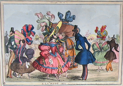
Robert Cruikshank Devastates Dandies.
__________
__________![]()
![]()
 |
| Meeting of Victuallers. |
"The Publicans, as well as every other branch of the community, were aware that recent improvements in modern science had effected a Rail Road from this Earth to the Moon, in which part of the Isle of Sky Bacchus has an airy summer residence; they therefore resolved to send up by the new Steam Coach, one of the Victualler Chiefs, to invite their jovial Patron down to head their forces, and to fight their battles with their foes, The Tee-Totallers" (from the Introduction).
 |
| Steam Coachman To The Moon. |
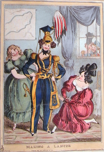
This very amusing, curious little satire is comprised of six anti-temperance drinking-songs each with an accompanying hand-colored aquatint plate by Robert Cruikshank. It appeared when the temperance movement in England began in earnest, an effort that was "a major cause for social reform in Victorian Britain" (Rebecca Smith. The Temperance Movement and Class Struggle in Victorian England. Loyola University). At the time of its publication in 1841 Robert Cruikshank, who shared a "deep fraternal bond" (Patten, p. 216) with his celebrated brother, George, was already deteriorating from alcoholism.
 |
| Bacchus At Home. |
George, in the same year, contributed the etchings to John O'Niell's poem, The Drunkard. Though not yet a committed tee-totaller, his faith in drink was shaken (not stirred), and in 1847 he committed himself to the cause of abstinence with his grim moral tale in caricature, The Bottle.
 |
| Meeting Of Tee-Totallers. |
In the next year, 1848, George Cruikshank, now a temperance zealot, produced a sequel in eight plates, The Drunkard's Children. Robert remained firmly on the side of anti-temperance.
 |
| Commencement Of Hostilities. |
Regarding Robert Cruikshank, George "could not cow his brother into signing a pledge; Robert lapsed deeper and deeper into chronic alcoholism" (Patten, p. 315). He died in 1856.
 |
| Departure Of The Victualler Chief For The Combat. |
The original binding for Bacchus and the Tee-Totallers was executed by Robert Riviere in green cloth with a blindstamped frame and large corner-pieces enclosing a gilt vignette by Robert Cruikshank loosely reproducing his plate, Steam Coachman to the Moon.

"Riviere was the top of the line and this small satirical volume must have had an important backer to finance a custom Riviere binding and six aquatinted plates by Cruikshank" (Princeton University, Graphic Arts).
An important backer who did not wish to see his libations become as scarce as this book has become, a committed anti-temperance man of means.
An important backer who did not wish to see his libations become as scarce as this book has become, a committed anti-temperance man of means.
Only one copy has come to auction since 1968. OCLC/KVK record only eight copies in institutional collections worldwide, with none, curiously, in the U.K. The Widener copy at Harvard is partially uncolored, and two institutional copies have been rebound.
__________
[CRUIKSHANK, Robert]. Bacchus and the Tee-Totallers by Rumfusticus Bibulus, Esq., President of the Anti-Temperance Society. London: Sherwood, Gilbert, And Piper, 1841.
First edition. Octavo (8 1/2 x 7 1/8 in; 218 x 178 mm). 19. {1, blank] pp. Six hand-colored aquatint plates with later tissue guards loosely inserted.
Original binding by Robert Riviere (per Princeton & Yale Universities) in green cloth with blindstamped frame and large corner-pieces enclosing a gilt vignette loosely reproducing the plate, Steam Coachman to the Moon.
Widener Collection, p. 235. Not in Abbey, Tooley, or Prideaux.
__________
Images courtesy of David Brass Rare Books, with our thanks.
__________
Of related interest:
Robert Cruikshank Devastates Dandies.
__________
__________